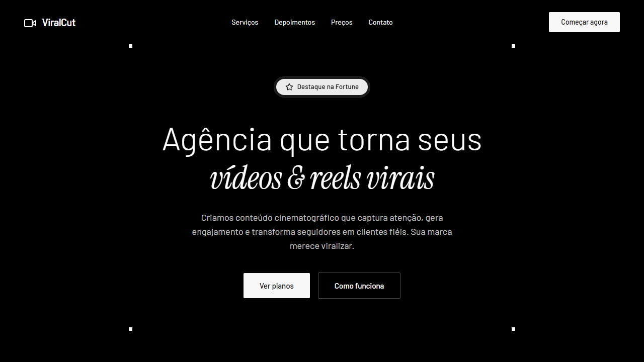
Agency Viral Videos & Reels Hero
Hero section de agência de vídeos virais com vídeo full-screen, navbar transparente, badge liquid glass, tipografia dual Barlow + Instrument Serif e corner accents. Prompt para IA.
Uso: Agências de vídeo, Produtoras de conteúdo, Marketing de reels, Agências criativas, Social media agencies
Contexto Histórico
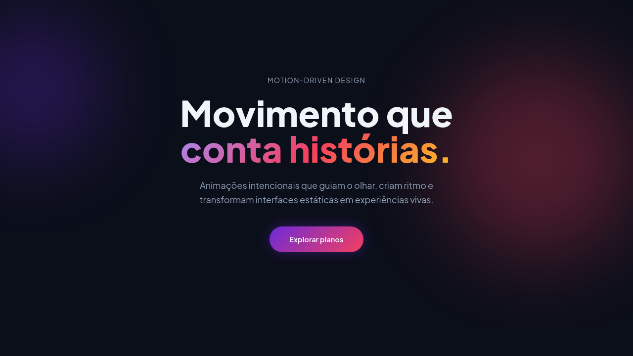
O formato hero full-screen com vídeo de fundo sem overlay tornou-se a assinatura visual de agências criativas em 2025-2026. A combinação de tipografia dual (sans-serif + serif italic) com elementos de corner accent e badges liquid glass cria uma estética cinematográfica premium que comunica autoridade criativa.
Especificações Técnicas
Cores
Primárias
Efeitos
Video background full-screen sem overlay (object-cover, autoplay, loop, muted, playsInline), navbar totalmente transparente sem borda, badge Featured in Fortune com efeito liquid glass (white/10 backdrop-blur-sm outer + white/90 backdrop-blur-md inner pill), headline dinâmica com duas fontes (Barlow light 64px + Instrument Serif italic 64px), botões retangulares com border-radius 2px e bg #f8f8f8, quatro quadrados brancos 7x7px nos cantos do container hero, hover suave transition-colors em todos interativos, 250px bottom padding no conteúdo principal
Light/Dark
✗ None / ✓ Full
CSS
font-family: 'Barlow', sans-serif; .accent-font { font-family: 'Instrument Serif', serif; font-style: italic; } video { position: absolute; inset: 0; width: 100%; height: 100%; object-fit: cover; } nav { background: transparent; border: none; } .badge-outer { background: rgba(255,255,255,0.1); backdrop-filter: blur(4px); } .badge-inner { background: rgba(255,255,255,0.9); backdrop-filter: blur(8px); } .btn-cta { background: #f8f8f8; color: #171717; border-radius: 2px; } .btn-cta:hover { background: #ffffff; } .corner-accent { width: 7px; height: 7px; background: #ffffff; position: absolute; } padding-bottom: 250px on hero content
Variáveis
--color-white: #FFFFFF; --color-white-75: rgba(255,255,255,0.75); --color-offwhite: #f8f8f8; --color-dark: #171717; --color-white-10: rgba(255,255,255,0.1); --color-white-90: rgba(255,255,255,0.9); --font-primary: 'Barlow', sans-serif; --font-accent: 'Instrument Serif', serif; --btn-radius: 2px; --corner-size: 7px; --hero-padding-bottom: 250px
Checklist
☐ Vídeo full-screen sem overlay cobrindo viewport inteiro, ☐ Navbar transparente sem background nem borda, ☐ Badge liquid glass com dois níveis de blur, ☐ Headline dinâmica com Barlow light + Instrument Serif italic, ☐ Botões retangulares border-radius 2px com bg #f8f8f8, ☐ Quatro quadrados 7x7px brancos nos cantos do container, ☐ 250px bottom padding no conteúdo, ☐ Hover transition-colors suave em todos interativos, ☐ Texto branco puro e branco 75% opacity, ☐ Fontes Barlow e Instrument Serif carregadas
DESIGN.md
Design System: Agency Viral Videos & Reels Hero
1. Visual Theme & Atmosphere
Hero section de agência de vídeos virais com vídeo full-screen, navbar transparente, badge liquid glass, tipografia dual Barlow + Instrument Serif e corner accents. Prompt para IA. O formato hero full-screen com vídeo de fundo sem overlay tornou-se a assinatura visual de agências criativas em 2025-2026. A combinação de tipografia dual (sans-serif + serif italic) com elementos de corner accent e badges liquid glass cria uma estética cinematográfica premium que comunica autoridade criativa.
- Density: 5/10 — Balanced
- Variance: 4/10 — Moderate
- Motion: 8/10 — Cinematic
2. Color Palette & Roles
- Branco Puro (#FFFFFF) — Light surface, card backgrounds
- Off-White CTA (#f8f8f8) — Light surface, card backgrounds
- Preto Texto (#171717) — Dark surface, primary background
- **** (rgba(255,255,255,0.75)) — Supporting palette color
- 10 (rgba(255,255,255,0.1)) — Extended palette, decorative use
- 90 (rgba(255,255,255,0.9)) — Extended palette, decorative use
3. Typography Rules
- Display / Hero: Barlow — Weight 700, tight tracking, used for headline impact
- Accent: Instrument Serif — Used for decorative or emphasis text
- Body: Barlow — Weight 400, 16px/1.6 line-height, max 72ch per line
- UI Labels / Captions: Barlow — 0.875rem, weight 500, slight letter-spacing
- Monospace: JetBrains Mono — Used for code, metadata, and technical values
Scale:
- Hero: clamp(2.5rem, 5vw, 4rem)
- H1: 2.25rem
- H2: 1.5rem
- Body: 1rem / 1.6
- Small: 0.875rem
4. Component Stylings
- Primary Button: Sharp edges (0px) shape. Accent color fill. Hover: 8% darken + subtle lift shadow. Active: -1px translate tactile press. Font weight 600. No outer glows.
- Secondary / Ghost Button: Outline variant. 1.5px border in muted color. Text in primary color. Hover: subtle background fill.
- Cards: Sharp edges (0px) corners. Surface background. Subtle shadow (0 2px 12px rgba(0,0,0,0.06)). 1px border stroke.
- Inputs: Label above input. 1px border stroke. Focus ring: 2px accent color offset 2px. Error text below in semantic red. No floating labels.
- Navigation: Primary surface background. Active item: accent color indicator. Font weight 500 when active.
- Skeletons: Shimmer animation matching component dimensions. No circular spinners.
- Empty States: Icon-based composition with descriptive text and action button.
5. Layout Principles
- Grid: CSS Grid primary. Max-width containment: 1280px centered with 1.5rem side padding.
- Spacing rhythm: Balanced. Base unit: 0.5rem (8px).
- Section vertical gaps: clamp(4rem, 8vw, 8rem).
- Hero layout: Split-screen (text left, visual right).
- Feature sections: Zig-zag alternating text+image rows. No 3-equal-columns.
- Mobile collapse: All multi-column layouts collapse below 768px. No horizontal overflow.
- z-index contract: base (0) / sticky-nav (100) / overlay (200) / modal (300) / toast (500).
6. Motion & Interaction
- Physics: Spring — stiffness 120, damping 20. Confident, weighted transitions.
- Entry animations: Fade + translate-Y (16px → 0) over 540ms ease-out. Staggered cascades for lists: 120ms between items.
- Hover states: Scale(1.03) + shadow lift over 200ms.
- Page transitions: Fade + slide (300ms).
- Performance: Only transform and opacity animated. No layout-triggering properties.
7. Anti-Patterns (Banned)
- No emojis in UI — use icon system only (Lucide, Heroicons)
- No pure black (#000000) — use off-black or charcoal variants
- No oversaturated accent colors (saturation cap: 80%)
- No 3-column equal-width feature layouts — use zig-zag or asymmetric grid
- No
h-screen— usemin-h-[100dvh] - No AI copywriting clichés: "Elevate", "Seamless", "Unleash", "Next-Gen"
- No broken external image links — use picsum.photos or inline SVG
- No generic lorem ipsum in demos
Prompt para AI
Build a high-impact full-screen hero section for a viral video agency. Background: Full-screen looping video of glowing rays emanating from center bottom like blurry lasers (use a stock video URL). Video settings: autoplay, loop, muted, playsInline, object-cover, NO color overlays or filters. Content has 250px bottom padding. Typography: Primary font Barlow (sans-serif) for UI/body, accent font Instrument Serif (italic) for poetic emphasis. Colors: primary text pure white #FFFFFF or white at 75% opacity, CTA buttons and badges use off-white #f8f8f8. Transparent Navigation: floating navbar with NO background fill, NO border strokes, all links and logo white. Featured Badge: 'Featured in Fortune' centered at top with liquid glass effect (white/10 bg + backdrop-blur-sm outer ring, white/90 + backdrop-blur-md inner pill). Dynamic Headline: Line 1 'Agency that makes your' (Barlow font-light 64px white), Line 2 'videos & reels viral' (Instrument Serif italic 64px white). Sub-headline: max-width paragraph Barlow white/75 opacity. Buttons: rectangular with 2px border-radius, #f8f8f8 background, #171717 medium Barlow text. Corner Accents: four 7x7px solid white squares at the four corners of the hero content container. Interactions: smooth transition-colors on hover, buttons shift #f8f8f8 to white on hover, nav items get white/10 bg on hover.
Relacionados
Última sincronização: 01/04/2026