Arctic Forsythia Premium
Estilo Arctic Forsythia Premium com fundo ártico, amarelo luminoso e teal profundo. Design escandinavo minimal com espaço generoso e clareza visual. Ideal para SaaS, fintechs e apps modernos.
Uso: SaaS moderno, Fintechs, Apps de produtividade, Startups de tecnologia, Plataformas de saúde digital
Contexto Histórico
Inspirado no design escandinavo e na luminosidade das flores forsythia contra paisagens árticas, este estilo combina a frescura do minimal nórdico com pops de amarelo energético para criar interfaces limpas, arejadas e contemporâneas.
Especificações Técnicas
Cores
Primárias
Secundárias
Efeitos
Generous white space, crisp thin borders (1px), luminous yellow accent pops against cool neutrals, clean geometric layouts, subtle mint-tinted card backgrounds, minimal shadows (2-4px blur), precise grid alignment, smooth 250ms transitions, focus on breathing room and clarity
Light/Dark
✓ Full
CSS
font-family: 'Inter', sans-serif; --font-display: 'Outfit', sans-serif; background-color: #F1F6F4; color: #172B36; --accent: #FFC801; --teal: #114C5A; border-radius: 8px; border: 1px solid rgba(17,76,90,0.1); box-shadow: 0 2px 8px rgba(0,0,0,0.04); transition: all 0.25s ease;
Variáveis
--color-arctic: #F1F6F4; --color-forsythia: #FFC801; --color-nocturnal: #114C5A; --color-mint: #D9E8E2; --color-saffron: #FF9932; --color-oceanic: #172B36; --font-display: 'Outfit', sans-serif; --font-body: 'Inter', sans-serif; --radius-md: 8px; --shadow-subtle: 0 2px 8px rgba(0,0,0,0.04); --border-light: 1px solid rgba(17,76,90,0.1);
Checklist
☐ Arctic Powder #F1F6F4 background, ☐ Forsythia Yellow #FFC801 accent, ☐ Nocturnal Teal #114C5A headings, ☐ Generous white space, ☐ Crisp thin borders, ☐ Clean geometric grid, ☐ Minimal shadows, ☐ Mystic Mint card backgrounds, ☐ Responsive layout
DESIGN.md
Design System: Arctic Forsythia Premium
1. Visual Theme & Atmosphere
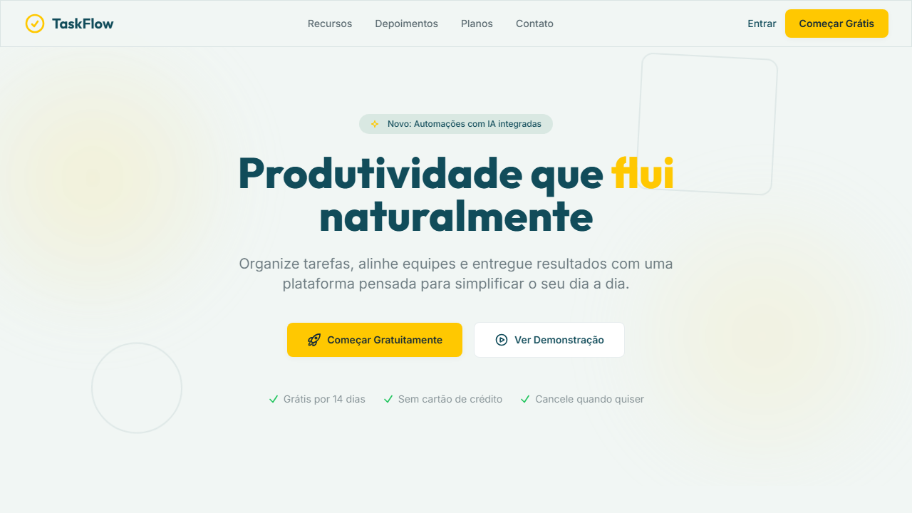
Estilo Arctic Forsythia Premium com fundo ártico, amarelo luminoso e teal profundo. Design escandinavo minimal com espaço generoso e clareza visual. Ideal para SaaS, fintechs e apps modernos. Inspirado no design escandinavo e na luminosidade das flores forsythia contra paisagens árticas, este estilo combina a frescura do minimal nórdico com pops de amarelo energético para criar interfaces limpas, arejadas e contemporâneas.
- Density: 3/10 — Airy
- Variance: 3/10 — Restrained
- Motion: 4/10 — Subtle
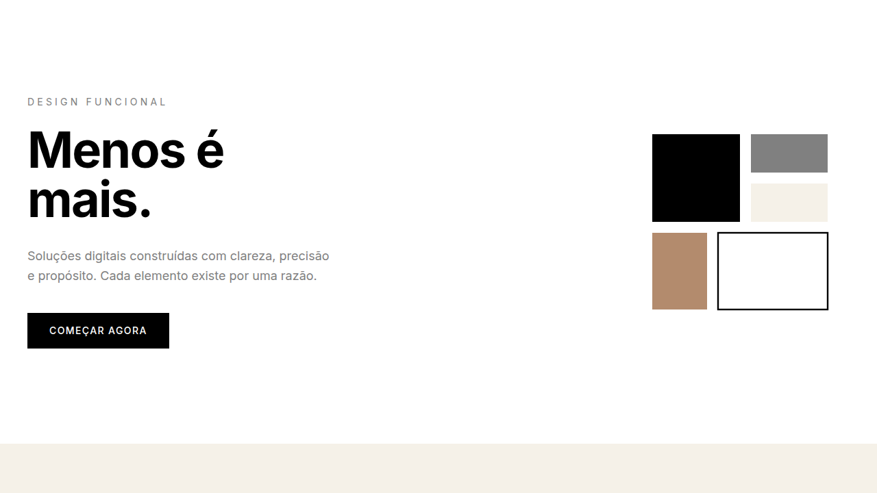
2. Color Palette & Roles
- Arctic Powder (#F1F6F4) — Primary surface or dominant color
- Forsythia Yellow (#FFC801) — Warning states, attention indicators
- Nocturnal Teal (#114C5A) — Accent highlight, links and focus states
- Mystic Mint (#D9E8E2) — Extended palette, decorative use
- Deep Saffron (#FF9932) — Extended palette, decorative use
- Oceanic Noir (#172B36) — Extended palette, decorative use
3. Typography Rules
- Display / Hero: Inter — Weight 700, tight tracking, used for headline impact
- Accent: Outfit — Used for decorative or emphasis text
- Body: Inter — Weight 400, 16px/1.6 line-height, max 72ch per line
- UI Labels / Captions: Inter — 0.875rem, weight 500, slight letter-spacing
- Monospace: JetBrains Mono — Used for code, metadata, and technical values
Scale:
- Hero: clamp(2.5rem, 5vw, 4rem)
- H1: 2.25rem
- H2: 1.5rem
- Body: 1rem / 1.6
- Small: 0.875rem
4. Component Stylings
- Primary Button: Rounded (8px) shape. Accent color fill. Hover: 8% darken + subtle lift shadow. Active: -1px translate tactile press. Font weight 600. No outer glows.
- Secondary / Ghost Button: Outline variant. 1.5px border in muted color. Text in primary color. Hover: subtle background fill.
- Cards: Rounded (8px) corners. Surface background. Subtle shadow (0 2px 12px rgba(0,0,0,0.06)). 1px border stroke.
- Inputs: Label above input. 1px border stroke. Focus ring: 2px accent color offset 2px. Error text below in semantic red. No floating labels.
- Navigation: Primary surface background. Active item: accent color indicator. Font weight 500 when active.
- Skeletons: Shimmer animation matching component dimensions. No circular spinners.
- Empty States: Icon-based composition with descriptive text and action button.
5. Layout Principles
- Grid: CSS Grid primary. Max-width containment: 1280px centered with 1.5rem side padding.
- Spacing rhythm: Balanced. Base unit: 0.5rem (8px).
- Section vertical gaps: clamp(4rem, 8vw, 8rem).
- Hero layout: Split-screen (text left, visual right).
- Feature sections: Zig-zag alternating text+image rows. No 3-equal-columns.
- Mobile collapse: All multi-column layouts collapse below 768px. No horizontal overflow.
- z-index contract: base (0) / sticky-nav (100) / overlay (200) / modal (300) / toast (500).
6. Motion & Interaction
- Physics: Ease-out curves, 200-300ms duration. Smooth and predictable.
- Entry animations: Fade + translate-Y (16px → 0) over 420ms ease-out. Staggered cascades for lists: 80ms between items.
- Hover states: Subtle color shift + shadow adjustment over 200ms.
- Page transitions: Fade only (200ms).
- Performance: Only transform and opacity animated. No layout-triggering properties.
7. Anti-Patterns (Banned)
- No emojis in UI — use icon system only (Lucide, Heroicons)
- No decorative gradients — flat color only
- No shadows heavier than 0 2px 8px rgba(0,0,0,0.08)
- No pure black (#000000) — use off-black or charcoal variants
- No oversaturated accent colors (saturation cap: 80%)
- No 3-column equal-width feature layouts — use zig-zag or asymmetric grid
- No
h-screen— usemin-h-[100dvh] - No AI copywriting clichés: "Elevate", "Seamless", "Unleash", "Next-Gen"
- No broken external image links — use picsum.photos or inline SVG
- No generic lorem ipsum in demos
Prompt para AI
Create a fresh, minimal, and luminous UI inspired by Scandinavian design. Use arctic powder (#F1F6F4) as the primary background with forsythia yellow (#FFC801) as a bright, energetic accent. Nocturnal teal (#114C5A) for headings and structural elements. Cards use mystic mint (#D9E8E2) tinted backgrounds. Deep saffron (#FF9932) for secondary CTAs. Oceanic noir (#172B36) for footer and dark sections. Prioritize generous white space, crisp thin borders, clean geometric layouts, and precise grid alignment. The feel should be airy, bright, and effortlessly modern.
Relacionados
Última sincronização: 01/04/2026