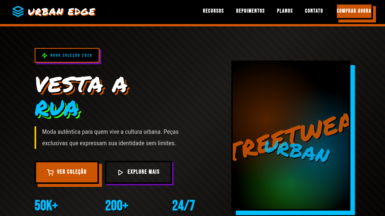
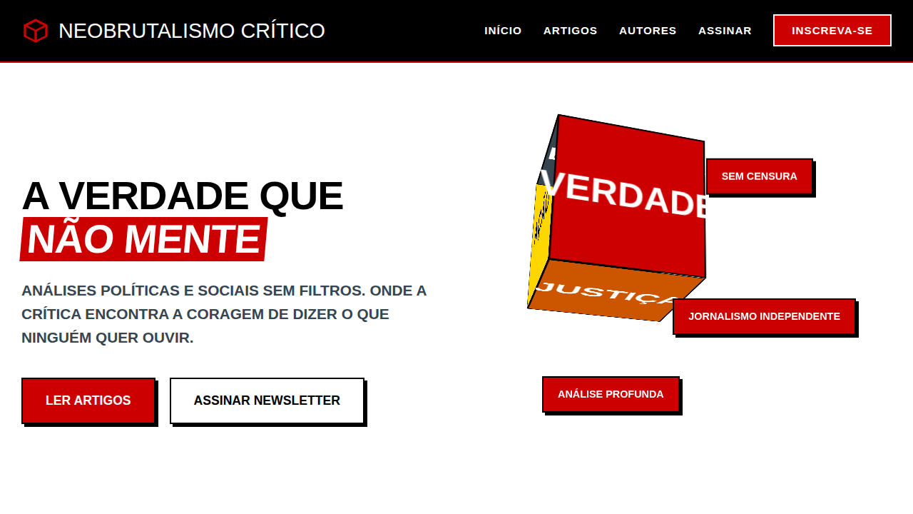
Brutalismo Urbano Expressivo
Brutalismo Urbano Expressivo — Design brutalism com streetwear, urban art, graffiti. Template e prompt pronto para IA.
Uso: Landing pages, Websites modernas
Contexto Histórico
Estilo Brutalismo Urbano Expressivo representa uma tendência moderna em design UI/UX web com foco em brutalism.
Especificações Técnicas
Cores
Primárias
Secundárias
Efeitos
Texturas de parede de concreto, tipografia de stencil e grafite, imagens de arte de rua em grande escala, elementos de interface com "rasgos" ou "desgastes", micro-interações de hover com efeitos de spray, animações de transição de elementos bruscas.
Light/Dark
✓ Full / ✗ No
CSS
background: url("concrete-texture.jpg") #A9A9A9, color: #FFFFFF, border: 5px solid #000000, box-shadow: 10px 10px 0px #CC5500, font-family: "Permanent Marker, cursive", text-shadow: 2px 2px #000000, .graffiti-text, .distressed-button, .spray-hover.
Variáveis
--black-bg: #000000, --white-text: #FFFFFF, --burnt-orange: #CC5500, --electric-blue: #00BFFF, --border-heavy: 5px solid #000000, --shadow-urban: 10px 10px 0px #CC5500, --font-graffiti: "Permanent Marker, cursive".
Checklist
☐ Texturas de concreto, ☐ Tipografia de stencil/grafite, ☐ Imagens de arte de rua, ☐ Elementos com "rasgos", ☐ Micro-interações de spray, ☐ Transições bruscas.
DESIGN.md
Design System: Brutalismo Urbano Expressivo
1. Visual Theme & Atmosphere
Brutalismo Urbano Expressivo — Design brutalism com streetwear, urban art, graffiti. Template e prompt pronto para IA. Estilo Brutalismo Urbano Expressivo representa uma tendência moderna em design UI/UX web com foco em brutalism.
- Density: 5/10 — Balanced
- Variance: 4/10 — Moderate
- Motion: 4/10 — Subtle
2. Color Palette & Roles
- Preto (#000000) — Dark surface, primary background
- Branco (#FFFFFF) — Light surface, card backgrounds
- Laranja Queimado (#CC5500) — Warm accent, call-to-action secondary
- Azul Elétrico (#00BFFF) — Accent highlight, links and focus states
- Verde Neon (#39FF14) — Success states, positive indicators
- Roxo Grafite (#6A0DAD) — Accent color, emphasis elements
- Amarelo Mostarda (#FFD700) — Warning states, attention indicators
- Cinza Concreto (#A9A9A9) — Secondary text, borders, muted elements
3. Typography Rules
- Display / Hero: Permanent Marker — Weight 700, tight tracking, used for headline impact
- Body: Permanent Marker — Weight 400, 16px/1.6 line-height, max 72ch per line
- UI Labels / Captions: Permanent Marker — 0.875rem, weight 500, slight letter-spacing
- Monospace: JetBrains Mono — Used for code, metadata, and technical values
Scale:
- Hero: clamp(2.5rem, 5vw, 4rem)
- H1: 2.25rem
- H2: 1.5rem
- Body: 1rem / 1.6
- Small: 0.875rem
4. Component Stylings
- Primary Button: Subtly rounded (0.5rem) shape. Accent color fill. Hover: 8% darken + subtle lift shadow. Active: -1px translate tactile press. Font weight 600. No outer glows.
- Secondary / Ghost Button: Outline variant. 1.5px border in muted color. Text in primary color. Hover: subtle background fill.
- Cards: Subtly rounded (0.5rem) corners. Surface background. Subtle shadow (0 2px 12px rgba(0,0,0,0.06)). 1px border stroke.
- Inputs: Label above input. 1px border stroke. Focus ring: 2px accent color offset 2px. Error text below in semantic red. No floating labels.
- Navigation: Primary surface background. Active item: accent color indicator. Font weight 500 when active.
- Skeletons: Shimmer animation matching component dimensions. No circular spinners.
- Empty States: Icon-based composition with descriptive text and action button.
5. Layout Principles
- Grid: CSS Grid primary. Max-width containment: 1280px centered with 1.5rem side padding.
- Spacing rhythm: Balanced. Base unit: 0.5rem (8px).
- Section vertical gaps: clamp(4rem, 8vw, 8rem).
- Hero layout: Split-screen (text left, visual right).
- Feature sections: Zig-zag alternating text+image rows. No 3-equal-columns.
- Mobile collapse: All multi-column layouts collapse below 768px. No horizontal overflow.
- z-index contract: base (0) / sticky-nav (100) / overlay (200) / modal (300) / toast (500).
6. Motion & Interaction
- Physics: Ease-out curves, 200-300ms duration. Smooth and predictable.
- Entry animations: Fade + translate-Y (16px → 0) over 420ms ease-out. Staggered cascades for lists: 80ms between items.
- Hover states: Subtle color shift + shadow adjustment over 200ms.
- Page transitions: Fade only (200ms).
- Performance: Only transform and opacity animated. No layout-triggering properties.
7. Anti-Patterns (Banned)
- No emojis in UI — use icon system only (Lucide, Heroicons)
- No pure black (#000000) — use off-black or charcoal variants
- No oversaturated accent colors (saturation cap: 80%)
- No 3-column equal-width feature layouts — use zig-zag or asymmetric grid
- No
h-screen— usemin-h-[100dvh] - No AI copywriting clichés: "Elevate", "Seamless", "Unleash", "Next-Gen"
- No broken external image links — use picsum.photos or inline SVG
- No generic lorem ipsum in demos
Prompt para AI
Design an edgy and expressive brutalist landing page for an urban art and streetwear store. Use: concrete wall textures, stencil and graffiti typography, large-scale street art images, UI elements with "tears" or "distress" effects, spray paint hover micro-interactions, abrupt element transition animations, burnt orange and electric blue accents, raw and authentic feel.
Relacionados
Última sincronização: 01/04/2026