CAD-Inspired Blueprint
CAD-Inspired Blueprint — Design technical com cad, blueprint, autocad. Template e prompt pronto para IA.
Uso: Landing pages, Websites modernas
Contexto Histórico
Estilo CAD-Inspired Blueprint representa uma tendência moderna em design UI/UX web com foco em technical.
Especificações Técnicas
Cores
Primárias
Secundárias
Efeitos
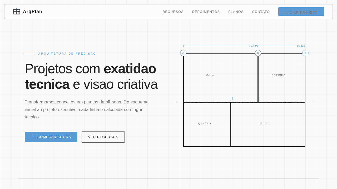
Mechanical gear motifs, flowchart connectors, modular blocks, white square mesh overlay, precise fine-line vector grid.
Light/Dark
✗ No / ✓ Full
CSS
background-color: #1C4E80; color: #FFFFFF; font-family: 'Consolas', 'Monaco', monospace; background-image: linear-gradient(rgba(255,255,255,0.1) 1px, transparent 1px), linear-gradient(90deg, rgba(255,255,255,0.1) 1px, transparent 1px); background-size: 50px 50px;
Variáveis
--cad-blue: #1C4E80, --line-white: #FFFFFF, --alert-orange: #E85D35, --grid-opacity: 0.1, --font-mono: 'Consolas', monospace
Checklist
☐ Dark blue blueprint background, ☐ White thin lines for elements, ☐ Mechanical/Gear decorative elements, ☐ Monospace fonts, ☐ Measurement ticks on borders
DESIGN.md
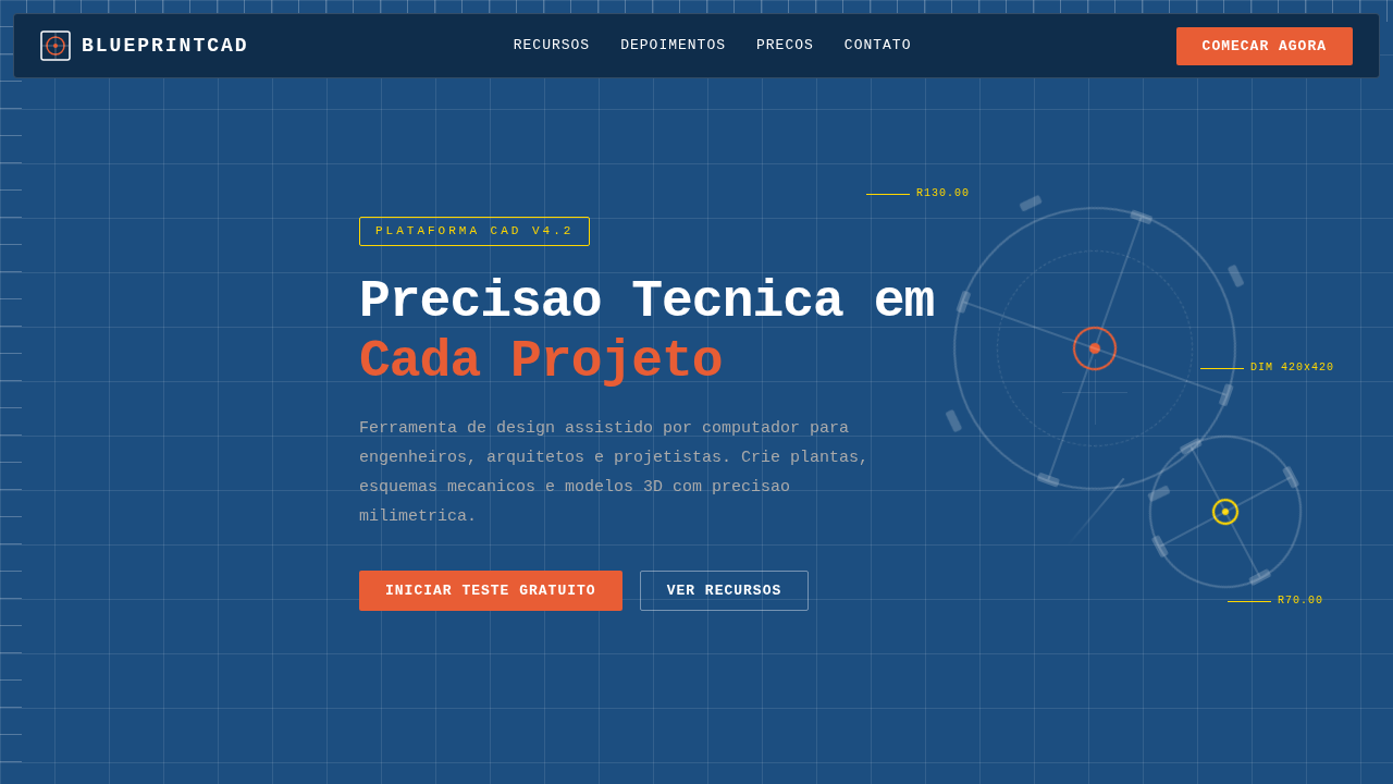
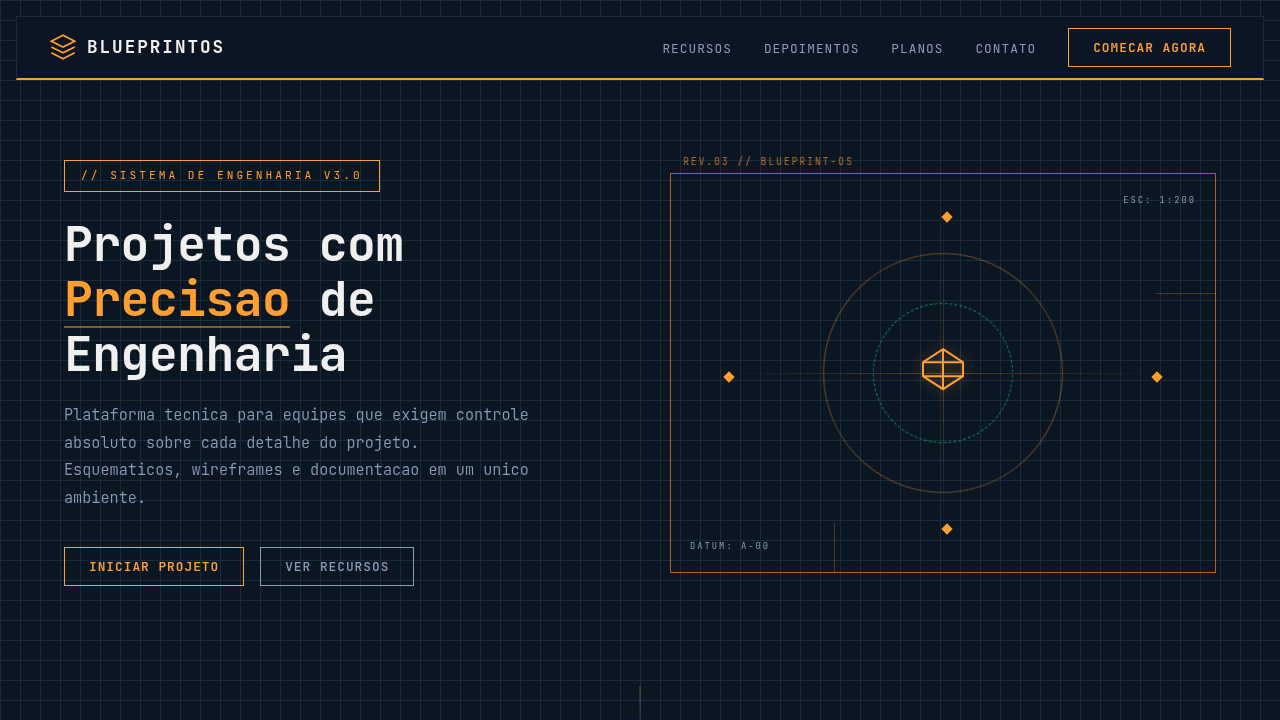
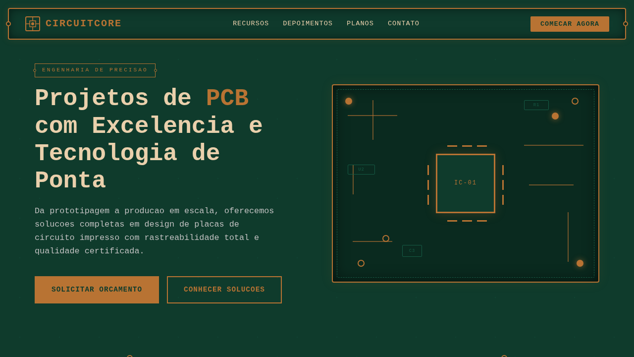
Design System: CAD-Inspired Blueprint
1. Visual Theme & Atmosphere
CAD-Inspired Blueprint — Design technical com cad, blueprint, autocad. Template e prompt pronto para IA. Estilo CAD-Inspired Blueprint representa uma tendência moderna em design UI/UX web com foco em technical.
- Density: 7/10 — Compact
- Variance: 2/10 — Structured
- Motion: 1/10 — Static
2. Color Palette & Roles
- Background (#1C4E80) — Primary background surface
- Text (#FFFFFF) — Primary text color
- Accent (#E85D35) — Primary accent, CTAs and interactive elements
- Grid Light (#FFFFFF1A) — Extended palette, decorative use
- Guide Line (#FFD700) — Extended palette, decorative use
- Dim (#AAAAAA) — Extended palette, decorative use
3. Typography Rules
- Display / Hero: Consolas — Weight 700, tight tracking, used for headline impact
- Accent: Monaco — Used for decorative or emphasis text
- Body: Consolas — Weight 400, 16px/1.6 line-height, max 72ch per line
- UI Labels / Captions: Consolas — 0.875rem, weight 500, slight letter-spacing
- Monospace: Consolas — Used for code, metadata, and technical values
Scale:
- Hero: clamp(2.5rem, 5vw, 4rem)
- H1: 2.25rem
- H2: 1.5rem
- Body: 1rem / 1.6
- Small: 0.875rem
4. Component Stylings
- Primary Button: Subtly rounded (0.5rem) shape. Accent color fill. Hover: 8% darken + subtle lift shadow. Active: -1px translate tactile press. Font weight 600. No outer glows.
- Secondary / Ghost Button: Outline variant. 1.5px border in muted color. Text in primary color. Hover: subtle background fill.
- Cards: Subtly rounded (0.5rem) corners. Surface background. Subtle shadow (0 2px 12px rgba(0,0,0,0.06)). 1px border stroke.
- Inputs: Label above input. 1px border stroke. Focus ring: 2px accent color offset 2px. Error text below in semantic red. No floating labels.
- Navigation: Primary surface background. Active item: accent color indicator. Font weight 500 when active.
- Skeletons: Shimmer animation matching component dimensions. No circular spinners.
- Empty States: Icon-based composition with descriptive text and action button.
5. Layout Principles
- Grid: CSS Grid primary. Max-width containment: 1280px centered with 1.5rem side padding.
- Spacing rhythm: Balanced. Base unit: 0.5rem (8px).
- Section vertical gaps: clamp(4rem, 8vw, 8rem).
- Hero layout: Split-screen (text left, visual right).
- Feature sections: Zig-zag alternating text+image rows. No 3-equal-columns.
- Mobile collapse: All multi-column layouts collapse below 768px. No horizontal overflow.
- z-index contract: base (0) / sticky-nav (100) / overlay (200) / modal (300) / toast (500).
6. Motion & Interaction
- Minimal motion design. Hover states use color transitions only (150ms).
- No entry animations. No page transitions. Instant, utilitarian feedback.
- Performance: No animation overhead. Static-first approach.
7. Anti-Patterns (Banned)
- No emojis in UI — use icon system only (Lucide, Heroicons)
- No pure white (#FFFFFF) backgrounds — use off-white or dark surfaces
- No oversaturated accent colors (saturation cap: 80%)
- No 3-column equal-width feature layouts — use zig-zag or asymmetric grid
- No
h-screen— usemin-h-[100dvh] - No AI copywriting clichés: "Elevate", "Seamless", "Unleash", "Next-Gen"
- No broken external image links — use picsum.photos or inline SVG
- No generic lorem ipsum in demos
Prompt para AI
CAD landing page style, blueprint aesthetic, dark blue background, white technical lines, mechanical details, engineering look.
Relacionados
Última sincronização: 01/04/2026