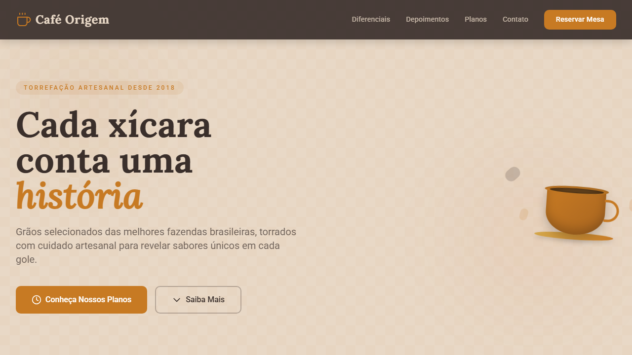
Caramelo Quente Premium
Estilo Caramelo Quente Premium com tons de café, texturas artesanais e tipografia serifada acolhedora. Perfeito para padarias, cafeterias e marcas de lifestyle.
Uso: Cafeterias artesanais, Padarias premium, Marcas de lifestyle, Restaurantes acolhedores, E-commerce de produtos naturais
Contexto Histórico
Inspirado na cultura artesanal de cafeterias e padarias premium, o Caramelo Quente Premium evoca a sensação de conforto e autenticidade com tons quentes de caramelo, texturas de linho e madeira, e tipografia elegante.
Especificações Técnicas
Cores
Primárias
Secundárias
Efeitos
Soft, diffused lighting, subtle texture overlays (linen, wood grain), elegant serif typography for headlines, warm sans-serif for body, gentle shadows, focus on natural materials and comfort, smooth transitions
Light/Dark
✓ Full
CSS
font-family: 'Lora', serif; --font-body: 'Roboto', sans-serif; color: #C77A23; background-color: #E8D8C6; border-radius: 10px; box-shadow: 0 6px 15px rgba(0,0,0,0.15); transition: all 0.4s ease-in-out;
Variáveis
--color-caramel: #C77A23; --color-latte: #E8D8C6; --color-dark-roast: #3A2F2B; --font-serif-primary: 'Lora', serif; --font-sans-body: 'Roboto', sans-serif; --border-radius-lg: 10px; --shadow-medium: 0 6px 15px rgba(0,0,0,0.15);
Checklist
☐ Warm Caramel Brown primary #C77A23, ☐ Earthy and cozy color palette, ☐ Elegant serif typography for headlines, ☐ Soft, gentle shadows, ☐ Natural textures (e.g., linen, coffee beans), ☐ Responsive design for all devices
DESIGN.md
Design System: Caramelo Quente Premium
1. Visual Theme & Atmosphere
Estilo Caramelo Quente Premium com tons de café, texturas artesanais e tipografia serifada acolhedora. Perfeito para padarias, cafeterias e marcas de lifestyle. Inspirado na cultura artesanal de cafeterias e padarias premium, o Caramelo Quente Premium evoca a sensação de conforto e autenticidade com tons quentes de caramelo, texturas de linho e madeira, e tipografia elegante.
- Density: 5/10 — Balanced
- Variance: 4/10 — Moderate
- Motion: 4/10 — Subtle
2. Color Palette & Roles
- Warm Caramel Brown (#C77A23) — Primary surface or dominant color
- Creamy Latte (#E8D8C6) — Light surface, card backgrounds
- Dark Roast (#3A2F2B) — Dark surface, primary background
- Cinnamon Spice (#D2691E) — Extended palette, decorative use
- Linen Grey (#D3D3D3) — Secondary text, borders, muted elements
- Golden Croissant (#F0C98D) — Premium accent, decorative highlights
3. Typography Rules
- Display / Hero: Lora — Weight 700, tight tracking, used for headline impact
- Accent: Roboto — Used for decorative or emphasis text
- Body: Lora — Weight 400, 16px/1.6 line-height, max 72ch per line
- UI Labels / Captions: Lora — 0.875rem, weight 500, slight letter-spacing
- Monospace: JetBrains Mono — Used for code, metadata, and technical values
Scale:
- Hero: clamp(2.5rem, 5vw, 4rem)
- H1: 2.25rem
- H2: 1.5rem
- Body: 1rem / 1.6
- Small: 0.875rem
4. Component Stylings
- Primary Button: Rounded (10px) shape. Accent color fill. Hover: 8% darken + subtle lift shadow. Active: -1px translate tactile press. Font weight 600. No outer glows.
- Secondary / Ghost Button: Outline variant. 1.5px border in muted color. Text in primary color. Hover: subtle background fill.
- Cards: Rounded (10px) corners. Surface background. Subtle shadow (0 2px 12px rgba(0,0,0,0.06)). 1px border stroke.
- Inputs: Label above input. 1px border stroke. Focus ring: 2px accent color offset 2px. Error text below in semantic red. No floating labels.
- Navigation: Primary surface background. Active item: accent color indicator. Font weight 500 when active.
- Skeletons: Shimmer animation matching component dimensions. No circular spinners.
- Empty States: Icon-based composition with descriptive text and action button.
5. Layout Principles
- Grid: CSS Grid primary. Max-width containment: 1280px centered with 1.5rem side padding.
- Spacing rhythm: Balanced. Base unit: 0.5rem (8px).
- Section vertical gaps: clamp(4rem, 8vw, 8rem).
- Hero layout: Split-screen (text left, visual right).
- Feature sections: Zig-zag alternating text+image rows. No 3-equal-columns.
- Mobile collapse: All multi-column layouts collapse below 768px. No horizontal overflow.
- z-index contract: base (0) / sticky-nav (100) / overlay (200) / modal (300) / toast (500).
6. Motion & Interaction
- Physics: Ease-out curves, 200-300ms duration. Smooth and predictable.
- Entry animations: Fade + translate-Y (16px → 0) over 420ms ease-out. Staggered cascades for lists: 80ms between items.
- Hover states: Subtle color shift + shadow adjustment over 200ms.
- Page transitions: Fade only (200ms).
- Performance: Only transform and opacity animated. No layout-triggering properties.
7. Anti-Patterns (Banned)
- No emojis in UI — use icon system only (Lucide, Heroicons)
- No pure black (#000000) — use off-black or charcoal variants
- No oversaturated accent colors (saturation cap: 80%)
- No 3-column equal-width feature layouts — use zig-zag or asymmetric grid
- No
h-screen— usemin-h-[100dvh] - No AI copywriting clichés: "Elevate", "Seamless", "Unleash", "Next-Gen"
- No broken external image links — use picsum.photos or inline SVG
- No generic lorem ipsum in demos
Prompt para AI
Create a warm, inviting, and artisanal UI with a premium feel. Use warm caramel brown (#C77A23) as the primary accent, complemented by creamy latte and dark roast tones. Incorporate subtle natural textures like linen and wood, elegant serif typography for headlines, and a cozy, comfortable layout. Focus on soft lighting and gentle shadows to evoke a sense of warmth and quality.
Relacionados
Última sincronização: 01/04/2026