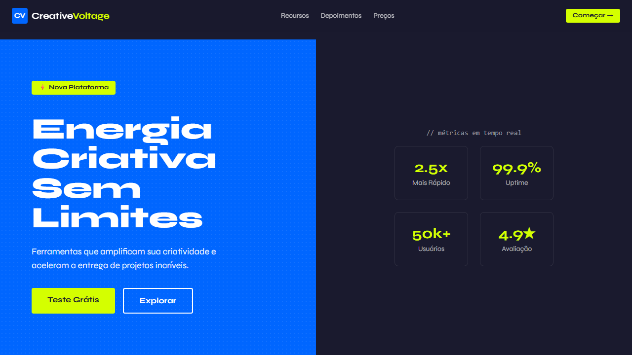
Creative Voltage
Design criativo com azul elétrico, amarelo neon, halftone textures e tipografia Syne bold. Energia retro-moderna para agências criativas. Prompt para IA.
Uso: Agências criativas, Estúdios de música, Marcas jovens, Eventos culturais
Contexto Histórico
Fusão de estética retro-moderna com energia criativa contemporânea. Combina halftone patterns dos anos 60 com paleta neon dos anos 80 e tipografia bold atual, criando um visual único e energético.
Especificações Técnicas
Cores
Primárias
Secundárias
Efeitos
Electric blue + neon yellow contrast, halftone texture patterns via CSS, neon badges/callouts, split panels blue left dark right, script typography accents, bold transitions 200ms
Light/Dark
✗ No / ✓ Full
CSS
font-family: 'Syne' for headings, 'Space Mono' for mono, background: #0066ff, .panel-dark { background: #1a1a2e }, .neon-badge { background: #d4ff00; color: #1a1a2e; padding: 4px 12px; border-radius: 4px; font-weight: 700 }, .halftone { background-image: radial-gradient(circle, #000 1px, transparent 1px); background-size: 8px 8px; opacity: 0.1 }
Variáveis
--bg-primary: #0066ff, --bg-dark: #1a1a2e, --accent-neon: #d4ff00, --text-light: #ffffff, --font-display: 'Syne', --font-mono: 'Space Mono', --halftone-size: 8px, --badge-radius: 4px
Checklist
☐ Syne + Space Mono carregados, ☐ Split panels azul/escuro, ☐ Halftone texture patterns, ☐ Neon badges amarelo (#d4ff00), ☐ Contraste elétrico forte, ☐ Script typography accents, ☐ Responsivo mobile/tablet/desktop
DESIGN.md
Design System: Creative Voltage
1. Visual Theme & Atmosphere
Design criativo com azul elétrico, amarelo neon, halftone textures e tipografia Syne bold. Energia retro-moderna para agências criativas. Prompt para IA. Fusão de estética retro-moderna com energia criativa contemporânea. Combina halftone patterns dos anos 60 com paleta neon dos anos 80 e tipografia bold atual, criando um visual único e energético.
- Density: 5/10 — Balanced
- Variance: 7/10 — Dynamic
- Motion: 4/10 — Subtle
2. Color Palette & Roles
- Electric Blue (#0066ff) — Accent highlight, links and focus states
- Dark Navy (#1a1a2e) — Dark surface, primary background
- Neon Yellow (#d4ff00) — Warning states, attention indicators
- White (#ffffff) — Secondary surface
- Dark Grey (#333333) — Deep contrast surface
- Light Blue (#3388ff) — Secondary accent
3. Typography Rules
- Display / Hero: Syne — Weight 700, tight tracking, used for headline impact
- Accent: Space Mono — Used for decorative or emphasis text
- Body: Syne — Weight 400, 16px/1.6 line-height, max 72ch per line
- UI Labels / Captions: Syne — 0.875rem, weight 500, slight letter-spacing
- Monospace: Space Mono — Used for code, metadata, and technical values
Scale:
- Hero: clamp(2.5rem, 5vw, 4rem)
- H1: 2.25rem
- H2: 1.5rem
- Body: 1rem / 1.6
- Small: 0.875rem
4. Component Stylings
- Primary Button: Rounded (4px) shape. Accent color fill. Hover: 8% darken + subtle lift shadow. Active: -1px translate tactile press. Font weight 600. No outer glows.
- Secondary / Ghost Button: Outline variant. 1.5px border in muted color. Text in primary color. Hover: subtle background fill.
- Cards: Rounded (4px) corners. Surface background. Subtle shadow (0 2px 12px rgba(0,0,0,0.06)). 1px border stroke.
- Inputs: Label above input. 1px border stroke. Focus ring: 2px accent color offset 2px. Error text below in semantic red. No floating labels.
- Navigation: Primary surface background. Active item: accent color indicator. Font weight 500 when active.
- Skeletons: Shimmer animation matching component dimensions. No circular spinners.
- Empty States: Icon-based composition with descriptive text and action button.
5. Layout Principles
- Grid: CSS Grid primary. Max-width containment: 1280px centered with 1.5rem side padding.
- Spacing rhythm: Balanced. Base unit: 0.5rem (8px).
- Section vertical gaps: clamp(4rem, 8vw, 8rem).
- Hero layout: Asymmetric composition.
- Feature sections: Asymmetric grid with varied card sizes. No 3-equal-columns.
- Mobile collapse: All multi-column layouts collapse below 768px. No horizontal overflow.
- z-index contract: base (0) / sticky-nav (100) / overlay (200) / modal (300) / toast (500).
6. Motion & Interaction
- Physics: Ease-out curves, 200-300ms duration. Smooth and predictable.
- Entry animations: Fade + translate-Y (16px → 0) over 420ms ease-out. Staggered cascades for lists: 80ms between items.
- Hover states: Subtle color shift + shadow adjustment over 200ms.
- Page transitions: Fade only (200ms).
- Performance: Only transform and opacity animated. No layout-triggering properties.
7. Anti-Patterns (Banned)
- No emojis in UI — use icon system only (Lucide, Heroicons)
- No pure white (#FFFFFF) backgrounds — use off-white or dark surfaces
- No oversaturated accent colors (saturation cap: 80%)
- No 3-column equal-width feature layouts — use zig-zag or asymmetric grid
- No
h-screen— usemin-h-[100dvh] - No AI copywriting clichés: "Elevate", "Seamless", "Unleash", "Next-Gen"
- No broken external image links — use picsum.photos or inline SVG
- No generic lorem ipsum in demos
Prompt para AI
Design a bold, creative, energetic landing page with retro-modern vibes. Use split panels with electric blue (#0066ff) on left and dark (#1a1a2e) on right. Add halftone texture patterns using CSS. Include neon badges and callouts in yellow (#d4ff00). Use Syne font (700/800) for display and Space Mono for code/accents. Script typography for creative flair.
Relacionados
Última sincronização: 01/04/2026