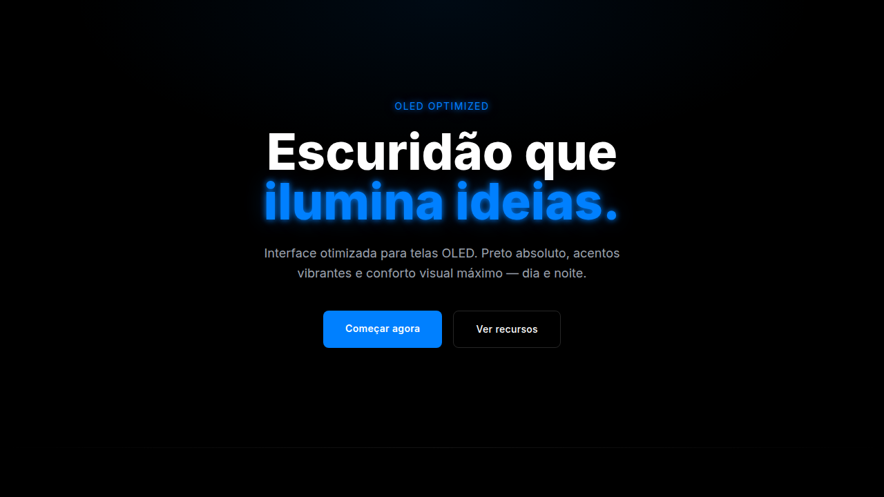
Dark Mode (OLED)
Tema escuro otimizado OLED, preto profundo e neons vibrantes. Economia de bateria garantida. Prompt para dark mode perfeito.
Uso: Dashboards financeiros, Apps criativas, Mobile-first, Gaming
Contexto Histórico
Otimização OLED (2010s+). Pixels pretos consomem 0% bateria em telas OLED. GitHub, Twitter, Discord popularizaram dark-first design.
Especificações Técnicas
Cores
Primárias
Secundárias
Efeitos
Minimal glow (text-shadow: 0 0 10px), dark-to-light transitions, low white emission, high readability, visible focus
Light/Dark
✗ No / ✓ Only
CSS
background: #000000 or #121212, color: #FFFFFF or #E0E0E0, text-shadow: 0 0 10px neon-color (sparingly), filter: brightness(0.8) if needed, color-scheme: dark
Variáveis
--bg-black: #000000, --bg-dark-grey: #121212, --text-primary: #FFFFFF, --accent-neon: neon colors, --glow-effect: minimal, --oled-optimized: true
Checklist
☐ Deep black #000000 or #121212, ☐ Vibrant neon accents used, ☐ Text contrast 7:1+, ☐ Minimal glow effects, ☐ OLED power optimization, ☐ No white (#FFFFFF) background
DESIGN.md
Design System: Dark Mode (OLED)
1. Visual Theme & Atmosphere
Tema escuro otimizado OLED, preto profundo e neons vibrantes. Economia de bateria garantida. Prompt para dark mode perfeito. Otimização OLED (2010s+). Pixels pretos consomem 0% bateria em telas OLED. GitHub, Twitter, Discord popularizaram dark-first design.
- Density: 5/10 — Balanced
- Variance: 4/10 — Moderate
- Motion: 4/10 — Subtle
2. Color Palette & Roles
- Deep Black (#000000) — Dark surface, primary background
- Dark Grey (#121212) — Dark surface, primary background
- Midnight Blue (#0A0E27) — Dark surface, primary background
- Neon Green (#39FF14) — Success states, positive indicators
- Electric Blue (#0080FF) — Secondary accent
- Gold (#FFD700) — Premium accent, decorative highlights
- Plasma Purple (#BF00FF) — Accent color, emphasis elements
3. Typography Rules
- Display / Hero: System UI stack (-apple-system, sans-serif) — Weight 700, tight tracking, used for headline impact
- Body: System UI stack (-apple-system, sans-serif) — Weight 400, 16px/1.6 line-height, max 72ch per line
- UI Labels / Captions: System UI stack (-apple-system, sans-serif) — 0.875rem, weight 500, slight letter-spacing
- Monospace: JetBrains Mono — Used for code, metadata, and technical values
Scale:
- Hero: clamp(2.5rem, 5vw, 4rem)
- H1: 2.25rem
- H2: 1.5rem
- Body: 1rem / 1.6
- Small: 0.875rem
4. Component Stylings
- Primary Button: Subtly rounded (0.5rem) shape. Accent color fill. Hover: 8% darken + subtle lift shadow. Active: -1px translate tactile press. Font weight 600. No outer glows.
- Secondary / Ghost Button: Outline variant. 1.5px border in muted color. Text in primary color. Hover: subtle background fill.
- Cards: Subtly rounded (0.5rem) corners. Surface background. Subtle shadow (0 2px 12px rgba(0,0,0,0.06)). 1px border stroke.
- Inputs: Label above input. 1px border stroke. Focus ring: 2px accent color offset 2px. Error text below in semantic red. No floating labels.
- Navigation: Primary surface background. Active item: accent color indicator. Font weight 500 when active.
- Skeletons: Shimmer animation matching component dimensions. No circular spinners.
- Empty States: Icon-based composition with descriptive text and action button.
5. Layout Principles
- Grid: CSS Grid primary. Max-width containment: 1280px centered with 1.5rem side padding.
- Spacing rhythm: Balanced. Base unit: 0.5rem (8px).
- Section vertical gaps: clamp(4rem, 8vw, 8rem).
- Hero layout: Split-screen (text left, visual right).
- Feature sections: Zig-zag alternating text+image rows. No 3-equal-columns.
- Mobile collapse: All multi-column layouts collapse below 768px. No horizontal overflow.
- z-index contract: base (0) / sticky-nav (100) / overlay (200) / modal (300) / toast (500).
6. Motion & Interaction
- Physics: Ease-out curves, 200-300ms duration. Smooth and predictable.
- Entry animations: Fade + translate-Y (16px → 0) over 420ms ease-out. Staggered cascades for lists: 80ms between items.
- Hover states: Subtle color shift + shadow adjustment over 200ms.
- Page transitions: Fade only (200ms).
- Performance: Only transform and opacity animated. No layout-triggering properties.
7. Anti-Patterns (Banned)
- No emojis in UI — use icon system only (Lucide, Heroicons)
- No pure white (#FFFFFF) backgrounds — use off-white or dark surfaces
- No oversaturated accent colors (saturation cap: 80%)
- No 3-column equal-width feature layouts — use zig-zag or asymmetric grid
- No
h-screen— usemin-h-[100dvh] - No AI copywriting clichés: "Elevate", "Seamless", "Unleash", "Next-Gen"
- No broken external image links — use picsum.photos or inline SVG
- No generic lorem ipsum in demos
Prompt para AI
Create an OLED-optimized dark interface with deep black (#000000), dark grey (#121212), midnight blue accents. Use minimal glow effects, vibrant neon accents (green, blue, gold, purple), high contrast text. Optimize for eye comfort and OLED power saving.
Relacionados
Última sincronização: 01/04/2026