Editorial Interativo Digital
Editorial Interativo Digital — Design editorialstyle com interactive book, digital, history. Template e prompt pronto para IA.
Uso: Landing pages, Websites modernas
Contexto Histórico
Estilo Editorial Interativo Digital representa uma tendência moderna em design UI/UX web com foco em editorialstyle.
Especificações Técnicas
Cores
Primárias
Secundárias
Efeitos
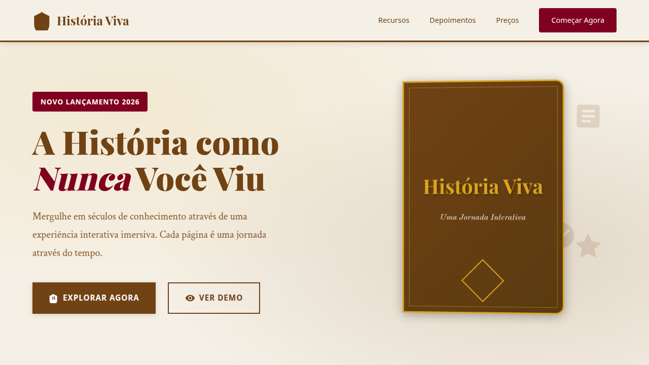
Capa de livro animada, tipografia serifada clássica para o corpo e sans-serif para elementos interativos, layouts de página de livro, imagens históricas em alta resolução, micro-interações de destaque de texto e elementos interativos, transições de página com efeito de "virar página" suave.
Light/Dark
✓ Full / ✗ No
CSS
background: #FFFFFF, color: #704214, border-bottom: 1px solid #D2B48C, font-family: "Old Standard TT, serif", line-height: 1.7, transition: all 0.6s ease-in-out, .book-cover-animated, .page-layout, .interactive-element-highlight.
Variáveis
--sepia-bg: #704214, --white-text: #FFFFFF, --black-text: #000000, --dark-green: #006400, --font-serif-book: "Old Standard TT, serif", --font-sans-interactive: "Roboto, sans-serif", --line-height-body: 1.7, --page-turn-duration: 0.6s.
Checklist
☐ Capa de livro animada, ☐ Tipografia serifada/sans-serif, ☐ Layouts de página de livro, ☐ Imagens históricas, ☐ Micro-interações de destaque, ☐ Transições de "virar página" suave.
DESIGN.md
Design System: Editorial Interativo Digital
1. Visual Theme & Atmosphere
Editorial Interativo Digital — Design editorialstyle com interactive book, digital, history. Template e prompt pronto para IA. Estilo Editorial Interativo Digital representa uma tendência moderna em design UI/UX web com foco em editorialstyle.
- Density: 5/10 — Balanced
- Variance: 4/10 — Moderate
- Motion: 8/10 — Cinematic
2. Color Palette & Roles
- Sépia (#704214) — Primary surface or dominant color
- Branco (#FFFFFF) — Light surface, card backgrounds
- Preto (#000000) — Dark surface, primary background
- Verde Escuro (#006400) — Dark surface, primary background
- Azul Antigo (#4682B4) — Secondary accent
- Vermelho Borgonha (#800020) — Error states, destructive actions
- Amarelo Queimado (#DAA520) — Warning states, attention indicators
- Cinza Claro (#E0E0E0) — Secondary text, borders, muted elements
3. Typography Rules
- Display / Hero: Old Standard TT — Weight 700, tight tracking, used for headline impact
- Body: Old Standard TT — Weight 400, 16px/1.6 line-height, max 72ch per line
- UI Labels / Captions: Old Standard TT — 0.875rem, weight 500, slight letter-spacing
- Monospace: JetBrains Mono — Used for code, metadata, and technical values
Scale:
- Hero: clamp(2.5rem, 5vw, 4rem)
- H1: 2.25rem
- H2: 1.5rem
- Body: 1rem / 1.6
- Small: 0.875rem
4. Component Stylings
- Primary Button: Subtly rounded (0.5rem) shape. Accent color fill. Hover: 8% darken + subtle lift shadow. Active: -1px translate tactile press. Font weight 600. No outer glows.
- Secondary / Ghost Button: Outline variant. 1.5px border in muted color. Text in primary color. Hover: subtle background fill.
- Cards: Subtly rounded (0.5rem) corners. Surface background. Subtle shadow (0 2px 12px rgba(0,0,0,0.06)). 1px border stroke.
- Inputs: Label above input. 1px border stroke. Focus ring: 2px accent color offset 2px. Error text below in semantic red. No floating labels.
- Navigation: Primary surface background. Active item: accent color indicator. Font weight 500 when active.
- Skeletons: Shimmer animation matching component dimensions. No circular spinners.
- Empty States: Icon-based composition with descriptive text and action button.
5. Layout Principles
- Grid: CSS Grid primary. Max-width containment: 1280px centered with 1.5rem side padding.
- Spacing rhythm: Balanced. Base unit: 0.5rem (8px).
- Section vertical gaps: clamp(4rem, 8vw, 8rem).
- Hero layout: Split-screen (text left, visual right).
- Feature sections: Zig-zag alternating text+image rows. No 3-equal-columns.
- Mobile collapse: All multi-column layouts collapse below 768px. No horizontal overflow.
- z-index contract: base (0) / sticky-nav (100) / overlay (200) / modal (300) / toast (500).
6. Motion & Interaction
- Physics: Spring — stiffness 120, damping 20. Confident, weighted transitions.
- Entry animations: Fade + translate-Y (16px → 0) over 540ms ease-out. Staggered cascades for lists: 120ms between items.
- Hover states: Scale(1.03) + shadow lift over 200ms.
- Page transitions: Fade + slide (300ms).
- Performance: Only transform and opacity animated. No layout-triggering properties.
7. Anti-Patterns (Banned)
- No emojis in UI — use icon system only (Lucide, Heroicons)
- No pure black (#000000) — use off-black or charcoal variants
- No oversaturated accent colors (saturation cap: 80%)
- No 3-column equal-width feature layouts — use zig-zag or asymmetric grid
- No
h-screen— usemin-h-[100dvh] - No AI copywriting clichés: "Elevate", "Seamless", "Unleash", "Next-Gen"
- No broken external image links — use picsum.photos or inline SVG
- No generic lorem ipsum in demos
Prompt para AI
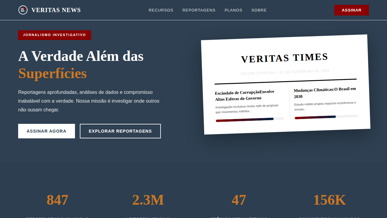
Design an engaging and informative editorial landing page for an interactive digital book. Use: animated book cover, classic serif typography for body, sans-serif for interactive elements, book page layouts, high-resolution historical images, text and interactive element highlight micro-interactions, smooth page-turn transition effects, sepia and antique blue accents, immersive storytelling feel.
Relacionados
Última sincronização: 01/04/2026