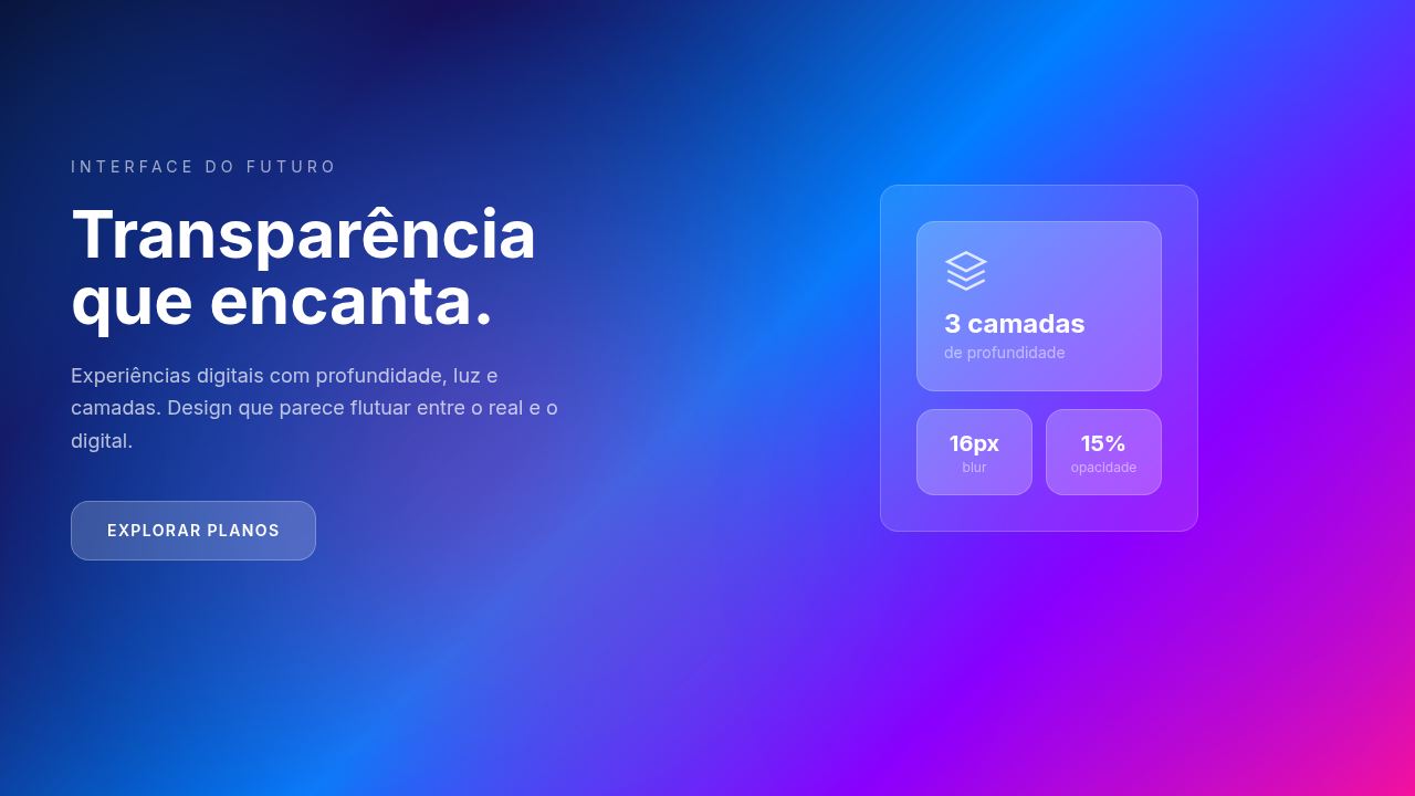
Glassmorphism
Efeito glass frosted com blur, translucência e vibração. Ideal para overlays modernos, dark mode e interfaces premium. Pronto para IA generativa.
Uso: Overlays, Modal dialogs, Card components, Interfaces premium
Contexto Histórico
Popularizado por Apple iOS, Microsoft Windows 11 e Figma (2020). Usa backdrop-filter CSS para efeito frosted glass realqueda.
Especificações Técnicas
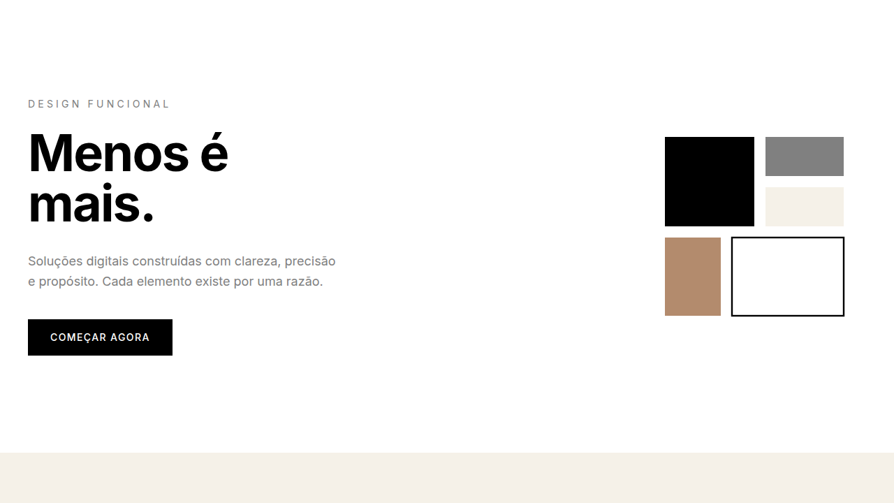
Cores
Secundárias
Efeitos
Backdrop blur (10-20px), subtle border (1px solid rgba white 0.2), light reflection, Z-depth
Light/Dark
✓ Full / ✓ Full
CSS
backdrop-filter: blur(15px), background: rgba(255, 255, 255, 0.15), border: 1px solid rgba(255,255,255,0.2), -webkit-backdrop-filter: blur(15px), z-index layering for depth
Variáveis
--blur-amount: 15px, --glass-opacity: 0.15, --border-color: rgba(255,255,255,0.2), --background: vibrant color, --text-color: light/dark based on BG
Checklist
☐ Backdrop-filter blur 10-20px, ☐ Translucent white 15-30% opacity, ☐ Subtle border 1px light, ☐ Vibrant background verified, ☐ Text contrast 4.5:1 checked
DESIGN.md
Design System: Glassmorphism
1. Visual Theme & Atmosphere
Efeito glass frosted com blur, translucência e vibração. Ideal para overlays modernos, dark mode e interfaces premium. Pronto para IA generativa. Popularizado por Apple iOS, Microsoft Windows 11 e Figma (2020). Usa backdrop-filter CSS para efeito frosted glass realqueda.
- Density: 5/10 — Balanced
- Variance: 4/10 — Moderate
- Motion: 4/10 — Subtle
2. Color Palette & Roles
- **** (rgba(255,255,255,0.1-0.3)) — Primary surface or dominant color
- Electric Blue (#0080FF) — Secondary accent
- Neon Purple (#8B00FF) — Accent color, emphasis elements
- Vivid Pink (#FF1493) — Primary text color
- Teal (#20B2AA) — Secondary accent
3. Typography Rules
- Display / Hero: System UI stack (-apple-system, sans-serif) — Weight 700, tight tracking, used for headline impact
- Body: System UI stack (-apple-system, sans-serif) — Weight 400, 16px/1.6 line-height, max 72ch per line
- UI Labels / Captions: System UI stack (-apple-system, sans-serif) — 0.875rem, weight 500, slight letter-spacing
- Monospace: JetBrains Mono — Used for code, metadata, and technical values
Scale:
- Hero: clamp(2.5rem, 5vw, 4rem)
- H1: 2.25rem
- H2: 1.5rem
- Body: 1rem / 1.6
- Small: 0.875rem
4. Component Stylings
- Primary Button: Subtly rounded (0.5rem) shape. Accent color fill. Hover: 8% darken + subtle lift shadow. Active: -1px translate tactile press. Font weight 600. No outer glows.
- Secondary / Ghost Button: Outline variant. 1.5px border in muted color. Text in primary color. Hover: subtle background fill.
- Cards: Subtly rounded (0.5rem) corners. Surface background. Subtle shadow (0 2px 12px rgba(0,0,0,0.06)). 1px border stroke.
- Inputs: Label above input. 1px border stroke. Focus ring: 2px accent color offset 2px. Error text below in semantic red. No floating labels.
- Navigation: Primary surface background. Active item: accent color indicator. Font weight 500 when active.
- Skeletons: Shimmer animation matching component dimensions. No circular spinners.
- Empty States: Icon-based composition with descriptive text and action button.
5. Layout Principles
- Grid: CSS Grid primary. Max-width containment: 1280px centered with 1.5rem side padding.
- Spacing rhythm: Balanced. Base unit: 0.5rem (8px).
- Section vertical gaps: clamp(4rem, 8vw, 8rem).
- Hero layout: Split-screen (text left, visual right).
- Feature sections: Zig-zag alternating text+image rows. No 3-equal-columns.
- Mobile collapse: All multi-column layouts collapse below 768px. No horizontal overflow.
- z-index contract: base (0) / sticky-nav (100) / overlay (200) / modal (300) / toast (500).
6. Motion & Interaction
- Physics: Ease-out curves, 200-300ms duration. Smooth and predictable.
- Entry animations: Fade + translate-Y (16px → 0) over 420ms ease-out. Staggered cascades for lists: 80ms between items.
- Hover states: Subtle color shift + shadow adjustment over 200ms.
- Page transitions: Fade only (200ms).
- Performance: Only transform and opacity animated. No layout-triggering properties.
7. Anti-Patterns (Banned)
- No emojis in UI — use icon system only (Lucide, Heroicons)
- No pure black (#000000) — use off-black or charcoal variants
- No oversaturated accent colors (saturation cap: 80%)
- No 3-column equal-width feature layouts — use zig-zag or asymmetric grid
- No
h-screen— usemin-h-[100dvh] - No AI copywriting clichés: "Elevate", "Seamless", "Unleash", "Next-Gen"
- No broken external image links — use picsum.photos or inline SVG
- No generic lorem ipsum in demos
Prompt para AI
Design a glassmorphic interface with frosted glass effect. Use backdrop blur (10-20px), translucent overlays (rgba 10-30% opacity), vibrant background colors, subtle borders, light source reflection, layered depth. Perfect for modern overlays and cards.
Relacionados
Última sincronização: 01/04/2026