Google Sans Typography
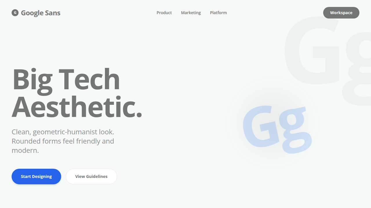
Branded, geometric-humanist Google look. Clean, big tech aesthetic.
Uso: Product and marketing sites that want a clean, big tech aesthetic.
Contexto Histórico
Rounded, geometric forms feel friendly and modern, great for bold headings and hero copy.
Especificações Técnicas
Cores
Primárias
Secundárias
Efeitos
Tight tracking (-3%), 90% leading
Light/Dark
✓ Full / ✗ No
CSS
font-family: 'Google Sans', sans-serif; color: #737574; letter-spacing: -0.03em; line-height: 0.9;
Variáveis
--font-family: 'Google Sans', --text-color: #737574, --bg-color: #F6F9F8
Checklist
☐ Google Sans Font, ☐ Color: #737574, ☐ Tracking -3%, ☐ Background #F6F9F8
DESIGN.md
Design System: Google Sans
1. Visual Theme & Atmosphere
Branded, geometric-humanist Google look. Clean, big tech aesthetic. Rounded, geometric forms feel friendly and modern, great for bold headings and hero copy.
- Density: 5/10 — Balanced
- Variance: 4/10 — Moderate
- Motion: 4/10 — Subtle
2. Color Palette & Roles
- #737574 (#737574) — Primary surface or dominant color
- #F6F9F8 (#F6F9F8) — Extended palette, decorative use
3. Typography Rules
- Display / Hero: Google Sans — Weight 700, tight tracking, used for headline impact
- Body: Google Sans — Weight 400, 16px/1.6 line-height, max 72ch per line
- UI Labels / Captions: Google Sans — 0.875rem, weight 500, slight letter-spacing
- Monospace: JetBrains Mono — Used for code, metadata, and technical values
Scale:
- Hero: clamp(2.5rem, 5vw, 4rem)
- H1: 2.25rem
- H2: 1.5rem
- Body: 1rem / 1.6
- Small: 0.875rem
4. Component Stylings
- Primary Button: Moderately rounded (0.75rem) shape. Accent color fill. Hover: 8% darken + subtle lift shadow. Active: -1px translate tactile press. Font weight 600. No outer glows.
- Secondary / Ghost Button: Outline variant. 1.5px border in muted color. Text in primary color. Hover: subtle background fill.
- Cards: Moderately rounded (0.75rem) corners. Surface background. Subtle shadow (0 2px 12px rgba(0,0,0,0.06)). 1px border stroke.
- Inputs: Label above input. 1px border stroke. Focus ring: 2px accent color offset 2px. Error text below in semantic red. No floating labels.
- Navigation: Primary surface background. Active item: accent color indicator. Font weight 500 when active.
- Skeletons: Shimmer animation matching component dimensions. No circular spinners.
- Empty States: Icon-based composition with descriptive text and action button.
5. Layout Principles
- Grid: CSS Grid primary. Max-width containment: 1280px centered with 1.5rem side padding.
- Spacing rhythm: Balanced. Base unit: 0.5rem (8px).
- Section vertical gaps: clamp(4rem, 8vw, 8rem).
- Hero layout: Split-screen (text left, visual right).
- Feature sections: Zig-zag alternating text+image rows. No 3-equal-columns.
- Mobile collapse: All multi-column layouts collapse below 768px. No horizontal overflow.
- z-index contract: base (0) / sticky-nav (100) / overlay (200) / modal (300) / toast (500).
6. Motion & Interaction
- Physics: Ease-out curves, 200-300ms duration. Smooth and predictable.
- Entry animations: Fade + translate-Y (16px → 0) over 420ms ease-out. Staggered cascades for lists: 80ms between items.
- Hover states: Subtle color shift + shadow adjustment over 200ms.
- Page transitions: Fade only (200ms).
- Performance: Only transform and opacity animated. No layout-triggering properties.
7. Anti-Patterns (Banned)
- No emojis in UI — use icon system only (Lucide, Heroicons)
- No pure black (#000000) — use off-black or charcoal variants
- No oversaturated accent colors (saturation cap: 80%)
- No 3-column equal-width feature layouts — use zig-zag or asymmetric grid
- No
h-screen— usemin-h-[100dvh] - No AI copywriting clichés: "Elevate", "Seamless", "Unleash", "Next-Gen"
- No broken external image links — use picsum.photos or inline SVG
- No generic lorem ipsum in demos
Prompt para AI
Render a 2D isolated text on a solid background. Font Family: @Google Sans Font, Color: Hex #737574, Background: #F6F9F8, Tracking: Tight (-3%), Leading: 90%, Alignment: Strictly Left Aligned, Position: Center, Scale: 50%.
Última sincronização: 01/04/2026