IBM Carbon Enterprise
Estilo IBM Carbon Enterprise com design system Carbon, IBM Plex Light e botões retangulares. Ideal para enterprise, infraestrutura e plataformas corporativas.
Uso: Enterprise, Infraestrutura cloud, Plataformas corporativas, Consultoria tech
Contexto Histórico
Inspirado no Carbon Design System da IBM, referência em design enterprise com precisão de engenharia e tipografia IBM Plex.
Especificações Técnicas
Cores
Primárias
Secundárias
Efeitos
IBM Plex Sans weight 300 (Light) para display — gravitas corporativa com leveza tipográfica. Único acento: IBM Blue 60 (#0f62fe) para tudo interativo. Border-radius 0px em botões primários — retângulos sem suavização. Inputs com bottom-border (não boxed) — padrão Carbon. Profundidade via layering de cor de fundo (branco → gray 10 → gray 20) sem sombras. Grid 2x de 8px com aderência estrita. Token system --cds-* para todas as cores semânticas. Micro letter-spacing (0.16px em 14px, 0.32px em 12px).
Light/Dark
✓ Full / ✓ Full
CSS
background: #ffffff; color: #161616; accent: #0f62fe; border-radius: 0px buttons; border-bottom: 2px solid #161616 inputs; font-family: 'IBM Plex Sans', sans-serif; font-weight: 300 display; letter-spacing: 0.16px at 14px; layer: #f4f4f4 cards
Variáveis
--cds-background: #ffffff; --cds-text-primary: #161616; --cds-button-primary: #0f62fe; --cds-button-primary-hover: #0353e9; --cds-layer-01: #f4f4f4; --cds-border-subtle: #c6c6c6; --cds-text-secondary: #525252; --cds-focus: #0f62fe; --radius: 0px
Checklist
☐ IBM Plex Sans weight 300 display, ☐ Azul #0f62fe único acento, ☐ Radius 0px em botões, ☐ Inputs bottom-border, ☐ Profundidade via cor de fundo, ☐ Grid 8px estrito, ☐ Micro letter-spacing, ☐ Responsivo
DESIGN.md
Design System: IBM Carbon Enterprise
1. Visual Theme & Atmosphere
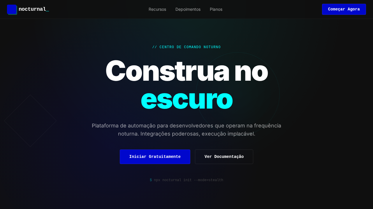
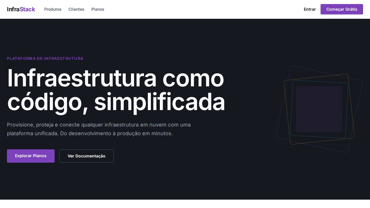
Estilo IBM Carbon Enterprise com design system Carbon, IBM Plex Light e botões retangulares. Ideal para enterprise, infraestrutura e plataformas corporativas. Inspirado no Carbon Design System da IBM, referência em design enterprise com precisão de engenharia e tipografia IBM Plex.
- Density: 5/10 — Balanced
- Variance: 2/10 — Structured
- Motion: 4/10 — Subtle
2. Color Palette & Roles
- Azul IBM (#0f62fe) — Accent highlight, links and focus states
- Branco (#ffffff) — Light surface, card backgrounds
- Gray 100 (#161616) — Secondary text, borders, muted elements
- Gray 10 (#f4f4f4) — Secondary text, borders, muted elements
- Gray 70 (#525252) — Secondary text, borders, muted elements
- Gray 30 (#c6c6c6) — Secondary text, borders, muted elements
- Azul Hover (#0043ce) — Secondary accent
- Vermelho (#da1e28) — Error states, destructive actions
3. Typography Rules
- Display / Hero: IBM Plex Sans — Weight 700, tight tracking, used for headline impact
- Body: IBM Plex Sans — Weight 400, 16px/1.6 line-height, max 72ch per line
- UI Labels / Captions: IBM Plex Sans — 0.875rem, weight 500, slight letter-spacing
- Monospace: JetBrains Mono — Used for code, metadata, and technical values
Scale:
- Hero: clamp(2.5rem, 5vw, 4rem)
- H1: 2.25rem
- H2: 1.5rem
- Body: 1rem / 1.6
- Small: 0.875rem
4. Component Stylings
- Primary Button: Sharp edges (0px) shape. Accent color fill. Hover: 8% darken + subtle lift shadow. Active: -1px translate tactile press. Font weight 600. No outer glows.
- Secondary / Ghost Button: Outline variant. 1.5px border in muted color. Text in primary color. Hover: subtle background fill.
- Cards: Sharp edges (0px) corners. Surface background. Subtle shadow (0 2px 12px rgba(0,0,0,0.06)). 1px border stroke.
- Inputs: Label above input. 1px border stroke. Focus ring: 2px accent color offset 2px. Error text below in semantic red. No floating labels.
- Navigation: Primary surface background. Active item: accent color indicator. Font weight 500 when active.
- Skeletons: Shimmer animation matching component dimensions. No circular spinners.
- Empty States: Icon-based composition with descriptive text and action button.
5. Layout Principles
- Grid: CSS Grid primary. Max-width containment: 1280px centered with 1.5rem side padding.
- Spacing rhythm: Balanced. Base unit: 0.5rem (8px).
- Section vertical gaps: clamp(4rem, 8vw, 8rem).
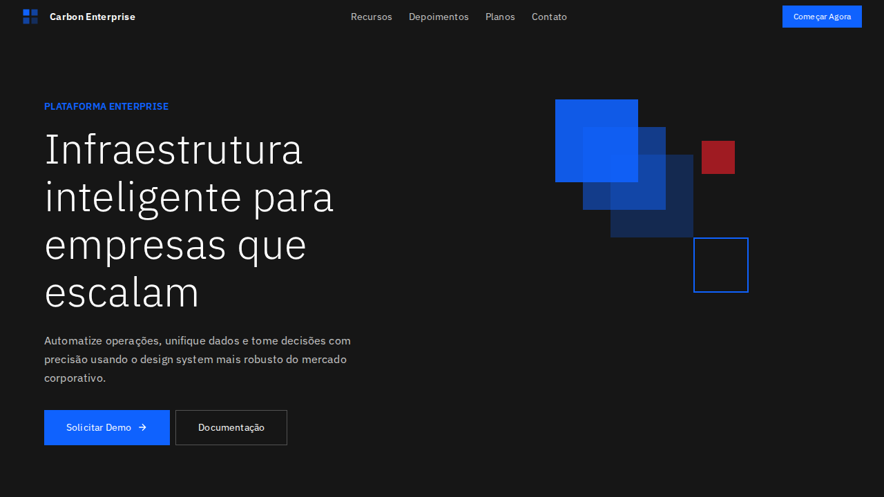
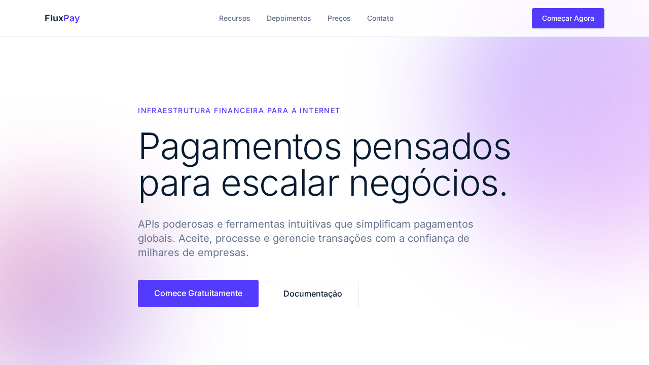
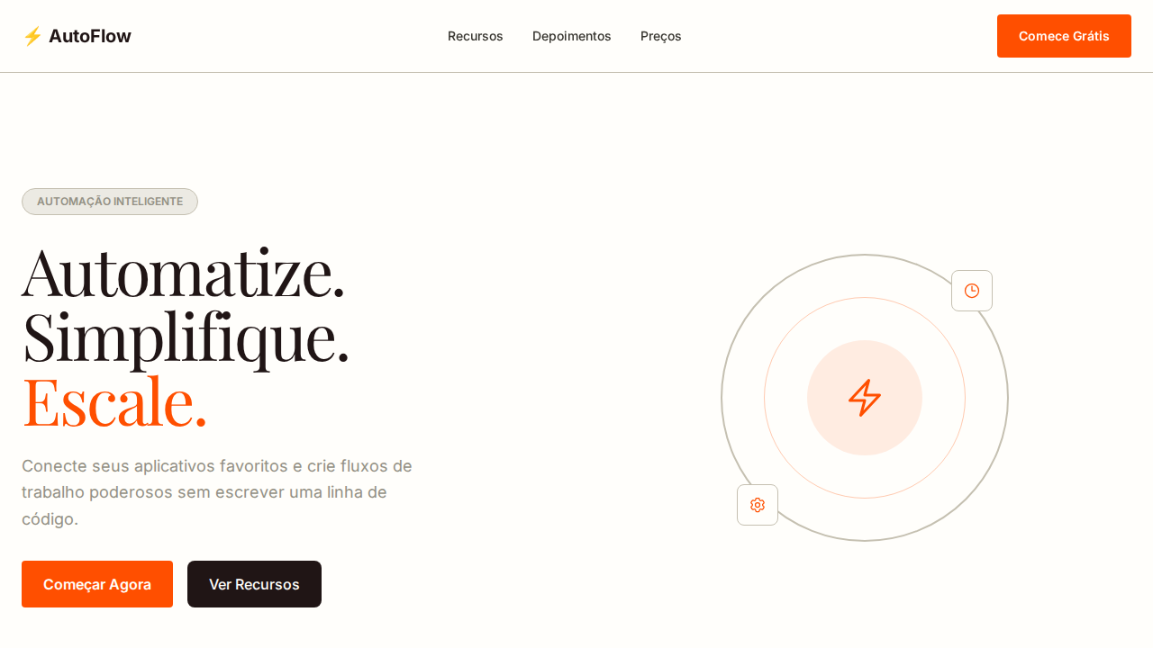
- Hero layout: Split-screen (text left, visual right).
- Feature sections: Zig-zag alternating text+image rows. No 3-equal-columns.
- Mobile collapse: All multi-column layouts collapse below 768px. No horizontal overflow.
- z-index contract: base (0) / sticky-nav (100) / overlay (200) / modal (300) / toast (500).
6. Motion & Interaction
- Physics: Ease-out curves, 200-300ms duration. Smooth and predictable.
- Entry animations: Fade + translate-Y (16px → 0) over 420ms ease-out. Staggered cascades for lists: 80ms between items.
- Hover states: Subtle color shift + shadow adjustment over 200ms.
- Page transitions: Fade only (200ms).
- Performance: Only transform and opacity animated. No layout-triggering properties.
7. Anti-Patterns (Banned)
- No emojis in UI — use icon system only (Lucide, Heroicons)
- No pure black (#000000) — use off-black or charcoal variants
- No oversaturated accent colors (saturation cap: 80%)
- No 3-column equal-width feature layouts — use zig-zag or asymmetric grid
- No
h-screen— usemin-h-[100dvh] - No AI copywriting clichés: "Elevate", "Seamless", "Unleash", "Next-Gen"
- No broken external image links — use picsum.photos or inline SVG
- No generic lorem ipsum in demos
Prompt para AI
Design an IBM Carbon-inspired enterprise landing page. IBM Plex Sans at weight 300 (Light) for display headlines at 60px. Single accent: IBM Blue 60 (#0f62fe) for all interactive elements. 0px border-radius on primary buttons — unapologetically rectangular. Bottom-border inputs (not boxed). Depth through background-color layering (white → #f4f4f4 → #e0e0e0), no shadows. Strict 8px grid. Gray 100 (#161616) for text and dark surfaces. Micro letter-spacing (0.16px at 14px). Three weights: 300 display, 400 body, 600 emphasis.
Relacionados
Última sincronização: 01/04/2026