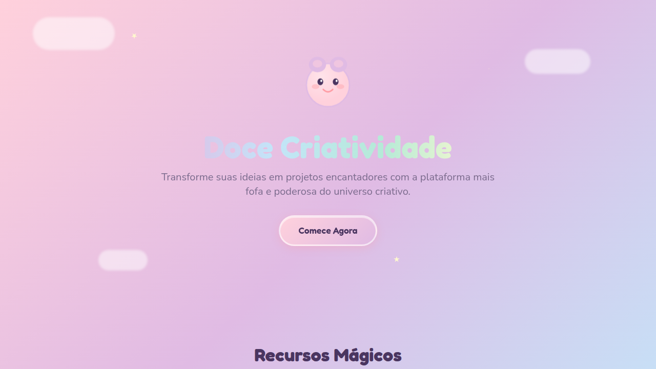
Kawaii / Sweet Pastel
Kawaii / Sweet Pastel — Design general com cute, playful, whimsical. Template e prompt pronto para IA.
Uso: Landing pages, SaaS
Contexto Histórico
Estilo Kawaii / Sweet Pastel representa uma tendência moderna em design UI/UX web com foco em general.
Especificações Técnicas
Cores
Primárias
Secundárias
Efeitos
High-key brightness, soft diffuse lighting, sparkle animations, bounce effects (cubic-bezier 0.34 1.56), rainbow gradient transitions, cute hover wobble
Light/Dark
✓ Full / ◐ Partial
CSS
background: pastel gradients, border-radius: 20px+, box-shadow: soft colored, animation: bounce/wobble, ::before for sparkles (star shapes), font-family: rounded playful, color: soft pastels
Variáveis
--pink: #FFD1DC, --lavender: #E0BBE4, --baby-blue: #C3E5F9, --lemon: #FFFACD, --mint: #B5EAD7, --border-radius: 24px
Checklist
☐ Pastel colors dominant, ☐ Rounded corners 20px+, ☐ Sparkle decorations, ☐ Cute mascot present, ☐ Rainbow gradients, ☐ Glossy highlights
DESIGN.md
Design System: Kawaii / Sweet Pastel
1. Visual Theme & Atmosphere
Kawaii / Sweet Pastel — Design general com cute, playful, whimsical. Template e prompt pronto para IA. Estilo Kawaii / Sweet Pastel representa uma tendência moderna em design UI/UX web com foco em general.
- Density: 5/10 — Balanced
- Variance: 7/10 — Dynamic
- Motion: 6/10 — Expressive
2. Color Palette & Roles
- Soft Pink (#FFD1DC) — Primary text color
- Lavender (#E0BBE4) — Secondary surface or text color
- Baby Blue (#C3E5F9) — Accent highlight, links and focus states
- Lemon (#FFFACD) — Supporting palette color
- Mint (#B5EAD7) — Extended palette, decorative use
- Salmon (#FF9AA2) — Extended palette, decorative use
- Lilac (#9D84B6) — Extended palette, decorative use
3. Typography Rules
- Display / Hero: rounded playful — Weight 700, tight tracking, used for headline impact
- Body: rounded playful — Weight 400, 16px/1.6 line-height, max 72ch per line
- UI Labels / Captions: rounded playful — 0.875rem, weight 500, slight letter-spacing
- Monospace: JetBrains Mono — Used for code, metadata, and technical values
Scale:
- Hero: clamp(2.5rem, 5vw, 4rem)
- H1: 2.25rem
- H2: 1.5rem
- Body: 1rem / 1.6
- Small: 0.875rem
4. Component Stylings
- Primary Button: Generously rounded (1.5rem) shape. Accent color fill. Hover: 8% darken + subtle lift shadow. Active: -1px translate tactile press. Font weight 600. No outer glows.
- Secondary / Ghost Button: Outline variant. 1.5px border in muted color. Text in primary color. Hover: subtle background fill.
- Cards: Generously rounded (1.5rem) corners. Surface background. Subtle shadow (0 2px 12px rgba(0,0,0,0.06)). 1px border stroke.
- Inputs: Label above input. 1px border stroke. Focus ring: 2px accent color offset 2px. Error text below in semantic red. No floating labels.
- Navigation: Primary surface background. Active item: accent color indicator. Font weight 500 when active.
- Skeletons: Shimmer animation matching component dimensions. No circular spinners.
- Empty States: Icon-based composition with descriptive text and action button.
5. Layout Principles
- Grid: CSS Grid primary. Max-width containment: 1280px centered with 1.5rem side padding.
- Spacing rhythm: Balanced. Base unit: 0.5rem (8px).
- Section vertical gaps: clamp(4rem, 8vw, 8rem).
- Hero layout: Asymmetric composition.
- Feature sections: Asymmetric grid with varied card sizes. No 3-equal-columns.
- Mobile collapse: All multi-column layouts collapse below 768px. No horizontal overflow.
- z-index contract: base (0) / sticky-nav (100) / overlay (200) / modal (300) / toast (500).
6. Motion & Interaction
- Physics: Spring — stiffness 120, damping 20. Confident, weighted transitions.
- Entry animations: Fade + translate-Y (16px → 0) over 480ms ease-out. Staggered cascades for lists: 100ms between items.
- Hover states: Scale(1.03) + shadow lift over 200ms.
- Page transitions: Fade + slide (300ms).
- Performance: Only transform and opacity animated. No layout-triggering properties.
7. Anti-Patterns (Banned)
- No emojis in UI — use icon system only (Lucide, Heroicons)
- No pure black (#000000) — use off-black or charcoal variants
- No oversaturated accent colors (saturation cap: 80%)
- No 3-column equal-width feature layouts — use zig-zag or asymmetric grid
- No
h-screen— usemin-h-[100dvh] - No AI copywriting clichés: "Elevate", "Seamless", "Unleash", "Next-Gen"
- No broken external image links — use picsum.photos or inline SVG
- No generic lorem ipsum in demos
Prompt para AI
Design a kawaii sweet pastel interface. Use: soft pastel colors (pink, lavender, mint), rainbow gradients, fluffy cloud motifs, sparkle embellishments, cute mascot characters, rounded everything (20px+), glossy highlights, high-key brightness.
Relacionados
Última sincronização: 01/04/2026