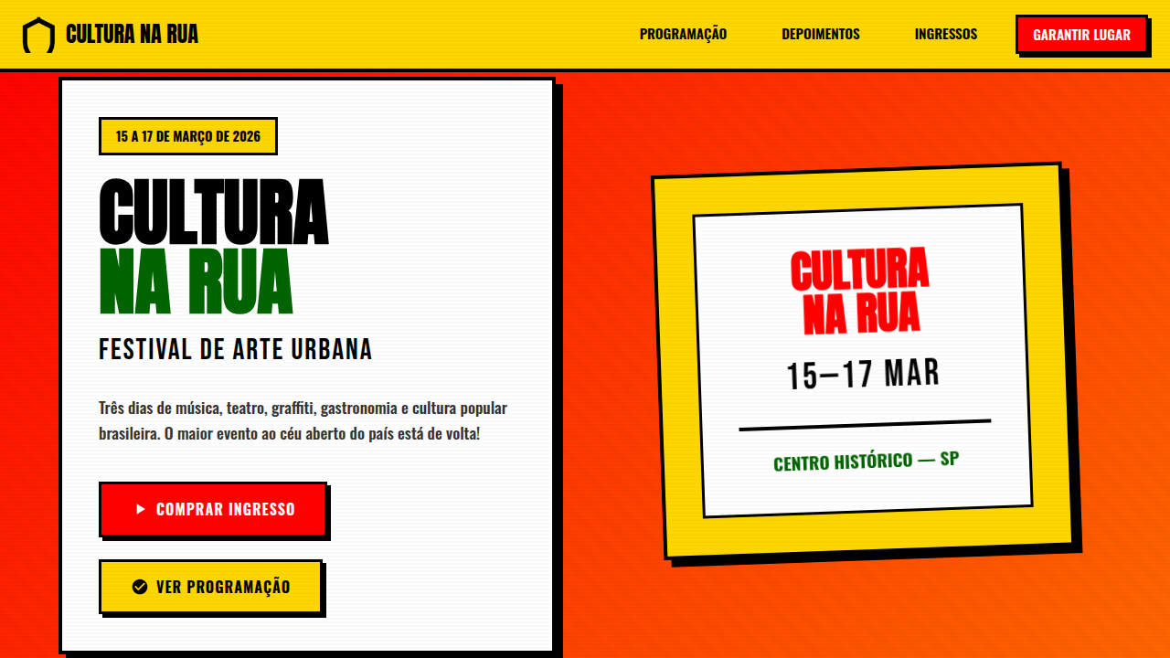
Lambe-Lambe Brasileiro
Lambe-Lambe Brasileiro — Design general com street art, brazilian folk, vibrant. Template e prompt pronto para IA.
Uso: Landing pages, SaaS
Contexto Histórico
Estilo Lambe-Lambe Brasileiro representa uma tendência moderna em design UI/UX web com foco em general.
Especificações Técnicas
Cores
Primárias
Secundárias
Efeitos
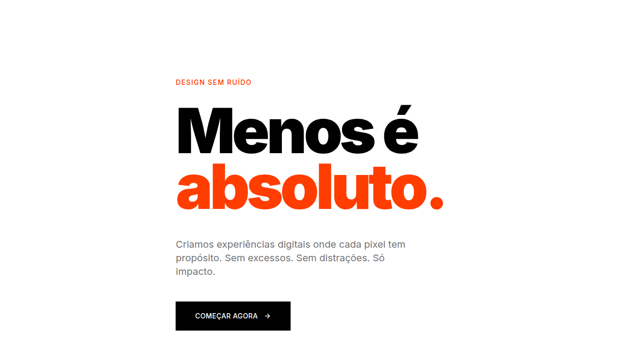
Tipografia ousada e bold como elemento visual principal, ilustrações xilográficas/linocut, bordas visíveis e marcadas, layouts densos e informacionais, texturas de colagem rasgada, sombras duras e sem blur, cores vibrantes de alto contraste para destaque urbano, sobreposições gráficas intencionais
Light/Dark
✓ Full / ✗ No
CSS
font-family: 'Oswald', 'Anton', or bold display fonts, font-weight: 700-900, text-transform: uppercase for headlines, color: vibrant red #FF0000, yellow #FFD700, green #006400, border: 3-4px solid black, box-shadow: 4px 4px 0px #000 (hard shadow, no blur), background: warm paper tones or textured overlays, text-shadow: 2px 2px 0px rgba(0,0,0,0.3)
Variáveis
--color-red: #FF0000, --color-yellow: #FFD700, --color-green: #006400, --color-black: #000000, --color-orange: #FF6600, --font-display: 'Oswald', sans-serif, --font-weight-bold: 900, --border-thick: 4px solid #000, --shadow-hard: 4px 4px 0px #000, --text-shadow: 2px 2px 0px rgba(0,0,0,0.3)
Checklist
☐ Tipografia bold/uppercase em headlines, ☐ Cores vibrantes tropicais (vermelho, amarelo, verde), ☐ Sombras duras sem blur, ☐ Bordas visíveis 3-4px, ☐ Layout denso e informativo, ☐ Alto contraste urbano, ☐ Texturas de colagem/woodcut
DESIGN.md
Design System: Lambe-Lambe Brasileiro
1. Visual Theme & Atmosphere
Lambe-Lambe Brasileiro — Design general com street art, brazilian folk, vibrant. Template e prompt pronto para IA. Estilo Lambe-Lambe Brasileiro representa uma tendência moderna em design UI/UX web com foco em general.
- Density: 5/10 — Balanced
- Variance: 4/10 — Moderate
- Motion: 4/10 — Subtle
2. Color Palette & Roles
- Vermelho (#FF0000) — Error states, destructive actions
- Amarelo (#FFD700) — Warning states, attention indicators
- Verde (#006400) — Supporting palette color
- Preto (#000000) — Dark surface, primary background
- Laranja (#FF6600) — Warm accent, call-to-action secondary
- Azul Royal (#0066CC) — Secondary accent
- Rosa Choque (#FF1493) — Decorative accent, highlight elements
- Branco (#FFFFFF) — Secondary surface
3. Typography Rules
- Display / Hero: Oswald — Weight 700, tight tracking, used for headline impact
- Accent: Anton — Used for decorative or emphasis text
- Body: Oswald — Weight 400, 16px/1.6 line-height, max 72ch per line
- UI Labels / Captions: Oswald — 0.875rem, weight 500, slight letter-spacing
- Monospace: JetBrains Mono — Used for code, metadata, and technical values
Scale:
- Hero: clamp(2.5rem, 5vw, 4rem)
- H1: 2.25rem
- H2: 1.5rem
- Body: 1rem / 1.6
- Small: 0.875rem
4. Component Stylings
- Primary Button: Subtly rounded (0.5rem) shape. Accent color fill. Hover: 8% darken + subtle lift shadow. Active: -1px translate tactile press. Font weight 600. No outer glows.
- Secondary / Ghost Button: Outline variant. 1.5px border in muted color. Text in primary color. Hover: subtle background fill.
- Cards: Subtly rounded (0.5rem) corners. Surface background. Subtle shadow (0 2px 12px rgba(0,0,0,0.06)). 1px border stroke.
- Inputs: Label above input. 1px border stroke. Focus ring: 2px accent color offset 2px. Error text below in semantic red. No floating labels.
- Navigation: Primary surface background. Active item: accent color indicator. Font weight 500 when active.
- Skeletons: Shimmer animation matching component dimensions. No circular spinners.
- Empty States: Icon-based composition with descriptive text and action button.
5. Layout Principles
- Grid: CSS Grid primary. Max-width containment: 1280px centered with 1.5rem side padding.
- Spacing rhythm: Balanced. Base unit: 0.5rem (8px).
- Section vertical gaps: clamp(4rem, 8vw, 8rem).
- Hero layout: Split-screen (text left, visual right).
- Feature sections: Zig-zag alternating text+image rows. No 3-equal-columns.
- Mobile collapse: All multi-column layouts collapse below 768px. No horizontal overflow.
- z-index contract: base (0) / sticky-nav (100) / overlay (200) / modal (300) / toast (500).
6. Motion & Interaction
- Physics: Ease-out curves, 200-300ms duration. Smooth and predictable.
- Entry animations: Fade + translate-Y (16px → 0) over 420ms ease-out. Staggered cascades for lists: 80ms between items.
- Hover states: Subtle color shift + shadow adjustment over 200ms.
- Page transitions: Fade only (200ms).
- Performance: Only transform and opacity animated. No layout-triggering properties.
7. Anti-Patterns (Banned)
- No emojis in UI — use icon system only (Lucide, Heroicons)
- No pure black (#000000) — use off-black or charcoal variants
- No oversaturated accent colors (saturation cap: 80%)
- No 3-column equal-width feature layouts — use zig-zag or asymmetric grid
- No
h-screen— usemin-h-[100dvh] - No AI copywriting clichés: "Elevate", "Seamless", "Unleash", "Next-Gen"
- No broken external image links — use picsum.photos or inline SVG
- No generic lorem ipsum in demos
Prompt para AI
Design a Brazilian lambe-lambe street poster style landing page. Use: bold typography as primary visual element, vibrant tropical colors (red, yellow, green, orange), woodcut/linocut style illustrations, visible borders, dense information layouts, high contrast for urban visibility, handcrafted folk aesthetic, graphic overlaps, textured backgrounds, activist-inspired messaging.
Relacionados
Última sincronização: 01/04/2026