Mini World
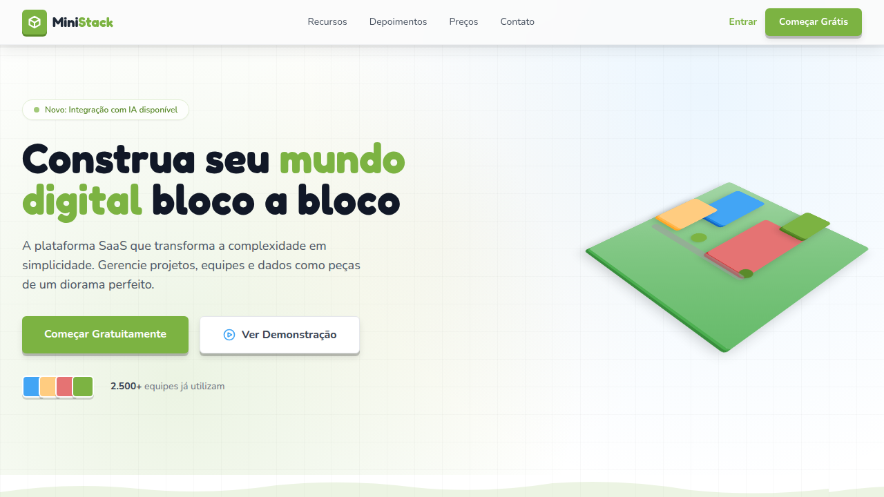
Estilo mundo em miniatura com perspectiva isométrica, formas geométricas blocadas e profundidade tipo diorama. Ideal para games, educação e projetos criativos.
Uso: Games indie, Educação infantil, Projetos criativos, Portfólios lúdicos
Contexto Histórico
Inspirado em jogos como Monument Valley e Crossy Road, o estilo Mini World usa perspectiva isométrica e formas blocadas para criar mundos em miniatura encantadores.
Especificações Técnicas
Cores
Primárias
Secundárias
Efeitos
Tilt-shift blur effect on edges, isometric grid layout, CSS 3D transforms for depth, box-shadow layers for elevation, subtle parallax on scroll, 200-300ms hover transitions
Light/Dark
✓ Full / ◐ Partial
CSS
transform: rotateX(45deg) rotateZ(45deg) for isometric feel, box-shadow: multiple layers for depth, filter: blur() on edges for tilt-shift, perspective: 800px, border-radius: 4-8px for blocky look, background: layered gradients for terrain
Variáveis
--perspective: 800px, --block-radius: 6px, --depth-shadow: 4-layer box-shadow, --tilt-blur: 2-4px edges, --grid-gap: 1.5rem, --elevation-step: 4px
Checklist
☐ Isometric/diorama perspective visible, ☐ Blocky geometric shapes used, ☐ Tilt-shift blur on edges, ☐ Layered depth with shadows, ☐ Warm saturated color palette, ☐ Responsive grid layout
DESIGN.md
Design System: Mini World
1. Visual Theme & Atmosphere
Estilo mundo em miniatura com perspectiva isométrica, formas geométricas blocadas e profundidade tipo diorama. Ideal para games, educação e projetos criativos. Inspirado em jogos como Monument Valley e Crossy Road, o estilo Mini World usa perspectiva isométrica e formas blocadas para criar mundos em miniatura encantadores.
- Density: 5/10 — Balanced
- Variance: 4/10 — Moderate
- Motion: 8/10 — Cinematic
2. Color Palette & Roles
- Grass Green (#7CB342) — Primary surface or dominant color
- Sky Blue (#42A5F5) — Accent highlight, links and focus states
- Warm Sand (#FFCC80) — Supporting palette color
- Brick Red (#E57373) — Error states, destructive actions
- Soft White (#FAFAFA) — Secondary surface
- Stone Grey (#9E9E9E) — Secondary text, borders, muted elements
- Water Blue (#29B6F6) — Secondary accent
- Wood Brown (#8D6E63) — Extended palette, decorative use
3. Typography Rules
- Display / Hero: System UI stack (-apple-system, sans-serif) — Weight 700, tight tracking, used for headline impact
- Body: System UI stack (-apple-system, sans-serif) — Weight 400, 16px/1.6 line-height, max 72ch per line
- UI Labels / Captions: System UI stack (-apple-system, sans-serif) — 0.875rem, weight 500, slight letter-spacing
- Monospace: JetBrains Mono — Used for code, metadata, and technical values
Scale:
- Hero: clamp(2.5rem, 5vw, 4rem)
- H1: 2.25rem
- H2: 1.5rem
- Body: 1rem / 1.6
- Small: 0.875rem
4. Component Stylings
- Primary Button: Generously rounded (1.5rem) shape. Accent color fill. Hover: 8% darken + subtle lift shadow. Active: -1px translate tactile press. Font weight 600. No outer glows.
- Secondary / Ghost Button: Outline variant. 1.5px border in muted color. Text in primary color. Hover: subtle background fill.
- Cards: Generously rounded (1.5rem) corners. Surface background. Subtle shadow (0 2px 12px rgba(0,0,0,0.06)). 1px border stroke.
- Inputs: Label above input. 1px border stroke. Focus ring: 2px accent color offset 2px. Error text below in semantic red. No floating labels.
- Navigation: Primary surface background. Active item: accent color indicator. Font weight 500 when active.
- Skeletons: Shimmer animation matching component dimensions. No circular spinners.
- Empty States: Icon-based composition with descriptive text and action button.
5. Layout Principles
- Grid: CSS Grid primary. Max-width containment: 1280px centered with 1.5rem side padding.
- Spacing rhythm: Balanced. Base unit: 0.5rem (8px).
- Section vertical gaps: clamp(4rem, 8vw, 8rem).
- Hero layout: Split-screen (text left, visual right).
- Feature sections: Zig-zag alternating text+image rows. No 3-equal-columns.
- Mobile collapse: All multi-column layouts collapse below 768px. No horizontal overflow.
- z-index contract: base (0) / sticky-nav (100) / overlay (200) / modal (300) / toast (500).
6. Motion & Interaction
- Physics: Spring — stiffness 120, damping 20. Confident, weighted transitions.
- Entry animations: Fade + translate-Y (16px → 0) over 540ms ease-out. Staggered cascades for lists: 120ms between items.
- Hover states: Scale(1.03) + shadow lift over 200ms.
- Page transitions: Fade + slide (300ms).
- Performance: Only transform and opacity animated. No layout-triggering properties.
7. Anti-Patterns (Banned)
- No emojis in UI — use icon system only (Lucide, Heroicons)
- No pure black (#000000) — use off-black or charcoal variants
- No oversaturated accent colors (saturation cap: 80%)
- No 3-column equal-width feature layouts — use zig-zag or asymmetric grid
- No
h-screen— usemin-h-[100dvh] - No AI copywriting clichés: "Elevate", "Seamless", "Unleash", "Next-Gen"
- No broken external image links — use picsum.photos or inline SVG
- No generic lorem ipsum in demos
Prompt para AI
Design a miniature world / diorama-style landing page. Use isometric perspective with geometric blocky shapes, tilt-shift blur on edges, layered depth with CSS transforms. Characters and elements should look like tiny toy figures. Use warm, saturated colors. Create a sense of looking down at a small world from above. Grid-based layout with 3D-extruded card elements.
Relacionados
Última sincronização: 01/04/2026