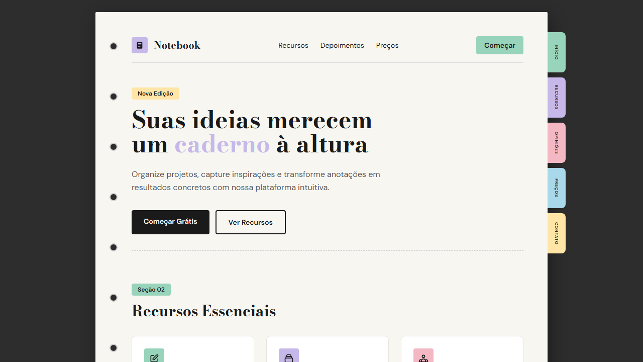
Notebook Tabs
Design editorial com visual de caderno, tabs coloridos, papel creme e tipografia Bodoni Moda. Organizado e elegante. Prompt pronto para IA.
Uso: Blogs editoriais, Revistas digitais, Portfolios criativos, Plataformas educacionais
Contexto Histórico
Inspirado em cadernos e agendas físicas com abas coloridas. Traduz a experiência tátil do papel para o digital, usando tipografia editorial clássica Bodoni Moda e elementos decorativos como furos de fichário e tabs com texto vertical.
Especificações Técnicas
Cores
Primárias
Secundárias
Efeitos
Paper container with subtle shadow, colorful section tabs on right edge with vertical text, binder hole decorations on left, tab text scales with viewport clamp(), smooth page-turn transitions 300ms
Light/Dark
✓ Full / ✗ No
CSS
font-family: 'Bodoni Moda' for headings, 'DM Sans' for body, .page { background: #f8f6f1; box-shadow: 0 4px 20px rgba(0,0,0,0.15); border-radius: 8px }, .tab { writing-mode: vertical-rl; font-size: clamp(0.5rem, 1vh, 0.7rem); padding: 12px 6px; border-radius: 0 8px 8px 0 }, .binder-hole { width: 12px; height: 12px; border-radius: 50%; border: 2px solid #ccc; background: #2d2d2d }
Variáveis
--bg-outer: #2d2d2d, --bg-page: #f8f6f1, --text-primary: #1a1a1a, --tab-1: #98d4bb, --tab-2: #c7b8ea, --tab-3: #f4b8c5, --tab-4: #a8d8ea, --tab-5: #ffe6a7, --font-display: 'Bodoni Moda', --font-body: 'DM Sans', --tab-font-size: clamp(0.5rem, 1vh, 0.7rem)
Checklist
☐ Bodoni Moda + DM Sans carregados, ☐ Paper container cream #f8f6f1, ☐ Dark outer background #2d2d2d, ☐ Colorful tabs na borda direita, ☐ Vertical text nos tabs, ☐ Binder holes na esquerda, ☐ Tab text com clamp(), ☐ Responsivo mobile/tablet/desktop
DESIGN.md
Design System: Notebook Tabs
1. Visual Theme & Atmosphere
Design editorial com visual de caderno, tabs coloridos, papel creme e tipografia Bodoni Moda. Organizado e elegante. Prompt pronto para IA. Inspirado em cadernos e agendas físicas com abas coloridas. Traduz a experiência tátil do papel para o digital, usando tipografia editorial clássica Bodoni Moda e elementos decorativos como furos de fichário e tabs com texto vertical.
- Density: 5/10 — Balanced
- Variance: 4/10 — Moderate
- Motion: 4/10 — Subtle
2. Color Palette & Roles
- Outer Dark (#2d2d2d) — Dark surface, primary background
- Page Cream (#f8f6f1) — Light surface, card backgrounds
- Text Dark (#1a1a1a) — Dark surface, primary background
- Tab Mint (#98d4bb) — Extended palette, decorative use
- Tab Lavender (#c7b8ea) — Extended palette, decorative use
- Tab Pink (#f4b8c5) — Primary text color
- Tab Sky (#a8d8ea) — Extended palette, decorative use
- Tab Cream (#ffe6a7) — Secondary surface
3. Typography Rules
- Display / Hero: Bodoni Moda — Weight 700, tight tracking, used for headline impact
- Accent: DM Sans — Used for decorative or emphasis text
- Body: Bodoni Moda — Weight 400, 16px/1.6 line-height, max 72ch per line
- UI Labels / Captions: Bodoni Moda — 0.875rem, weight 500, slight letter-spacing
- Monospace: JetBrains Mono — Used for code, metadata, and technical values
Scale:
- Hero: clamp(2.5rem, 5vw, 4rem)
- H1: 2.25rem
- H2: 1.5rem
- Body: 1rem / 1.6
- Small: 0.875rem
4. Component Stylings
- Primary Button: Sharp edges (0px) shape. Accent color fill. Hover: 8% darken + subtle lift shadow. Active: -1px translate tactile press. Font weight 600. No outer glows.
- Secondary / Ghost Button: Outline variant. 1.5px border in muted color. Text in primary color. Hover: subtle background fill.
- Cards: Sharp edges (0px) corners. Surface background. Subtle shadow (0 2px 12px rgba(0,0,0,0.06)). 1px border stroke.
- Inputs: Label above input. 1px border stroke. Focus ring: 2px accent color offset 2px. Error text below in semantic red. No floating labels.
- Navigation: Primary surface background. Active item: accent color indicator. Font weight 500 when active.
- Skeletons: Shimmer animation matching component dimensions. No circular spinners.
- Empty States: Icon-based composition with descriptive text and action button.
5. Layout Principles
- Grid: CSS Grid primary. Max-width containment: 1280px centered with 1.5rem side padding.
- Spacing rhythm: Balanced. Base unit: 0.5rem (8px).
- Section vertical gaps: clamp(4rem, 8vw, 8rem).
- Hero layout: Split-screen (text left, visual right).
- Feature sections: Zig-zag alternating text+image rows. No 3-equal-columns.
- Mobile collapse: All multi-column layouts collapse below 768px. No horizontal overflow.
- z-index contract: base (0) / sticky-nav (100) / overlay (200) / modal (300) / toast (500).
6. Motion & Interaction
- Physics: Ease-out curves, 200-300ms duration. Smooth and predictable.
- Entry animations: Fade + translate-Y (16px → 0) over 420ms ease-out. Staggered cascades for lists: 80ms between items.
- Hover states: Subtle color shift + shadow adjustment over 200ms.
- Page transitions: Fade only (200ms).
- Performance: Only transform and opacity animated. No layout-triggering properties.
7. Anti-Patterns (Banned)
- No emojis in UI — use icon system only (Lucide, Heroicons)
- No pure black (#000000) — use off-black or charcoal variants
- No oversaturated accent colors (saturation cap: 80%)
- No 3-column equal-width feature layouts — use zig-zag or asymmetric grid
- No
h-screen— usemin-h-[100dvh] - No AI copywriting clichés: "Elevate", "Seamless", "Unleash", "Next-Gen"
- No broken external image links — use picsum.photos or inline SVG
- No generic lorem ipsum in demos
Prompt para AI
Design an editorial, organized landing page that looks like a notebook. Use cream paper card (#f8f6f1) on dark background (#2d2d2d). Add colorful section tabs on the right edge with vertical text (mint, lavender, pink, sky, cream). Include binder hole decorations on the left side. Use Bodoni Moda (400/700) for display and DM Sans (400/500) for body. Tab text must scale: font-size: clamp(0.5rem, 1vh, 0.7rem).
Relacionados
Última sincronização: 01/04/2026