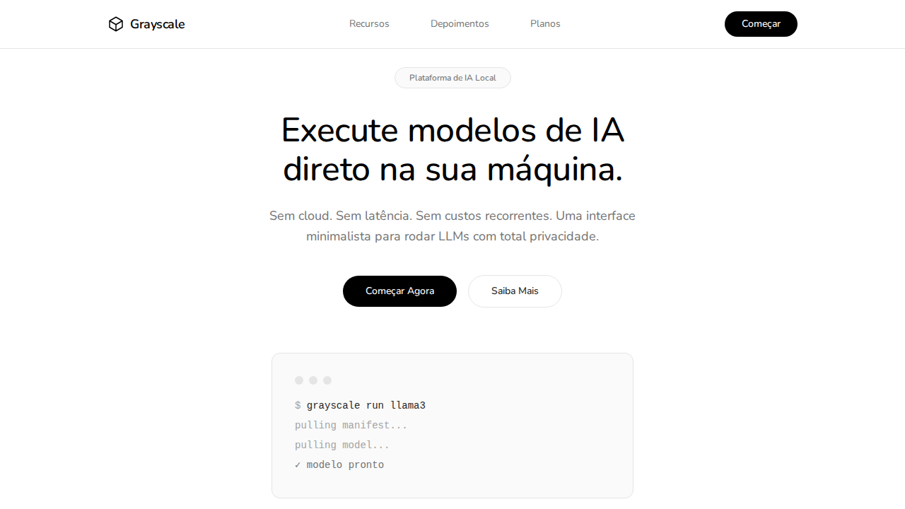
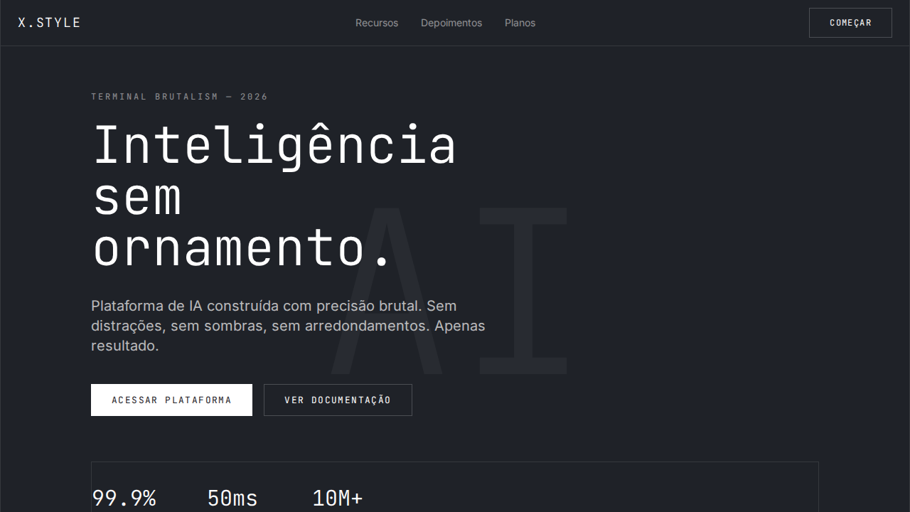
Ollama Pure Grayscale
Estilo Ollama Pure Grayscale com minimalismo radical, zero sombras e geometria pill. Ideal para ferramentas CLI, open-source e plataformas developer minimalistas.
Uso: Ferramentas CLI, Open-source, Plataformas developer minimalistas, Modelos de IA local
Contexto Histórico
Inspirado no design do Ollama, que leva o minimalismo ao extremo lógico com zero cor, zero sombras e geometria binária pill/container.
Especificações Técnicas
Cores
Primárias
Secundárias
Efeitos
Zero cor cromática — paleta 100% grayscale. Zero sombras em qualquer elemento. Geometria pill (9999px) em TUDO interativo — botões, tabs, inputs, tags. Containers com 12px radius — o único radius não-pill. SF Pro Rounded para headlines criando suavidade distintiva. Profundidade apenas via mudanças de cor de fundo e bordas 1px. Conteúdo extremamente restrito — cada seção apresenta uma ideia clara.
Light/Dark
✓ Full / ✗ Not Recommended
CSS
background: #ffffff; color: #000000; border: 1px solid #e5e5e5; border-radius: 9999px interactive, 12px containers; box-shadow: none; font-family: 'SF Pro Rounded', system-ui; font-weight: 500 headlines, 400 body
Variáveis
--bg: #ffffff; --text: #000000; --surface: #fafafa; --border: #e5e5e5; --text-secondary: #737373; --text-muted: #a3a3a3; --radius-pill: 9999px; --radius-container: 12px; --shadow: none
Checklist
☐ Paleta 100% grayscale, ☐ Zero sombras, ☐ Pill 9999px em tudo interativo, ☐ 12px em containers, ☐ SF Pro Rounded headlines, ☐ Profundidade via cor/bordas, ☐ Conteúdo restrito, ☐ Responsivo
DESIGN.md
Design System: Ollama Pure Grayscale
1. Visual Theme & Atmosphere
Estilo Ollama Pure Grayscale com minimalismo radical, zero sombras e geometria pill. Ideal para ferramentas CLI, open-source e plataformas developer minimalistas. Inspirado no design do Ollama, que leva o minimalismo ao extremo lógico com zero cor, zero sombras e geometria binária pill/container.
- Density: 3/10 — Airy
- Variance: 2/10 — Structured
- Motion: 4/10 — Subtle
2. Color Palette & Roles
- Preto (#000000) — Dark surface, primary background
- Branco (#ffffff) — Light surface, card backgrounds
- Cinza Claro (#e5e5e5) — Secondary text, borders, muted elements
- Snow (#fafafa) — Light surface, card backgrounds
- Quase Preto (#262626) — Deep contrast surface
- Stone (#737373) — Extended palette, decorative use
- Silver (#a3a3a3) — Extended palette, decorative use
- Escuro (#090909) — Deep contrast surface
3. Typography Rules
- Display / Hero: SF Pro Rounded — Weight 700, tight tracking, used for headline impact
- Body: SF Pro Rounded — Weight 400, 16px/1.6 line-height, max 72ch per line
- UI Labels / Captions: SF Pro Rounded — 0.875rem, weight 500, slight letter-spacing
- Monospace: JetBrains Mono — Used for code, metadata, and technical values
Scale:
- Hero: clamp(2.5rem, 5vw, 4rem)
- H1: 2.25rem
- H2: 1.5rem
- Body: 1rem / 1.6
- Small: 0.875rem
4. Component Stylings
- Primary Button: Pill-shaped (9999px) shape. Accent color fill. Hover: 8% darken + subtle lift shadow. Active: -1px translate tactile press. Font weight 600. No outer glows.
- Secondary / Ghost Button: Outline variant. 1.5px border in muted color. Text in primary color. Hover: subtle background fill.
- Cards: Pill-shaped (9999px) corners. Surface background. Subtle shadow (0 2px 12px rgba(0,0,0,0.06)). 1px border stroke.
- Inputs: Label above input. 1px border stroke. Focus ring: 2px accent color offset 2px. Error text below in semantic red. No floating labels.
- Navigation: Primary surface background. Active item: accent color indicator. Font weight 500 when active.
- Skeletons: Shimmer animation matching component dimensions. No circular spinners.
- Empty States: Icon-based composition with descriptive text and action button.
5. Layout Principles
- Grid: CSS Grid primary. Max-width containment: 1280px centered with 1.5rem side padding.
- Spacing rhythm: Balanced. Base unit: 0.5rem (8px).
- Section vertical gaps: clamp(4rem, 8vw, 8rem).
- Hero layout: Split-screen (text left, visual right).
- Feature sections: Zig-zag alternating text+image rows. No 3-equal-columns.
- Mobile collapse: All multi-column layouts collapse below 768px. No horizontal overflow.
- z-index contract: base (0) / sticky-nav (100) / overlay (200) / modal (300) / toast (500).
6. Motion & Interaction
- Physics: Ease-out curves, 200-300ms duration. Smooth and predictable.
- Entry animations: Fade + translate-Y (16px → 0) over 420ms ease-out. Staggered cascades for lists: 80ms between items.
- Hover states: Subtle color shift + shadow adjustment over 200ms.
- Page transitions: Fade only (200ms).
- Performance: Only transform and opacity animated. No layout-triggering properties.
7. Anti-Patterns (Banned)
- No emojis in UI — use icon system only (Lucide, Heroicons)
- No decorative gradients — flat color only
- No shadows heavier than 0 2px 8px rgba(0,0,0,0.08)
- No pure black (#000000) — use off-black or charcoal variants
- No oversaturated accent colors (saturation cap: 80%)
- No 3-column equal-width feature layouts — use zig-zag or asymmetric grid
- No
h-screen— usemin-h-[100dvh] - No AI copywriting clichés: "Elevate", "Seamless", "Unleash", "Next-Gen"
- No broken external image links — use picsum.photos or inline SVG
- No generic lorem ipsum in demos
Prompt para AI
Design a radically minimal Ollama-inspired landing page. Pure grayscale only — zero chromatic color. Zero shadows on any element. Pill-shaped (9999px) radius on ALL interactive elements. 12px radius on containers only. SF Pro Rounded for display headlines at 48px weight 500. Depth through background color shifts and 1px borders only. Extremely restrained content — each section presents one clear idea. Binary radius system: 12px containers or 9999px interactive.
Relacionados
Última sincronização: 01/04/2026