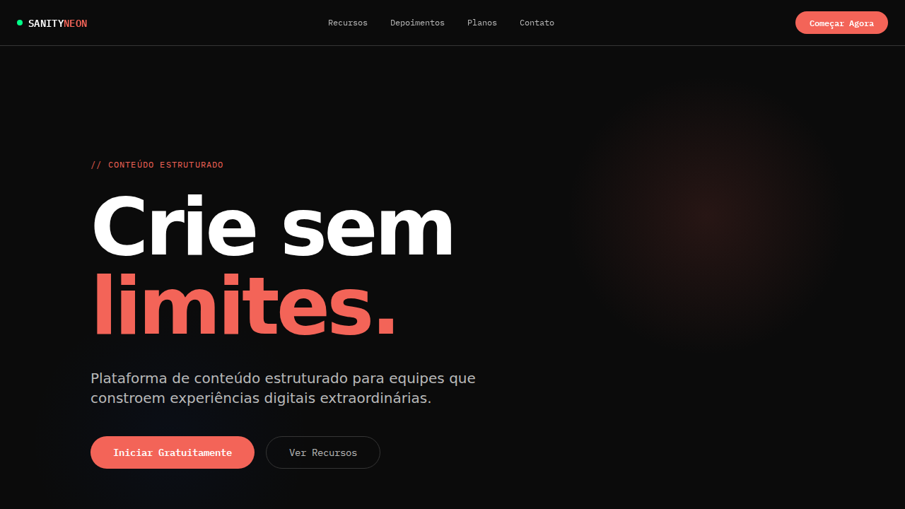
Sanity Neon Structured
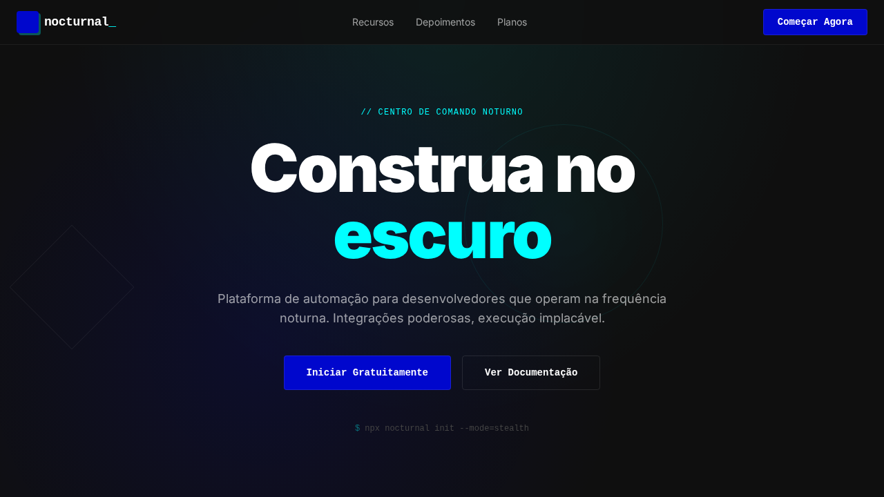
Estilo Sanity Neon Structured com CMS noturno, CTA coral e hover azul elétrico. Ideal para CMS headless, plataformas de conteúdo e ferramentas de dados.
Uso: CMS headless, Plataformas de conteúdo estruturado, Ferramentas de dados, APIs de conteúdo
Contexto Histórico
Inspirado no design do Sanity, que trata conteúdo estruturado como infraestrutura séria com estética de centro de comando noturno.
Especificações Técnicas
Cores
Primárias
Secundárias
Efeitos
Canvas near-black (#0b0b0b) como ambiente natural. waldenburg font com tracking extremo negativo (-4.48px em 112px). Escala de cinzas pura acromática sem subtom. Acento neon green (display-p3) e coral-red (#f36458) como sinais vívidos contra campo escuro. Botões pill primários (99999px). Hover universal para azul elétrico (#0052ef). IBM Plex Mono para labels técnicos. Bordas escuras (#0b0b0b, #212121, #353535) criando profundidade sutil.
Light/Dark
✗ Not Recommended / ✓ Full
CSS
background:#0b0b0b;color:#ffffff;accent:#f36458;hover:#0052ef;border-radius:99999px pills,6px secondary;font-family:system-ui for display,monospace for code;letter-spacing:-4.48px at 112px;border:1px solid #212121
Variáveis
--bg:#0b0b0b;--text:#ffffff;--text-secondary:#b9b9b9;--text-tertiary:#797979;--accent:#f36458;--hover:#0052ef;--surface:#212121;--border:#353535;--radius-pill:99999px
Checklist
☐ Canvas near-black #0b0b0b, ☐ Tracking extremo negativo, ☐ Cinzas acromáticos, ☐ CTA coral #f36458, ☐ Hover azul elétrico, ☐ Pill buttons, ☐ IBM Plex Mono, ☐ Responsivo
DESIGN.md
Design System: Sanity Neon Structured
1. Visual Theme & Atmosphere
Estilo Sanity Neon Structured com CMS noturno, CTA coral e hover azul elétrico. Ideal para CMS headless, plataformas de conteúdo e ferramentas de dados. Inspirado no design do Sanity, que trata conteúdo estruturado como infraestrutura séria com estética de centro de comando noturno.
- Density: 5/10 — Balanced
- Variance: 2/10 — Structured
- Motion: 4/10 — Subtle
2. Color Palette & Roles
- Sanity Black (#0b0b0b) — Dark surface, primary background
- Branco (#ffffff) — Light surface, card backgrounds
- Coral (#f36458) — Supporting palette color
- Azul Elétrico (#0052ef) — Accent highlight, links and focus states
- Cinza Escuro (#212121) — Deep contrast surface
- Cinza Médio (#353535) — Secondary text, borders, muted elements
- Silver (#b9b9b9) — Extended palette, decorative use
- Cinza (#797979) — Secondary text, borders, muted elements
3. Typography Rules
- Display / Hero: system-ui for display — Weight 700, tight tracking, used for headline impact
- Body: system-ui for display — Weight 400, 16px/1.6 line-height, max 72ch per line
- UI Labels / Captions: system-ui for display — 0.875rem, weight 500, slight letter-spacing
- Monospace: JetBrains Mono — Used for code, metadata, and technical values
Scale:
- Hero: clamp(2.5rem, 5vw, 4rem)
- H1: 2.25rem
- H2: 1.5rem
- Body: 1rem / 1.6
- Small: 0.875rem
4. Component Stylings
- Primary Button: Pill-shaped (9999px) shape. Accent color fill. Hover: 8% darken + subtle lift shadow. Active: -1px translate tactile press. Font weight 600. No outer glows.
- Secondary / Ghost Button: Outline variant. 1.5px border in muted color. Text in primary color. Hover: subtle background fill.
- Cards: Pill-shaped (9999px) corners. Surface background. Subtle shadow (0 2px 12px rgba(0,0,0,0.06)). 1px border stroke.
- Inputs: Label above input. 1px border stroke. Focus ring: 2px accent color offset 2px. Error text below in semantic red. No floating labels.
- Navigation: Primary surface background. Active item: accent color indicator. Font weight 500 when active.
- Skeletons: Shimmer animation matching component dimensions. No circular spinners.
- Empty States: Icon-based composition with descriptive text and action button.
5. Layout Principles
- Grid: CSS Grid primary. Max-width containment: 1280px centered with 1.5rem side padding.
- Spacing rhythm: Balanced. Base unit: 0.5rem (8px).
- Section vertical gaps: clamp(4rem, 8vw, 8rem).
- Hero layout: Split-screen (text left, visual right).
- Feature sections: Zig-zag alternating text+image rows. No 3-equal-columns.
- Mobile collapse: All multi-column layouts collapse below 768px. No horizontal overflow.
- z-index contract: base (0) / sticky-nav (100) / overlay (200) / modal (300) / toast (500).
6. Motion & Interaction
- Physics: Ease-out curves, 200-300ms duration. Smooth and predictable.
- Entry animations: Fade + translate-Y (16px → 0) over 420ms ease-out. Staggered cascades for lists: 80ms between items.
- Hover states: Subtle color shift + shadow adjustment over 200ms.
- Page transitions: Fade only (200ms).
- Performance: Only transform and opacity animated. No layout-triggering properties.
7. Anti-Patterns (Banned)
- No emojis in UI — use icon system only (Lucide, Heroicons)
- No pure white (#FFFFFF) backgrounds — use off-white or dark surfaces
- No oversaturated accent colors (saturation cap: 80%)
- No 3-column equal-width feature layouts — use zig-zag or asymmetric grid
- No
h-screen— usemin-h-[100dvh] - No AI copywriting clichés: "Elevate", "Seamless", "Unleash", "Next-Gen"
- No broken external image links — use picsum.photos or inline SVG
- No generic lorem ipsum in demos
Prompt para AI
Design a Sanity-inspired nocturnal CMS landing page. Near-black canvas (#0b0b0b). Custom font with extreme negative tracking (-4.48px at 112px). Pure achromatic gray scale. Vivid coral-red (#f36458) CTA buttons. Electric blue (#0052ef) universal hover state. Pill-shaped primary buttons (99999px). IBM Plex Mono for technical labels. Dark border hierarchy (#0b0b0b → #212121 → #353535). Neon green for success states.
Relacionados
Última sincronização: 01/04/2026