Soft Maximalism
Maximalismo controlado com tipografia gigante, animacoes em camadas e pops de cor disruptivos. Caos cirurgico para landing pages de alto impacto. Prompt para IA.
Uso: Marcas jovens, Agencias criativas, Lancamentos de produto, Portfolios ousados, Eventos e festivais
Contexto Histórico
O Soft Maximalism de 2025-2026 e uma reacao direta a esterilidade minimalista, trazendo energia de volta ao design web. Opera como um caos cirurgico que compreende limites para nao sacrificar usabilidade. Foca nas geracoes mais jovens com tipografia gigantesca, animacoes em camadas e pops de cor inesperados.
Especificações Técnicas
Cores
Primárias
Secundárias
Efeitos
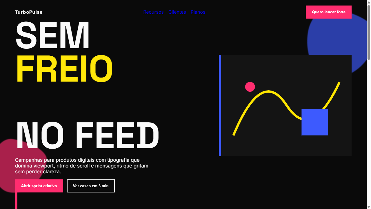
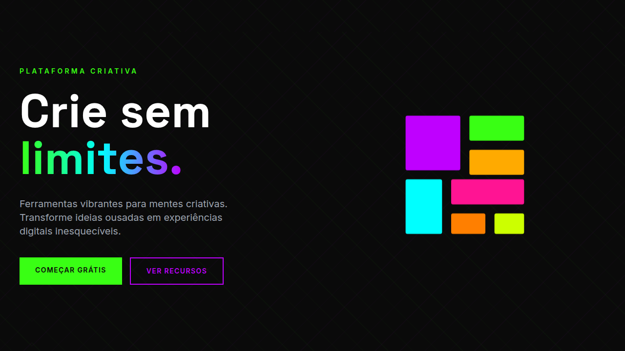
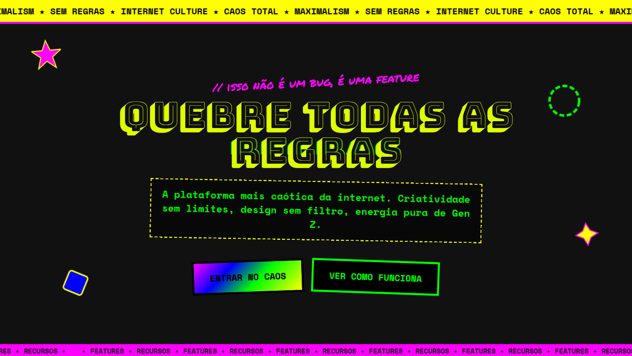
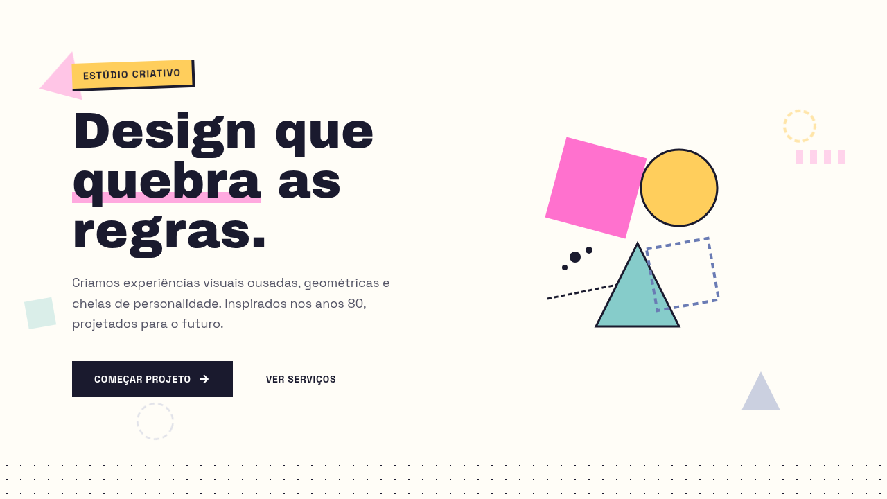
Tipografia gigantesca ocupando 80% da viewport, animacoes em camadas reagindo ao scroll, componentes dinamicos com parallax, pops de cor unicos e disruptivos por secao, transicoes bold 400-600ms com easing dramatico, mix-blend-mode para sobreposicoes
Light/Dark
✓ Full / ✓ Full
CSS
font-size: clamp(3rem, 10vw, 8rem); font-weight: 800-900; mix-blend-mode: difference/exclusion; scroll-behavior: smooth; animation-timeline: scroll(); transform: scale/rotate on scroll; transition: all 400ms cubic-bezier(0.16, 1, 0.3, 1); overflow-x: hidden; position: sticky for layered sections
Variáveis
--font-display: 'Space Grotesk', sans-serif; --font-body: 'Inter', sans-serif; --weight-black: 900; --color-base: #0A0A0A; --color-surface: #FAFAFA; --pop-magenta: #FF2D6F; --pop-yellow: #FFE600; --pop-blue: #3D5AFE; --pop-lime: #76FF03; --transition-bold: 400ms cubic-bezier(0.16, 1, 0.3, 1); --spacing-section: 8rem; --type-hero: clamp(3rem, 10vw, 8rem)
Checklist
☐ Tipografia hero ocupando 80% viewport, ☐ Animacoes reagindo ao scroll, ☐ Um pop de cor disruptivo por secao, ☐ Mix-blend-mode em sobreposicoes, ☐ Parallax em camadas, ☐ Hover states dramaticos, ☐ Usabilidade mantida apesar do caos visual, ☐ Responsivo com stack vertical no mobile
DESIGN.md
Design System: Soft Maximalism
1. Visual Theme & Atmosphere
Maximalismo controlado com tipografia gigante, animacoes em camadas e pops de cor disruptivos. Caos cirurgico para landing pages de alto impacto. Prompt para IA. O Soft Maximalism de 2025-2026 e uma reacao direta a esterilidade minimalista, trazendo energia de volta ao design web. Opera como um caos cirurgico que compreende limites para nao sacrificar usabilidade. Foca nas geracoes mais jovens com tipografia gigantesca, animacoes em camadas e pops de cor inesperados.
- Density: 5/10 — Balanced
- Variance: 7/10 — Dynamic
- Motion: 8/10 — Cinematic
2. Color Palette & Roles
- Preto Base (#0A0A0A) — Primary background surface
- Branco Off-White (#FAFAFA) — Light surface, card backgrounds
- Cinza Quente (#2D2D2D) — Secondary text, borders, muted elements
- Pop Magenta (#FF2D6F) — Decorative accent, highlight elements
- Pop Amarelo (#FFE600) — Warning states, attention indicators
- Pop Azul Eletrico (#3D5AFE) — Secondary accent
- Pop Verde Lima (#76FF03) — Success states, positive indicators
3. Typography Rules
- Display / Hero: Space Grotesk — Weight 700, tight tracking, used for headline impact
- Accent: Inter — Used for decorative or emphasis text
- Body: Space Grotesk — Weight 400, 16px/1.6 line-height, max 72ch per line
- UI Labels / Captions: Space Grotesk — 0.875rem, weight 500, slight letter-spacing
- Monospace: JetBrains Mono — Used for code, metadata, and technical values
Scale:
- Hero: clamp(2.5rem, 5vw, 4rem)
- H1: 2.25rem
- H2: 1.5rem
- Body: 1rem / 1.6
- Small: 0.875rem
4. Component Stylings
- Primary Button: Moderately rounded (0.75rem) shape. Accent color fill. Hover: 8% darken + subtle lift shadow. Active: -1px translate tactile press. Font weight 600. No outer glows.
- Secondary / Ghost Button: Outline variant. 1.5px border in muted color. Text in primary color. Hover: subtle background fill.
- Cards: Moderately rounded (0.75rem) corners. Surface background. Subtle shadow (0 2px 12px rgba(0,0,0,0.06)). 1px border stroke.
- Inputs: Label above input. 1px border stroke. Focus ring: 2px accent color offset 2px. Error text below in semantic red. No floating labels.
- Navigation: Primary surface background. Active item: accent color indicator. Font weight 500 when active.
- Skeletons: Shimmer animation matching component dimensions. No circular spinners.
- Empty States: Icon-based composition with descriptive text and action button.
5. Layout Principles
- Grid: CSS Grid primary. Max-width containment: 1280px centered with 1.5rem side padding.
- Spacing rhythm: Balanced. Base unit: 0.5rem (8px).
- Section vertical gaps: clamp(4rem, 8vw, 8rem).
- Hero layout: Asymmetric composition.
- Feature sections: Asymmetric grid with varied card sizes. No 3-equal-columns.
- Mobile collapse: All multi-column layouts collapse below 768px. No horizontal overflow.
- z-index contract: base (0) / sticky-nav (100) / overlay (200) / modal (300) / toast (500).
6. Motion & Interaction
- Physics: Spring — stiffness 120, damping 20. Confident, weighted transitions.
- Entry animations: Fade + translate-Y (16px → 0) over 540ms ease-out. Staggered cascades for lists: 120ms between items.
- Hover states: Scale(1.03) + shadow lift over 200ms.
- Page transitions: Fade + slide (300ms).
- Performance: Only transform and opacity animated. No layout-triggering properties.
7. Anti-Patterns (Banned)
- No emojis in UI — use icon system only (Lucide, Heroicons)
- No pure black (#000000) — use off-black or charcoal variants
- No oversaturated accent colors (saturation cap: 80%)
- No 3-column equal-width feature layouts — use zig-zag or asymmetric grid
- No
h-screen— usemin-h-[100dvh] - No AI copywriting clichés: "Elevate", "Seamless", "Unleash", "Next-Gen"
- No broken external image links — use picsum.photos or inline SVG
- No generic lorem ipsum in demos
Prompt para AI
Design a soft maximalist landing page with CONTROLLED CHAOS energy. Use oversized bold typography (clamp(3rem, 10vw, 8rem)) that fills up to 80% of the viewport width, breaking traditional margins. Layer multiple animated elements that react to scroll position using Intersection Observer and CSS scroll-driven animations. Each section should have ONE disruptive color pop against a controlled base (dark or light). Use mix-blend-mode for text overlapping images. Parallax layers on scroll. Bold hover states with dramatic scale transforms. Dynamic components that shift, rotate, or morph on scroll. Keep usability intact despite the visual energy — clear CTAs, readable body text, logical flow.
Relacionados
Última sincronização: 01/04/2026