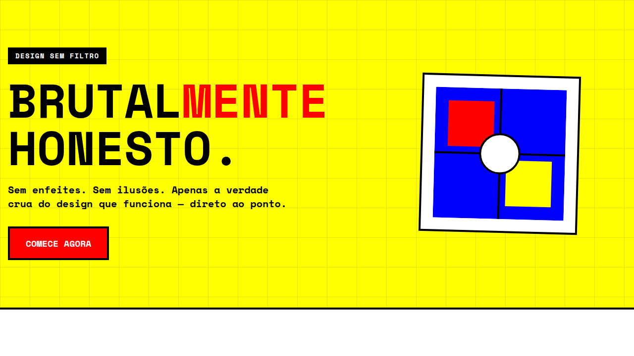
Swiss Modern
Design Swiss Modern com grid visível, formas geométricas, preto/branco/vermelho e tipografia Archivo bold. Precisão Bauhaus. Prompt para IA.
Uso: Agências de design, Arquitetura, Galerias de arte, Portfolios minimalistas
Contexto Histórico
Fusão do movimento Bauhaus (1919-1933) com design suíço moderno. Usa grid visível, formas geométricas puras e a paleta clássica preto/branco/vermelho para criar layouts assimétricos com precisão tipográfica.
Especificações Técnicas
Cores
Primárias
Secundárias
Efeitos
Visible grid lines, asymmetric layouts, geometric shapes (circles, rectangles, lines), red accent as focal point, precise typography hierarchy, clean transitions 200ms
Light/Dark
✓ Full / ✗ No
CSS
font-family: 'Archivo' for headings, 'Nunito' for body, background: #ffffff, color: #000000, .accent-red { color: #ff3300 }, .grid-visible { background-image: linear-gradient(rgba(0,0,0,0.05) 1px, transparent 1px), linear-gradient(90deg, rgba(0,0,0,0.05) 1px, transparent 1px); background-size: 60px 60px }, .geo-shape { position: absolute }, .geo-circle { border: 2px solid #000; border-radius: 50% }, .geo-rect { border: 2px solid #ff3300 }
Variáveis
--bg-white: #ffffff, --text-black: #000000, --accent-red: #ff3300, --grid-size: 60px, --font-display: 'Archivo', --font-body: 'Nunito', --font-weight-display: 800, --font-weight-body: 400, --border-width: 2px
Checklist
☐ Archivo + Nunito carregados, ☐ Pure white/black/red palette, ☐ Visible grid lines, ☐ Asymmetric layouts, ☐ Geometric shapes CSS, ☐ Red accent como focal point, ☐ Typography hierarchy precisa, ☐ Responsivo mobile/tablet/desktop
DESIGN.md
Design System: Swiss Modern
1. Visual Theme & Atmosphere
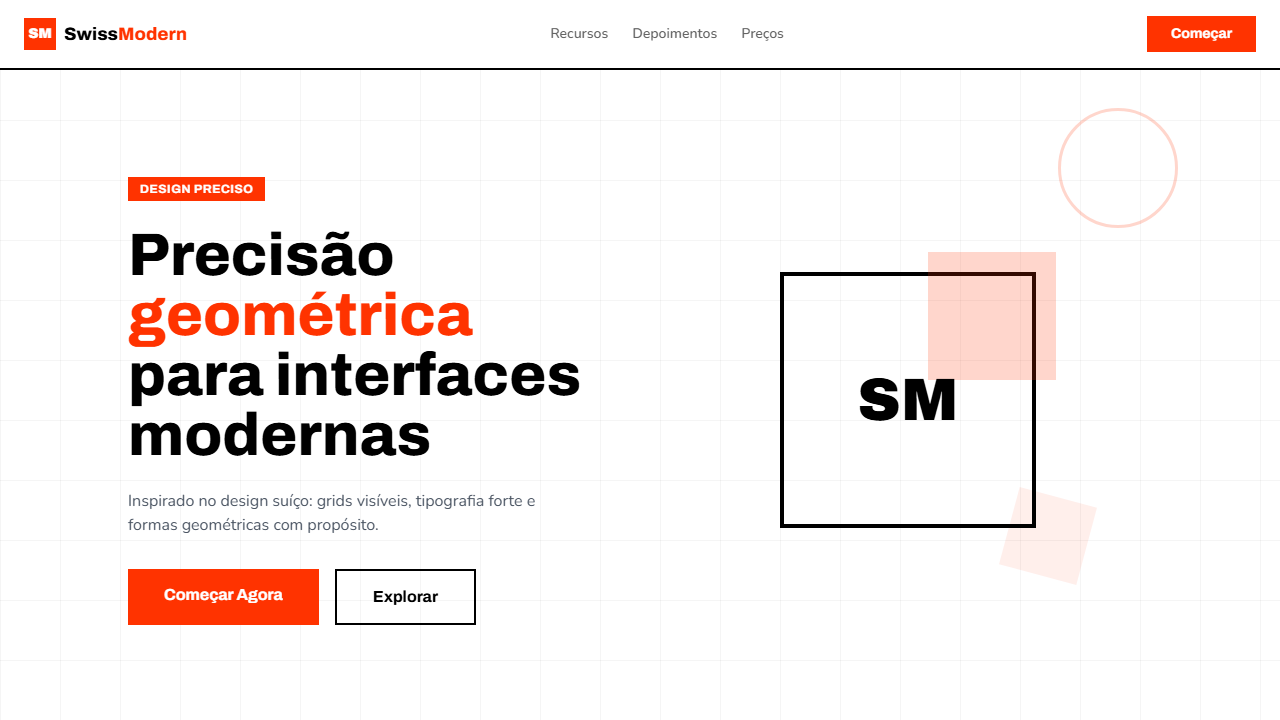
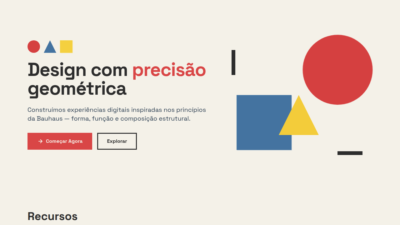
Design Swiss Modern com grid visível, formas geométricas, preto/branco/vermelho e tipografia Archivo bold. Precisão Bauhaus. Prompt para IA. Fusão do movimento Bauhaus (1919-1933) com design suíço moderno. Usa grid visível, formas geométricas puras e a paleta clássica preto/branco/vermelho para criar layouts assimétricos com precisão tipográfica.
- Density: 3/10 — Airy
- Variance: 7/10 — Dynamic
- Motion: 4/10 — Subtle
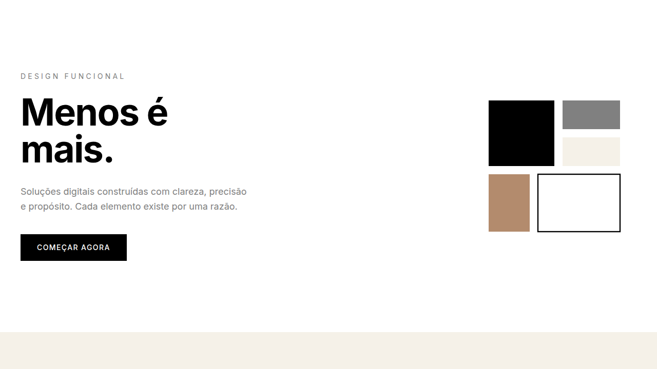
2. Color Palette & Roles
- Pure White (#ffffff) — Light surface, card backgrounds
- Pure Black (#000000) — Dark surface, primary background
- Red Accent (#ff3300) — Primary accent, CTAs and interactive elements
- Light Grey (#f5f5f5) — Secondary text, borders, muted elements
- Medium Grey (#cccccc) — Secondary text, borders, muted elements
- Dark Grey (#333333) — Deep contrast surface
3. Typography Rules
- Display / Hero: Archivo — Weight 700, tight tracking, used for headline impact
- Accent: Nunito — Used for decorative or emphasis text
- Body: Archivo — Weight 400, 16px/1.6 line-height, max 72ch per line
- UI Labels / Captions: Archivo — 0.875rem, weight 500, slight letter-spacing
- Monospace: JetBrains Mono — Used for code, metadata, and technical values
Scale:
- Hero: clamp(2.5rem, 5vw, 4rem)
- H1: 2.25rem
- H2: 1.5rem
- Body: 1rem / 1.6
- Small: 0.875rem
4. Component Stylings
- Primary Button: Rounded (50%) shape. Accent color fill. Hover: 8% darken + subtle lift shadow. Active: -1px translate tactile press. Font weight 600. No outer glows.
- Secondary / Ghost Button: Outline variant. 1.5px border in muted color. Text in primary color. Hover: subtle background fill.
- Cards: Rounded (50%) corners. Surface background. Subtle shadow (0 2px 12px rgba(0,0,0,0.06)). 1px border stroke.
- Inputs: Label above input. 1px border stroke. Focus ring: 2px accent color offset 2px. Error text below in semantic red. No floating labels.
- Navigation: Primary surface background. Active item: accent color indicator. Font weight 500 when active.
- Skeletons: Shimmer animation matching component dimensions. No circular spinners.
- Empty States: Icon-based composition with descriptive text and action button.
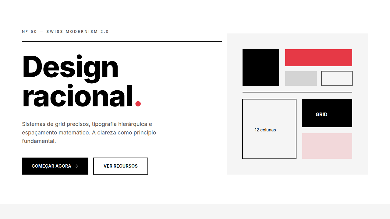
5. Layout Principles
- Grid: CSS Grid primary. Max-width containment: 1280px centered with 1.5rem side padding.
- Spacing rhythm: Balanced. Base unit: 0.5rem (8px).
- Section vertical gaps: clamp(4rem, 8vw, 8rem).
- Hero layout: Asymmetric composition.
- Feature sections: Asymmetric grid with varied card sizes. No 3-equal-columns.
- Mobile collapse: All multi-column layouts collapse below 768px. No horizontal overflow.
- z-index contract: base (0) / sticky-nav (100) / overlay (200) / modal (300) / toast (500).
6. Motion & Interaction
- Physics: Ease-out curves, 200-300ms duration. Smooth and predictable.
- Entry animations: Fade + translate-Y (16px → 0) over 420ms ease-out. Staggered cascades for lists: 80ms between items.
- Hover states: Subtle color shift + shadow adjustment over 200ms.
- Page transitions: Fade only (200ms).
- Performance: Only transform and opacity animated. No layout-triggering properties.
7. Anti-Patterns (Banned)
- No emojis in UI — use icon system only (Lucide, Heroicons)
- No decorative gradients — flat color only
- No shadows heavier than 0 2px 8px rgba(0,0,0,0.08)
- No pure black (#000000) — use off-black or charcoal variants
- No oversaturated accent colors (saturation cap: 80%)
- No 3-column equal-width feature layouts — use zig-zag or asymmetric grid
- No
h-screen— usemin-h-[100dvh] - No AI copywriting clichés: "Elevate", "Seamless", "Unleash", "Next-Gen"
- No broken external image links — use picsum.photos or inline SVG
- No generic lorem ipsum in demos
Prompt para AI
Design a clean, precise, Bauhaus-inspired landing page with Swiss Modern aesthetic. Pure white background, pure black text, red accent (#ff3300). Use Archivo (800) for bold display and Nunito (400) for body. Include visible grid lines. Create asymmetric layouts with geometric shapes (circles, rectangles, lines). Red accent as focal point. Precise typography hierarchy.
Relacionados
Última sincronização: 01/04/2026