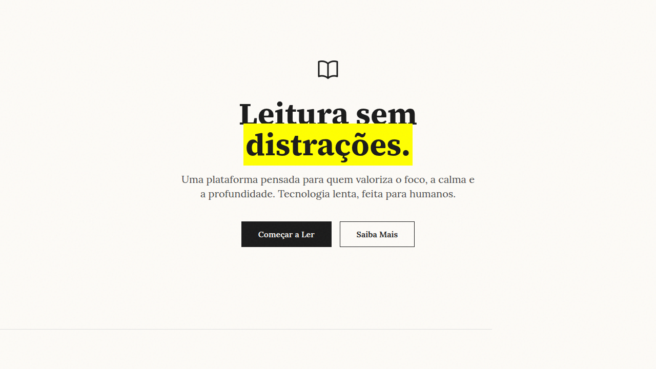
The Barely-There UI
Interface quase inexistente inspirada em OpenAI e Perplexity. Ultra-minimal com hierarquia por opacidade, tipografia fina e zero decoracao. Prompt pronto para IA.
Uso: Plataformas de IA, SaaS B2B enterprise, Dashboards analiticos, Ferramentas de produtividade, Interfaces de dados
Contexto Histórico
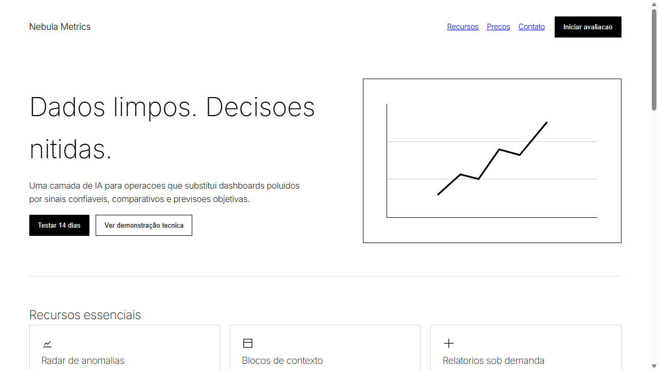
A Interface Quase Inexistente e o novo codigo visual da seriedade tecnica em 2025-2026, adotado por gigantes da inteligencia artificial como OpenAI e Perplexity. Sinaliza que o valor do produto esta no cerebro da tecnologia, nao na maquiagem estetica. Usa opacidade como unica ferramenta de hierarquia e substitui ilustracoes por visualizacoes de dados rigorosas.
Especificações Técnicas
Cores
Primárias
Secundárias
Efeitos
Opacidade como hierarquia (100% titulo, 87% corpo, 60% secundario), transicoes ultra-suaves 300ms, zero sombras, zero gradientes, espacamento arquitetonico generoso, visualizacoes de dados rigorosas substituindo ilustracoes
Light/Dark
✓ Full / ✓ Full
CSS
font-family: 'Inter', system-ui, sans-serif; font-weight: 100-300; color: rgba(0,0,0,1/0.87/0.7/0.6); letter-spacing: -0.02em; line-height: 1.6; max-width: 1200px; margin: 0 auto; padding: 4rem; gap: 3rem; border: none; box-shadow: none; background: #FFFFFF or #000000; transition: opacity 300ms ease
Variáveis
--font-primary: 'Inter', system-ui; --weight-thin: 100; --weight-light: 200; --weight-regular: 300; --opacity-high: 1; --opacity-medium: 0.87; --opacity-low: 0.7; --opacity-muted: 0.6; --color-bg: #FFFFFF; --color-ink: #000000; --spacing-xl: 4rem; --spacing-lg: 3rem; --border-radius: 0; --shadow: none
Checklist
☐ Apenas UMA familia tipografica, ☐ Pesos ultra-finos (100-300), ☐ Hierarquia por opacidade (4 niveis), ☐ Maximo 3 cores, ☐ Zero sombras e gradientes, ☐ Visualizacoes de dados no lugar de ilustracoes, ☐ Espacamento arquitetonico generoso, ☐ Contraste WCAG AA verificado
DESIGN.md
Design System: The Barely-There UI
1. Visual Theme & Atmosphere
Interface quase inexistente inspirada em OpenAI e Perplexity. Ultra-minimal com hierarquia por opacidade, tipografia fina e zero decoracao. Prompt pronto para IA. A Interface Quase Inexistente e o novo codigo visual da seriedade tecnica em 2025-2026, adotado por gigantes da inteligencia artificial como OpenAI e Perplexity. Sinaliza que o valor do produto esta no cerebro da tecnologia, nao na maquiagem estetica. Usa opacidade como unica ferramenta de hierarquia e substitui ilustracoes por visualizacoes de dados rigorosas.
- Density: 3/10 — Airy
- Variance: 2/10 — Structured
- Motion: 4/10 — Subtle
2. Color Palette & Roles
- Branco Puro (#FFFFFF) — Light surface, card backgrounds
- Preto Absoluto (#000000) — Dark surface, primary background
- Cinza Neutro (#808080) — Secondary text, borders, muted elements
- Cinza Claro (#F5F5F5) — Secondary text, borders, muted elements
- Cinza Medio (#BDBDBD) — Secondary text, borders, muted elements
- Cinza Escuro (#424242) — Deep contrast surface
3. Typography Rules
- Display / Hero: Inter — Weight 700, tight tracking, used for headline impact
- Body: Inter — Weight 400, 16px/1.6 line-height, max 72ch per line
- UI Labels / Captions: Inter — 0.875rem, weight 500, slight letter-spacing
- Monospace: JetBrains Mono — Used for code, metadata, and technical values
Scale:
- Hero: clamp(2.5rem, 5vw, 4rem)
- H1: 2.25rem
- H2: 1.5rem
- Body: 1rem / 1.6
- Small: 0.875rem
4. Component Stylings
- Primary Button: Sharp edges (0px) shape. Accent color fill. Hover: 8% darken + subtle lift shadow. Active: -1px translate tactile press. Font weight 600. No outer glows.
- Secondary / Ghost Button: Outline variant. 1.5px border in muted color. Text in primary color. Hover: subtle background fill.
- Cards: Sharp edges (0px) corners. Surface background. Subtle shadow (0 2px 12px rgba(0,0,0,0.06)). 1px border stroke.
- Inputs: Label above input. 1px border stroke. Focus ring: 2px accent color offset 2px. Error text below in semantic red. No floating labels.
- Navigation: Primary surface background. Active item: accent color indicator. Font weight 500 when active.
- Skeletons: Shimmer animation matching component dimensions. No circular spinners.
- Empty States: Icon-based composition with descriptive text and action button.
5. Layout Principles
- Grid: CSS Grid primary. Max-width containment: 1280px centered with 1.5rem side padding.
- Spacing rhythm: Balanced. Base unit: 0.5rem (8px).
- Section vertical gaps: clamp(4rem, 8vw, 8rem).
- Hero layout: Split-screen (text left, visual right).
- Feature sections: Zig-zag alternating text+image rows. No 3-equal-columns.
- Mobile collapse: All multi-column layouts collapse below 768px. No horizontal overflow.
- z-index contract: base (0) / sticky-nav (100) / overlay (200) / modal (300) / toast (500).
6. Motion & Interaction
- Physics: Ease-out curves, 200-300ms duration. Smooth and predictable.
- Entry animations: Fade + translate-Y (16px → 0) over 420ms ease-out. Staggered cascades for lists: 80ms between items.
- Hover states: Subtle color shift + shadow adjustment over 200ms.
- Page transitions: Fade only (200ms).
- Performance: Only transform and opacity animated. No layout-triggering properties.
7. Anti-Patterns (Banned)
- No emojis in UI — use icon system only (Lucide, Heroicons)
- No decorative gradients — flat color only
- No shadows heavier than 0 2px 8px rgba(0,0,0,0.08)
- No pure black (#000000) — use off-black or charcoal variants
- No oversaturated accent colors (saturation cap: 80%)
- No 3-column equal-width feature layouts — use zig-zag or asymmetric grid
- No
h-screen— usemin-h-[100dvh] - No AI copywriting clichés: "Elevate", "Seamless", "Unleash", "Next-Gen"
- No broken external image links — use picsum.photos or inline SVG
- No generic lorem ipsum in demos
Prompt para AI
Design an ultra-minimal AI-native interface inspired by OpenAI and Perplexity. Use ONLY ONE sans-serif font family (Inter or system-ui) in ultra-thin weights (100-300). Create text hierarchy EXCLUSIVELY through opacity levels: 100% for headings, 87% for body, 70% for secondary, 60% for tertiary. Maximum 2-3 colors total (black, white, one neutral gray). Replace all illustrations with functional data visualizations and rigorous charts. Use white space as architectural tool to reduce cognitive load. Zero shadows, zero gradients, zero decorative elements. Sharp geometric layouts with mathematical precision. Every pixel must serve a purpose.
Relacionados
Última sincronização: 01/04/2026