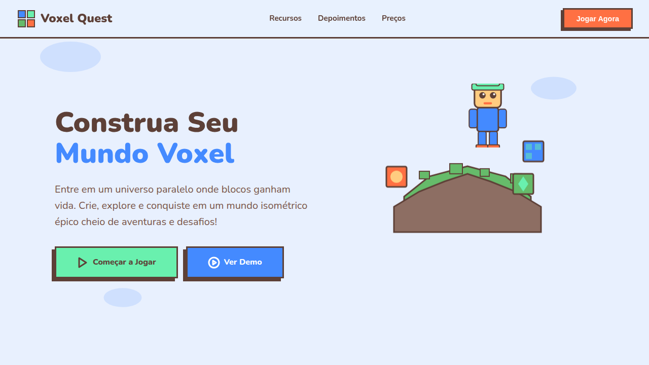
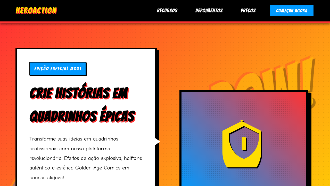
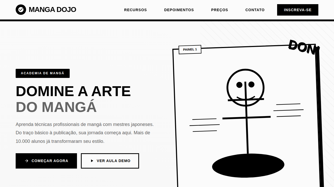
Voxel Gamified Isometric
Voxel Gamified Isometric — Design pop culture com voxel, isometric, 3d. Template e prompt pronto para IA.
Uso: Landing pages, Websites modernas
Contexto Histórico
Estilo Voxel Gamified Isometric representa uma tendência moderna em design UI/UX web com foco em pop culture.
Especificações Técnicas
Cores
Primárias
Secundárias
Efeitos
Isometric projection, voxel-style block characters, floating island platforms, smooth vector gradients, edge lighting.
Light/Dark
✓ Full / ✗ No
CSS
background-color: #E8F0FE; color: #5D4037; font-family: 'Nunito', sans-serif; transform: rotateX(60deg) rotateY(0deg) rotateZ(-45deg); box-shadow: -10px 10px 0 #ddd;
Variáveis
--bg-sky: #E8F0FE, --text-earth: #5D4037, --accent-green: #69F0AE, --font-round: 'Nunito', sans-serif, --iso-angle: rotateX(60deg) rotateZ(-45deg)
Checklist
☐ Isometric layout/illustration, ☐ Blocky 'Minecraft' style elements, ☐ Bright cheerful colors, ☐ Floating containers (shadows underneath), ☐ Gamified UI elements
DESIGN.md
Design System: Voxel Gamified Isometric
1. Visual Theme & Atmosphere
Voxel Gamified Isometric — Design pop culture com voxel, isometric, 3d. Template e prompt pronto para IA. Estilo Voxel Gamified Isometric representa uma tendência moderna em design UI/UX web com foco em pop culture.
- Density: 5/10 — Balanced
- Variance: 7/10 — Dynamic
- Motion: 8/10 — Cinematic
2. Color Palette & Roles
- Background (#E8F0FE) — Primary background surface
- Text (#5D4037) — Primary text color
- Accent (#69F0AE) — Primary accent, CTAs and interactive elements
- Cube Blue (#448AFF) — Secondary accent
- Grass Block (#66BB6A) — Extended palette, decorative use
- Lava Orange (#FF7043) — Warm accent, call-to-action secondary
3. Typography Rules
- Display / Hero: Nunito — Weight 700, tight tracking, used for headline impact
- Body: Nunito — Weight 400, 16px/1.6 line-height, max 72ch per line
- UI Labels / Captions: Nunito — 0.875rem, weight 500, slight letter-spacing
- Monospace: JetBrains Mono — Used for code, metadata, and technical values
Scale:
- Hero: clamp(2.5rem, 5vw, 4rem)
- H1: 2.25rem
- H2: 1.5rem
- Body: 1rem / 1.6
- Small: 0.875rem
4. Component Stylings
- Primary Button: Subtly rounded (0.5rem) shape. Accent color fill. Hover: 8% darken + subtle lift shadow. Active: -1px translate tactile press. Font weight 600. No outer glows.
- Secondary / Ghost Button: Outline variant. 1.5px border in muted color. Text in primary color. Hover: subtle background fill.
- Cards: Subtly rounded (0.5rem) corners. Surface background. Subtle shadow (0 2px 12px rgba(0,0,0,0.06)). 1px border stroke.
- Inputs: Label above input. 1px border stroke. Focus ring: 2px accent color offset 2px. Error text below in semantic red. No floating labels.
- Navigation: Primary surface background. Active item: accent color indicator. Font weight 500 when active.
- Skeletons: Shimmer animation matching component dimensions. No circular spinners.
- Empty States: Icon-based composition with descriptive text and action button.
5. Layout Principles
- Grid: CSS Grid primary. Max-width containment: 1280px centered with 1.5rem side padding.
- Spacing rhythm: Balanced. Base unit: 0.5rem (8px).
- Section vertical gaps: clamp(4rem, 8vw, 8rem).
- Hero layout: Asymmetric composition.
- Feature sections: Asymmetric grid with varied card sizes. No 3-equal-columns.
- Mobile collapse: All multi-column layouts collapse below 768px. No horizontal overflow.
- z-index contract: base (0) / sticky-nav (100) / overlay (200) / modal (300) / toast (500).
6. Motion & Interaction
- Physics: Spring — stiffness 120, damping 20. Confident, weighted transitions.
- Entry animations: Fade + translate-Y (16px → 0) over 540ms ease-out. Staggered cascades for lists: 120ms between items.
- Hover states: Scale(1.03) + shadow lift over 200ms.
- Page transitions: Fade + slide (300ms).
- Performance: Only transform and opacity animated. No layout-triggering properties.
7. Anti-Patterns (Banned)
- No emojis in UI — use icon system only (Lucide, Heroicons)
- No pure black (#000000) — use off-black or charcoal variants
- No oversaturated accent colors (saturation cap: 80%)
- No 3-column equal-width feature layouts — use zig-zag or asymmetric grid
- No
h-screen— usemin-h-[100dvh] - No AI copywriting clichés: "Elevate", "Seamless", "Unleash", "Next-Gen"
- No broken external image links — use picsum.photos or inline SVG
- No generic lorem ipsum in demos
Prompt para AI
voxel landing page, isometric 3d style, gamified design, floating islands, blocky characters, colorful and friendly.
Relacionados
Última sincronização: 01/04/2026