Coastal Mist
Estilo costeiro sereno com tons de navy, seafoam e slate. Gradientes suaves e tipografia clean para transmitir calma e confiança. Prompt pronto para IA.
Uso: SaaS de bem-estar, Apps de meditação, Turismo costeiro, Imobiliárias de praia, Clínicas e spas
Contexto Histórico
Inspirado na estética costeira escandinava e no design hygge, combina paletas oceânicas com minimalismo funcional. A atmosfera de neblina evoca tranquilidade e confiança, tendência forte em marcas de wellness desde 2022.
Especificações Técnicas
Cores
Primárias
Secundárias
Efeitos
Background com gradiente suave azul-acizentado, sombras delicadas, bordas arredondadas leves, imagens com overlay de neblina, blur sutil em elementos de fundo
Light/Dark
✓ Full / ◐ Partial
CSS
border-radius: 14px; box-shadow: 0 18px 45px rgba(38,60,89,0.25); background: linear-gradient(180deg, #C8D9E6 0%, #AFC3D4 45%, #263C59 100%); filter: saturate(0.9) blur(0.2px);
Variáveis
--radius-coastal: 14px; --color-deep: #263C59; --color-seafoam: #C8D9E6; --color-slate: #6D89A6; --color-driftwood: #E6DED4; --shadow-mist: 0 18px 45px rgba(38,60,89,0.25);
Checklist
☐ Gradiente de fundo inspirado em céu costeiro nublado, ☐ Uso equilibrado de Deep Current, Seafoam Cloud e Coastal Slate, ☐ Tipografia clean com bastante espaço em branco, ☐ Cards com sombras suaves e bordas arredondadas, ☐ Imagens com overlay levemente azulado para reforçar o clima costeiro
DESIGN.md
Design System: Coastal Mist
1. Visual Theme & Atmosphere
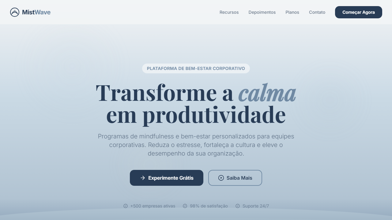
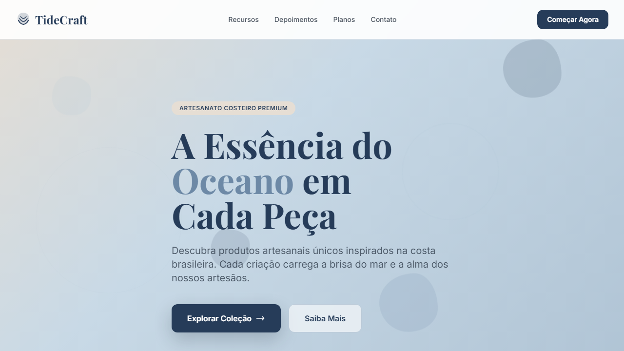
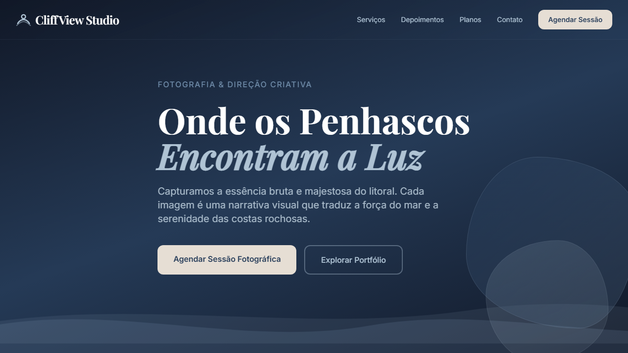
Estilo costeiro sereno com tons de navy, seafoam e slate. Gradientes suaves e tipografia clean para transmitir calma e confiança. Prompt pronto para IA. Inspirado na estética costeira escandinava e no design hygge, combina paletas oceânicas com minimalismo funcional. A atmosfera de neblina evoca tranquilidade e confiança, tendência forte em marcas de wellness desde 2022.
- Density: 3/10 — Airy
- Variance: 3/10 — Restrained
- Motion: 4/10 — Subtle
2. Color Palette & Roles
- Deep Current (#263C59) — Primary surface or dominant color
- Seafoam Cloud (#C8D9E6) — Secondary surface or text color
- Coastal Slate (#6D89A6) — Supporting palette color
- Driftwood Pale (#E6DED4) — Extended palette, decorative use
- Ocean Pearl (#AFC3D4) — Extended palette, decorative use
- Cinza neblina (#F2F4F6) — Secondary text, borders, muted elements
3. Typography Rules
- Display / Hero: System UI stack (-apple-system, sans-serif) — Weight 700, tight tracking, used for headline impact
- Body: System UI stack (-apple-system, sans-serif) — Weight 400, 16px/1.6 line-height, max 72ch per line
- UI Labels / Captions: System UI stack (-apple-system, sans-serif) — 0.875rem, weight 500, slight letter-spacing
- Monospace: JetBrains Mono — Used for code, metadata, and technical values
Scale:
- Hero: clamp(2.5rem, 5vw, 4rem)
- H1: 2.25rem
- H2: 1.5rem
- Body: 1rem / 1.6
- Small: 0.875rem
4. Component Stylings
- Primary Button: Rounded (14px) shape. Accent color fill. Hover: 8% darken + subtle lift shadow. Active: -1px translate tactile press. Font weight 600. No outer glows.
- Secondary / Ghost Button: Outline variant. 1.5px border in muted color. Text in primary color. Hover: subtle background fill.
- Cards: Rounded (14px) corners. Surface background. Subtle shadow (0 2px 12px rgba(0,0,0,0.06)). 1px border stroke.
- Inputs: Label above input. 1px border stroke. Focus ring: 2px accent color offset 2px. Error text below in semantic red. No floating labels.
- Navigation: Primary surface background. Active item: accent color indicator. Font weight 500 when active.
- Skeletons: Shimmer animation matching component dimensions. No circular spinners.
- Empty States: Icon-based composition with descriptive text and action button.
5. Layout Principles
- Grid: CSS Grid primary. Max-width containment: 1280px centered with 1.5rem side padding.
- Spacing rhythm: Balanced. Base unit: 0.5rem (8px).
- Section vertical gaps: clamp(4rem, 8vw, 8rem).
- Hero layout: Split-screen (text left, visual right).
- Feature sections: Zig-zag alternating text+image rows. No 3-equal-columns.
- Mobile collapse: All multi-column layouts collapse below 768px. No horizontal overflow.
- z-index contract: base (0) / sticky-nav (100) / overlay (200) / modal (300) / toast (500).
6. Motion & Interaction
- Physics: Ease-out curves, 200-300ms duration. Smooth and predictable.
- Entry animations: Fade + translate-Y (16px → 0) over 420ms ease-out. Staggered cascades for lists: 80ms between items.
- Hover states: Subtle color shift + shadow adjustment over 200ms.
- Page transitions: Fade only (200ms).
- Performance: Only transform and opacity animated. No layout-triggering properties.
7. Anti-Patterns (Banned)
- No emojis in UI — use icon system only (Lucide, Heroicons)
- No pure black (#000000) — use off-black or charcoal variants
- No oversaturated accent colors (saturation cap: 80%)
- No 3-column equal-width feature layouts — use zig-zag or asymmetric grid
- No
h-screen— usemin-h-[100dvh] - No AI copywriting clichés: "Elevate", "Seamless", "Unleash", "Next-Gen"
- No broken external image links — use picsum.photos or inline SVG
- No generic lorem ipsum in demos
Prompt para AI
Design a serene coastal UI using deep navy, pale seafoam, and soft slate blues. Create misty gradients, gentle shadows, and clean typography to evoke calm and trust.
Relacionados
Última sincronização: 01/04/2026