Coastal Studio
Landing page de estúdio criativo costeiro com hero fotográfico, painéis translúcidos e tipografia editorial serif. Prompt pronto para portfólios e agências.
Uso: Portfólios de fotografia, Estúdios criativos, Agências de branding, Arquitetura costeira
Contexto Histórico
Inspirado em estúdios criativos escandinavos e na fotografia editorial de paisagens costeiras. Combina a força visual de penhascos e mar com UI translúcida e tipografia serif elegante, tendência em portfólios premium desde 2021.
Especificações Técnicas
Cores
Primárias
Secundárias
Efeitos
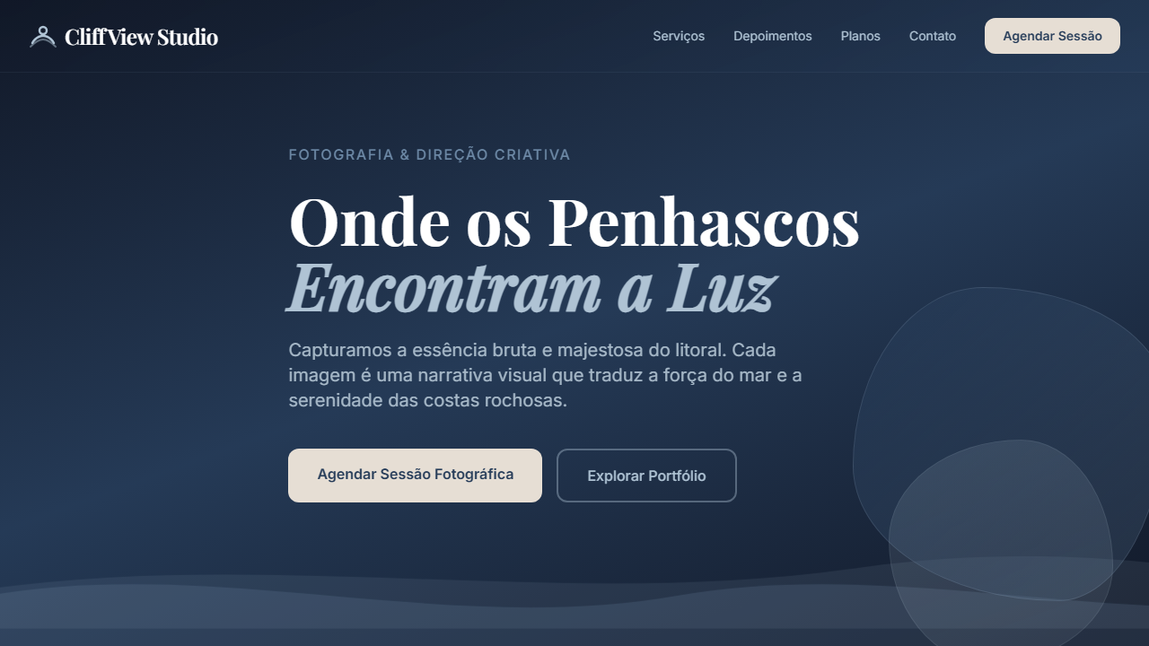
Hero com foto de costa rochosa, overlays semi-transparentes em Coastal Slate, títulos serif grandes, textos em branco sobre navy, botões em Driftwood Pale com texto em Deep Current
Light/Dark
◐ Partial
CSS
border-radius: 20px; box-shadow: 0 22px 60px rgba(0,0,0,0.35); background: linear-gradient(160deg, rgba(17,24,39,0.95), rgba(38,60,89,0.9)); backdrop-filter: blur(12px);
Variáveis
--radius-panel: 20px; --color-overlay-dark: rgba(17,24,39,0.95); --color-slate: #6D89A6; --color-ocean: #AFC3D4; --shadow-hero: 0 22px 60px rgba(0,0,0,0.35);
Checklist
☐ Hero com foto costeira em tela cheia, ☐ Painéis semi-transparentes em Coastal Slate/Ocean Pearl, ☐ Títulos serif grandes em branco, ☐ Botões em Driftwood Pale com texto em Deep Current, ☐ Layout que balanceia fotografia forte com UI minimal
DESIGN.md
Design System: Coastal Studio
1. Visual Theme & Atmosphere
Landing page de estúdio criativo costeiro com hero fotográfico, painéis translúcidos e tipografia editorial serif. Prompt pronto para portfólios e agências. Inspirado em estúdios criativos escandinavos e na fotografia editorial de paisagens costeiras. Combina a força visual de penhascos e mar com UI translúcida e tipografia serif elegante, tendência em portfólios premium desde 2021.
- Density: 5/10 — Balanced
- Variance: 4/10 — Moderate
- Motion: 4/10 — Subtle
2. Color Palette & Roles
- Deep Current (#263C59) — Primary surface or dominant color
- Coastal Slate (#6D89A6) — Secondary surface or text color
- Ocean Pearl (#AFC3D4) — Supporting palette color
- Seafoam Cloud (#C8D9E6) — Extended palette, decorative use
- Driftwood Pale (#E6DED4) — Extended palette, decorative use
- Preto suave (#111827) — Deep contrast surface
3. Typography Rules
- Display / Hero: System UI stack (-apple-system, sans-serif) — Weight 700, tight tracking, used for headline impact
- Body: System UI stack (-apple-system, sans-serif) — Weight 400, 16px/1.6 line-height, max 72ch per line
- UI Labels / Captions: System UI stack (-apple-system, sans-serif) — 0.875rem, weight 500, slight letter-spacing
- Monospace: JetBrains Mono — Used for code, metadata, and technical values
Scale:
- Hero: clamp(2.5rem, 5vw, 4rem)
- H1: 2.25rem
- H2: 1.5rem
- Body: 1rem / 1.6
- Small: 0.875rem
4. Component Stylings
- Primary Button: Rounded (20px) shape. Accent color fill. Hover: 8% darken + subtle lift shadow. Active: -1px translate tactile press. Font weight 600. No outer glows.
- Secondary / Ghost Button: Outline variant. 1.5px border in muted color. Text in primary color. Hover: subtle background fill.
- Cards: Rounded (20px) corners. Surface background. Subtle shadow (0 2px 12px rgba(0,0,0,0.06)). 1px border stroke.
- Inputs: Label above input. 1px border stroke. Focus ring: 2px accent color offset 2px. Error text below in semantic red. No floating labels.
- Navigation: Primary surface background. Active item: accent color indicator. Font weight 500 when active.
- Skeletons: Shimmer animation matching component dimensions. No circular spinners.
- Empty States: Icon-based composition with descriptive text and action button.
5. Layout Principles
- Grid: CSS Grid primary. Max-width containment: 1280px centered with 1.5rem side padding.
- Spacing rhythm: Balanced. Base unit: 0.5rem (8px).
- Section vertical gaps: clamp(4rem, 8vw, 8rem).
- Hero layout: Split-screen (text left, visual right).
- Feature sections: Zig-zag alternating text+image rows. No 3-equal-columns.
- Mobile collapse: All multi-column layouts collapse below 768px. No horizontal overflow.
- z-index contract: base (0) / sticky-nav (100) / overlay (200) / modal (300) / toast (500).
6. Motion & Interaction
- Physics: Ease-out curves, 200-300ms duration. Smooth and predictable.
- Entry animations: Fade + translate-Y (16px → 0) over 420ms ease-out. Staggered cascades for lists: 80ms between items.
- Hover states: Subtle color shift + shadow adjustment over 200ms.
- Page transitions: Fade only (200ms).
- Performance: Only transform and opacity animated. No layout-triggering properties.
7. Anti-Patterns (Banned)
- No emojis in UI — use icon system only (Lucide, Heroicons)
- No pure black (#000000) — use off-black or charcoal variants
- No oversaturated accent colors (saturation cap: 80%)
- No 3-column equal-width feature layouts — use zig-zag or asymmetric grid
- No
h-screen— usemin-h-[100dvh] - No AI copywriting clichés: "Elevate", "Seamless", "Unleash", "Next-Gen"
- No broken external image links — use picsum.photos or inline SVG
- No generic lorem ipsum in demos
Prompt para AI
Design a creative studio landing page inspired by rocky coastal cliffs, using deep navy, slate blue, and ocean pearl overlays. Combine large editorial serif headlines with soft translucent panels.
Relacionados
Última sincronização: 01/04/2026