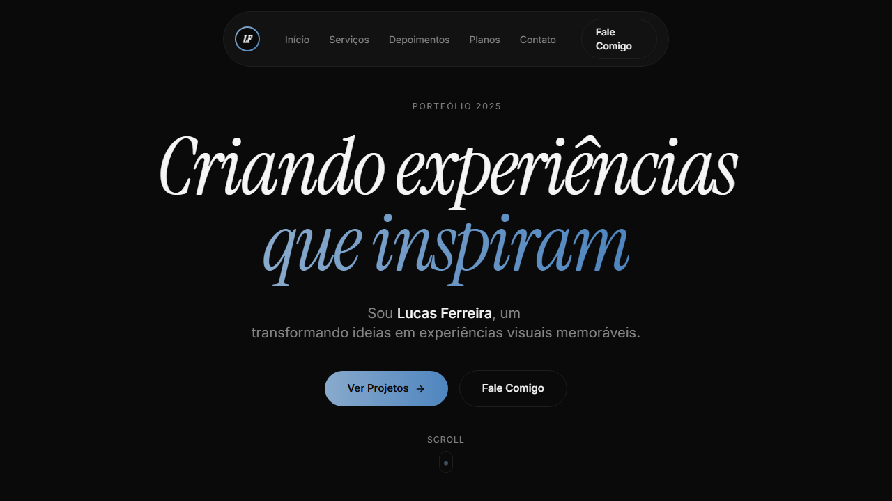
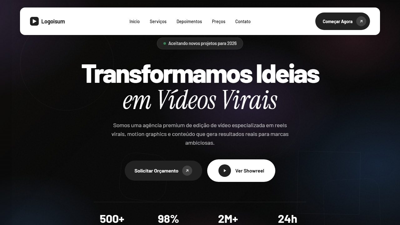
Dark Portfolio Hero
Estilo Dark Portfolio com loading screen animado, vídeo HLS, GSAP animations e gradient accent azul. Ideal para portfólios de desenvolvedores, designers e criativos fullstack.
Uso: Portfólios de desenvolvedores, Designers criativos, Freelancers fullstack, Sites pessoais premium
Contexto Histórico
Representa o ápice dos portfólios pessoais premium, combinando loading screens cinematográficos, GSAP animations, vídeo HLS e micro-interações sofisticadas.
Especificações Técnicas
Cores
Primárias
Secundárias
Efeitos
VÍDEO: Stream HLS (~17s loop) com animação abstrata de fluido escuro. Ondas e gradientes orgânicos em tons de azul marinho profundo (#1a2a4a) e preto, com movimento suave e contínuo sem texto ou objetos. Aspect ratio ~2:1 (332x160px storyboard). Overlay preto 20% sutil e gradient fade inferior (h-48 from bg to transparent) fundem o vídeo no fundo #0a0a0a da página. Cria atmosfera contemplativa e premium para o portfólio. | EFEITOS CSS: Loading screen animado (2.7s): contador 000→100 via requestAnimationFrame, palavras rotativas (Design→Create→Inspire) com AnimatePresence, barra de progresso gradiente azul com glow, fade-out 0.6s. Hero com vídeo HLS de fundo (fluid/wave dark blue), overlay preto 20%, gradient fade inferior h-48. Pill navbar flutuante com logo gradiente azul ring 36x36px, links pill active state, botão Say hi com gradient border hover. Headline massiva Instrument Serif italic com GSAP entrance (y 50→0, 1.2s). Role cycling a cada 2s com fade-in. Scroll indicator com dot animado translateY loop 1.5s. Botões CTA com gradient border hover technique
Light/Dark
✗ Not Recommended / ✓ Full
CSS
font-family: 'Inter' / 'Instrument Serif' italic, --bg: #0a0a0a, --surface: #141414, --text: #f5f5f5, --stroke: #1f1f1f, gradient: linear-gradient(90deg, #89AACC, #4E85BF), video: HLS with bg-black/20, GSAP: power3.out y 50→0 1.2s, animation: scroll-down 1.5s infinite, loading: 2.7s counter + words + progress
Variáveis
--bg: #0a0a0a, --surface: #141414, --text: #f5f5f5, --muted: #888888, --accent: #f5f5f5, --stroke: #1f1f1f, --gradient-accent: linear-gradient(90deg, #89AACC, #4E85BF), --glow: rgba(137,170,204,0.35), --font-body: 'Inter', --font-display: 'Instrument Serif', --loading-duration: 2.7s
Checklist
☐ Loading screen 2.7s contador + palavras rotativas, ☐ Barra progresso gradiente azul glow, ☐ Vídeo HLS fundo overlay 20%, ☐ Gradient fade inferior h-48, ☐ Pill navbar logo gradiente ring, ☐ Headline Instrument Serif GSAP, ☐ Role cycling 2s, ☐ Scroll indicator dot animado, ☐ Botões gradient border hover, ☐ Responsivo
DESIGN.md
Design System: Dark Portfolio Hero
1. Visual Theme & Atmosphere
Estilo Dark Portfolio com loading screen animado, vídeo HLS, GSAP animations e gradient accent azul. Ideal para portfólios de desenvolvedores, designers e criativos fullstack. Representa o ápice dos portfólios pessoais premium, combinando loading screens cinematográficos, GSAP animations, vídeo HLS e micro-interações sofisticadas.
- Density: 5/10 — Balanced
- Variance: 4/10 — Moderate
- Motion: 8/10 — Cinematic
2. Color Palette & Roles
- Preto Fundo (#0a0a0a) — Primary background surface
- Superfície (#141414) — Secondary surface or text color
- Texto (#f5f5f5) — Primary text color
- Muted (#888888) — Secondary text, borders, muted elements
- Acento (#f5f5f5) — Extended palette, decorative use
- Stroke (#1f1f1f) — Extended palette, decorative use
- Gradiente Azul from (#89AACC) — Secondary accent
- to (#4E85BF) — Extended palette, decorative use
- Glow (rgba(137,170,204,0.35)) — Extended palette, decorative use
3. Typography Rules
- Display / Hero: Inter — Weight 700, tight tracking, used for headline impact
- Accent: Instrument Serif — Used for decorative or emphasis text
- Body: Inter — Weight 400, 16px/1.6 line-height, max 72ch per line
- UI Labels / Captions: Inter — 0.875rem, weight 500, slight letter-spacing
- Monospace: JetBrains Mono — Used for code, metadata, and technical values
Scale:
- Hero: clamp(2.5rem, 5vw, 4rem)
- H1: 2.25rem
- H2: 1.5rem
- Body: 1rem / 1.6
- Small: 0.875rem
4. Component Stylings
- Primary Button: Pill-shaped (9999px) shape. Accent color fill. Hover: 8% darken + subtle lift shadow. Active: -1px translate tactile press. Font weight 600. No outer glows.
- Secondary / Ghost Button: Outline variant. 1.5px border in muted color. Text in primary color. Hover: subtle background fill.
- Cards: Pill-shaped (9999px) corners. Surface background. Subtle shadow (0 2px 12px rgba(0,0,0,0.06)). 1px border stroke.
- Inputs: Label above input. 1px border stroke. Focus ring: 2px accent color offset 2px. Error text below in semantic red. No floating labels.
- Navigation: Primary surface background. Active item: accent color indicator. Font weight 500 when active.
- Skeletons: Shimmer animation matching component dimensions. No circular spinners.
- Empty States: Icon-based composition with descriptive text and action button.
5. Layout Principles
- Grid: CSS Grid primary. Max-width containment: 1280px centered with 1.5rem side padding.
- Spacing rhythm: Balanced. Base unit: 0.5rem (8px).
- Section vertical gaps: clamp(4rem, 8vw, 8rem).
- Hero layout: Split-screen (text left, visual right).
- Feature sections: Zig-zag alternating text+image rows. No 3-equal-columns.
- Mobile collapse: All multi-column layouts collapse below 768px. No horizontal overflow.
- z-index contract: base (0) / sticky-nav (100) / overlay (200) / modal (300) / toast (500).
6. Motion & Interaction
- Physics: Spring — stiffness 120, damping 20. Confident, weighted transitions.
- Entry animations: Fade + translate-Y (16px → 0) over 540ms ease-out. Staggered cascades for lists: 120ms between items.
- Hover states: Scale(1.03) + shadow lift over 200ms.
- Page transitions: Fade + slide (300ms).
- Performance: Only transform and opacity animated. No layout-triggering properties.
7. Anti-Patterns (Banned)
- No emojis in UI — use icon system only (Lucide, Heroicons)
- No pure black (#000000) — use off-black or charcoal variants
- No oversaturated accent colors (saturation cap: 80%)
- No 3-column equal-width feature layouts — use zig-zag or asymmetric grid
- No
h-screen— usemin-h-[100dvh] - No AI copywriting clichés: "Elevate", "Seamless", "Unleash", "Next-Gen"
- No broken external image links — use picsum.photos or inline SVG
- No generic lorem ipsum in demos
Prompt para AI
Design a dark portfolio with animated loading screen (2.7s): counter 000→100 via rAF, rotating words with AnimatePresence, gradient progress bar (#89AACC to #4E85BF) with glow. Hero with HLS video (dark fluid waves), 20% black overlay, bottom fade h-48. Floating pill navbar with gradient blue ring logo 36x36, pill links, gradient border hover. Massive headline Instrument Serif italic with GSAP y 50→0. Role cycling every 2s. Scroll indicator animated dot. CTA gradient border hover.
Relacionados
Última sincronização: 01/04/2026