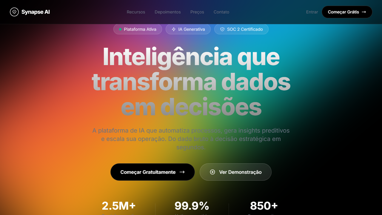
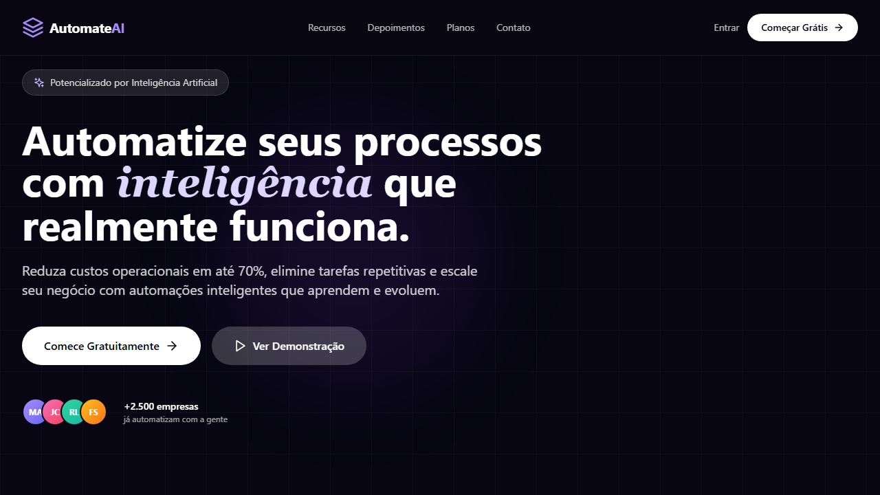
Synapse Dark Hero
Estilo Synapse Dark com fundo preto puro, vídeo HLS flutuante, badges glassmorphism e animações staggered. Ideal para SaaS de inovação, plataformas AI e ferramentas enterprise.
Uso: SaaS de inovação, Plataformas de AI, Ferramentas enterprise, Startups de tecnologia
Contexto Histórico
Representa o pico da estética dark SaaS com vídeo flutuante e glassmorphism, popularizada por empresas como Linear, Vercel e Raycast.
Especificações Técnicas
Cores
Primárias
Secundárias
Efeitos
VÍDEO: Stream HLS curto (~5s loop) com visual abstrato minimalista. Formas geométricas ou partículas sutis em movimento sobre fundo escuro. Aspect ratio ~16:9 (276x160px storyboard). Exibido em opacity 100% sem overlay, posicionado com height 80vh e absolute bottom-[35vh], flutuando atrás do conteúdo de texto. O vídeo cria profundidade visual sem competir com o conteúdo. | EFEITOS CSS: Fundo preto puro com vídeo HLS (opacity 100%, sem overlay) posicionado em height 80vh e bottom-[35vh] flutuando atrás do texto, navbar fixa com blur glassmorphism, 3 badges glassmorphism em row, headline massiva (~80px) com animação fade-in-up, botões sólido preto com borda branca e glass transparente, logo marquee estático grayscale opacity-40, animações staggered via Framer Motion
Light/Dark
✗ Not Recommended / ✓ Full
CSS
background: #000000, video: HLS opacity-100 h-[80vh] absolute bottom-[35vh], backdrop-filter: blur(12px), background: rgba(255,255,255,0.1), font-size: ~80px, animation: staggered fade-in-up, filter: grayscale(1) opacity(0.4), border: 1px solid rgba(255,255,255,0.2)
Variáveis
--bg-primary: #000000, --text-primary: #FFFFFF, --text-muted: #6B7280, --glass-bg: rgba(255,255,255,0.1), --glass-border: rgba(255,255,255,0.2), --video-height: 80vh, --video-bottom: 35vh, --headline-size: 80px, --logo-opacity: 0.4
Checklist
☐ Fundo preto puro com vídeo HLS sem overlay, ☐ Vídeo h-80vh bottom-35vh, ☐ Navbar fixa blur glass, ☐ 3 badges glassmorphism, ☐ Headline ~80px fade-in-up, ☐ Botão preto + glass transparente, ☐ Logo marquee grayscale, ☐ Animações staggered, ☐ Responsivo
DESIGN.md
Design System: Synapse Dark Hero
1. Visual Theme & Atmosphere
Estilo Synapse Dark com fundo preto puro, vídeo HLS flutuante, badges glassmorphism e animações staggered. Ideal para SaaS de inovação, plataformas AI e ferramentas enterprise. Representa o pico da estética dark SaaS com vídeo flutuante e glassmorphism, popularizada por empresas como Linear, Vercel e Raycast.
- Density: 5/10 — Balanced
- Variance: 4/10 — Moderate
- Motion: 8/10 — Cinematic
2. Color Palette & Roles
- Preto Puro (#000000) — Dark surface, primary background
- Branco (#FFFFFF) — Light surface, card backgrounds
- Cinza Gradiente from (#FFFFFF) — Secondary text, borders, muted elements
- to (#888888) — Supporting palette color
- Cinza Muted (#6B7280) — Secondary text, borders, muted elements
- Preto Botão (#000000) — Deep contrast surface
- Vidro Badge (rgba(255,255,255,0.1)) — Extended palette, decorative use
- Borda Gradiente (rgba(255,255,255,0.3)) — Extended palette, decorative use
- Borda Branca (rgba(255,255,255,0.2)) — Extended palette, decorative use
3. Typography Rules
- Display / Hero: System UI stack (-apple-system, sans-serif) — Weight 700, tight tracking, used for headline impact
- Body: System UI stack (-apple-system, sans-serif) — Weight 400, 16px/1.6 line-height, max 72ch per line
- UI Labels / Captions: System UI stack (-apple-system, sans-serif) — 0.875rem, weight 500, slight letter-spacing
- Monospace: JetBrains Mono — Used for code, metadata, and technical values
Scale:
- Hero: clamp(2.5rem, 5vw, 4rem)
- H1: 2.25rem
- H2: 1.5rem
- Body: 1rem / 1.6
- Small: 0.875rem
4. Component Stylings
- Primary Button: Subtly rounded (0.5rem) shape. Accent color fill. Hover: 8% darken + subtle lift shadow. Active: -1px translate tactile press. Font weight 600. No outer glows.
- Secondary / Ghost Button: Outline variant. 1.5px border in muted color. Text in primary color. Hover: subtle background fill.
- Cards: Subtly rounded (0.5rem) corners. Surface background. Subtle shadow (0 2px 12px rgba(0,0,0,0.06)). 1px border stroke.
- Inputs: Label above input. 1px border stroke. Focus ring: 2px accent color offset 2px. Error text below in semantic red. No floating labels.
- Navigation: Primary surface background. Active item: accent color indicator. Font weight 500 when active.
- Skeletons: Shimmer animation matching component dimensions. No circular spinners.
- Empty States: Icon-based composition with descriptive text and action button.
5. Layout Principles
- Grid: CSS Grid primary. Max-width containment: 1280px centered with 1.5rem side padding.
- Spacing rhythm: Balanced. Base unit: 0.5rem (8px).
- Section vertical gaps: clamp(4rem, 8vw, 8rem).
- Hero layout: Split-screen (text left, visual right).
- Feature sections: Zig-zag alternating text+image rows. No 3-equal-columns.
- Mobile collapse: All multi-column layouts collapse below 768px. No horizontal overflow.
- z-index contract: base (0) / sticky-nav (100) / overlay (200) / modal (300) / toast (500).
6. Motion & Interaction
- Physics: Spring — stiffness 120, damping 20. Confident, weighted transitions.
- Entry animations: Fade + translate-Y (16px → 0) over 540ms ease-out. Staggered cascades for lists: 120ms between items.
- Hover states: Scale(1.03) + shadow lift over 200ms.
- Page transitions: Fade + slide (300ms).
- Performance: Only transform and opacity animated. No layout-triggering properties.
7. Anti-Patterns (Banned)
- No emojis in UI — use icon system only (Lucide, Heroicons)
- No pure black (#000000) — use off-black or charcoal variants
- No oversaturated accent colors (saturation cap: 80%)
- No 3-column equal-width feature layouts — use zig-zag or asymmetric grid
- No
h-screen— usemin-h-[100dvh] - No AI copywriting clichés: "Elevate", "Seamless", "Unleash", "Next-Gen"
- No broken external image links — use picsum.photos or inline SVG
- No generic lorem ipsum in demos
Prompt para AI
Design a pure black SaaS hero with HLS video at 100% opacity no overlay, positioned at height 80vh and absolute bottom-[35vh]. Fixed navbar with blur glass. Row of 3 glassmorphism badges. Massive headline ~80px with fade-in-up. Solid black CTA with white border and transparent glass secondary. Static grayscale logo marquee at 40% opacity. Staggered entrance animations via Framer Motion.
Relacionados
Última sincronização: 01/04/2026