New Era Automotive Hero
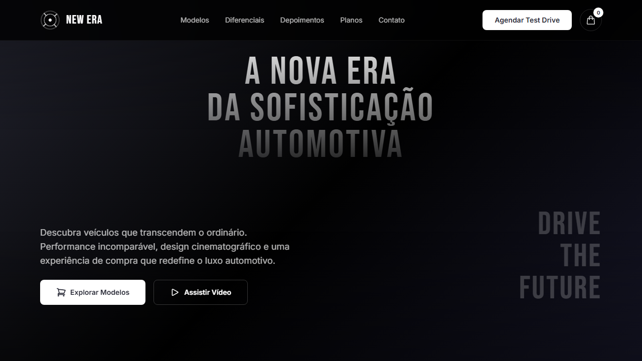
Estilo New Era Automotive com vídeo cinematográfico, tipografia decorativa gigante e gradient overlays. Ideal para concessionárias, marketplaces de carros e marcas automotivas.
Uso: Concessionárias de carros, Marketplaces automotivos, Marcas de veículos, Landing pages de lançamento
Contexto Histórico
Combina a estética cinematográfica de comerciais automotivos com tipografia decorativa oversized, criando uma experiência imersiva que reflete luxo e inovação.
Especificações Técnicas
Cores
Primárias
Secundárias
Efeitos
VÍDEO: Vídeo cinematográfico automotivo com cenas de carros em movimento, estradas ou detalhes de veículos em tons escuros e elegantes. Filmagem em câmera lenta com iluminação dramática, transmitindo luxo e performance. Gradient overlays no topo e base (260px, from black/30 to transparent) garantem legibilidade do texto decorativo gigante sobreposto. | EFEITOS CSS: Vídeo de fundo tela cheia (min 600px, max 965px) com gradient overlays no topo e base (260px, from black/30 to transparent), texto decorativo gigante centralizado (75% largura) com gradient fill vertical (branco 83% opacity para 12%), navbar com logo spinner e botão Cart arredondado, CTA inferior com parágrafo + botão esquerda e tagline Bebas Neue 64px direita
Light/Dark
✗ Not Recommended / ✓ Full
CSS
font-family: 'Inter' / 'Bebas Neue', video: object-cover min-h-[600px] max-h-[965px], gradient: 260px from rgba(0,0,0,0.3) to transparent, decorative text: 75% width gradient fill, font-size: 64px tagline, button: rounded-lg bg-white, padding: 80px horizontal
Variáveis
--bg-primary: #010101, --text-primary: #FFFFFF, --text-button: #272835, --overlay: rgba(0,0,0,0.3), --overlay-height: 260px, --font-body: 'Inter', --font-display: 'Bebas Neue', --tagline-size: 64px, --padding-x: 80px
Checklist
☐ Vídeo tela cheia min 600px max 965px, ☐ Gradient overlays topo e base, ☐ Texto decorativo gigante gradient fill, ☐ Navbar com logo spinner e Cart, ☐ CTA inferior split layout, ☐ Bebas Neue 64px tagline, ☐ Responsivo stack mobile, ☐ Inter + Bebas Neue
DESIGN.md
Design System: New Era Automotive Hero
1. Visual Theme & Atmosphere
Estilo New Era Automotive com vídeo cinematográfico, tipografia decorativa gigante e gradient overlays. Ideal para concessionárias, marketplaces de carros e marcas automotivas. Combina a estética cinematográfica de comerciais automotivos com tipografia decorativa oversized, criando uma experiência imersiva que reflete luxo e inovação.
- Density: 5/10 — Balanced
- Variance: 4/10 — Moderate
- Motion: 8/10 — Cinematic
2. Color Palette & Roles
- Preto (#010101) — Dark surface, primary background
- Branco (#FFFFFF) — Light surface, card backgrounds
- Branco Suave (#FBFBFD) — Light surface, card backgrounds
- Cinza Claro (#EEEFF2) — Secondary text, borders, muted elements
- Branco Botão (#FFFFFF) — Secondary surface
- Cinza Escuro (#272835) — Deep contrast surface
- Preto Overlay (rgba(0,0,0,0.3)) — Deep contrast surface
- Sombra Sutil (rgba(0,0,0,0.1)) — Extended palette, decorative use
3. Typography Rules
- Display / Hero: Inter — Weight 700, tight tracking, used for headline impact
- Accent: Bebas Neue — Used for decorative or emphasis text
- Body: Inter — Weight 400, 16px/1.6 line-height, max 72ch per line
- UI Labels / Captions: Inter — 0.875rem, weight 500, slight letter-spacing
- Monospace: JetBrains Mono — Used for code, metadata, and technical values
Scale:
- Hero: clamp(2.5rem, 5vw, 4rem)
- H1: 2.25rem
- H2: 1.5rem
- Body: 1rem / 1.6
- Small: 0.875rem
4. Component Stylings
- Primary Button: Moderately rounded (0.75rem) shape. Accent color fill. Hover: 8% darken + subtle lift shadow. Active: -1px translate tactile press. Font weight 600. No outer glows.
- Secondary / Ghost Button: Outline variant. 1.5px border in muted color. Text in primary color. Hover: subtle background fill.
- Cards: Moderately rounded (0.75rem) corners. Surface background. Subtle shadow (0 2px 12px rgba(0,0,0,0.06)). 1px border stroke.
- Inputs: Label above input. 1px border stroke. Focus ring: 2px accent color offset 2px. Error text below in semantic red. No floating labels.
- Navigation: Primary surface background. Active item: accent color indicator. Font weight 500 when active.
- Skeletons: Shimmer animation matching component dimensions. No circular spinners.
- Empty States: Icon-based composition with descriptive text and action button.
5. Layout Principles
- Grid: CSS Grid primary. Max-width containment: 1280px centered with 1.5rem side padding.
- Spacing rhythm: Balanced. Base unit: 0.5rem (8px).
- Section vertical gaps: clamp(4rem, 8vw, 8rem).
- Hero layout: Split-screen (text left, visual right).
- Feature sections: Zig-zag alternating text+image rows. No 3-equal-columns.
- Mobile collapse: All multi-column layouts collapse below 768px. No horizontal overflow.
- z-index contract: base (0) / sticky-nav (100) / overlay (200) / modal (300) / toast (500).
6. Motion & Interaction
- Physics: Spring — stiffness 120, damping 20. Confident, weighted transitions.
- Entry animations: Fade + translate-Y (16px → 0) over 540ms ease-out. Staggered cascades for lists: 120ms between items.
- Hover states: Scale(1.03) + shadow lift over 200ms.
- Page transitions: Fade + slide (300ms).
- Performance: Only transform and opacity animated. No layout-triggering properties.
7. Anti-Patterns (Banned)
- No emojis in UI — use icon system only (Lucide, Heroicons)
- No pure white (#FFFFFF) backgrounds — use off-white or dark surfaces
- No oversaturated accent colors (saturation cap: 80%)
- No 3-column equal-width feature layouts — use zig-zag or asymmetric grid
- No
h-screen— usemin-h-[100dvh] - No AI copywriting clichés: "Elevate", "Seamless", "Unleash", "Next-Gen"
- No broken external image links — use picsum.photos or inline SVG
- No generic lorem ipsum in demos
Prompt para AI
Design an automotive hero with full-viewport video (min 600px, max 965px). Top and bottom gradient overlays 260px. Large decorative text centered at 15% from top spanning 75% width with vertical gradient fill. Navbar with spinner logo and rounded Cart button. Bottom CTA: paragraph + Shop Now left, Bebas Neue 64px tagline right. Inter and Bebas Neue fonts.
Relacionados
Última sincronização: 01/04/2026