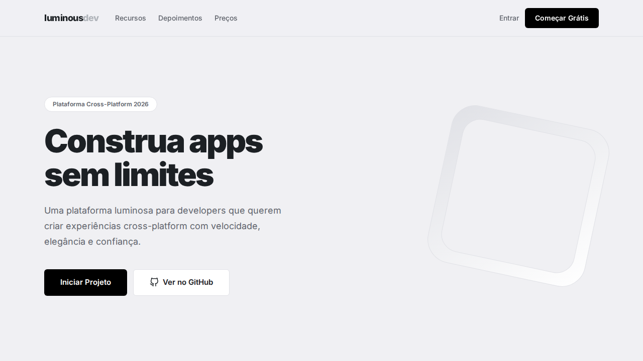
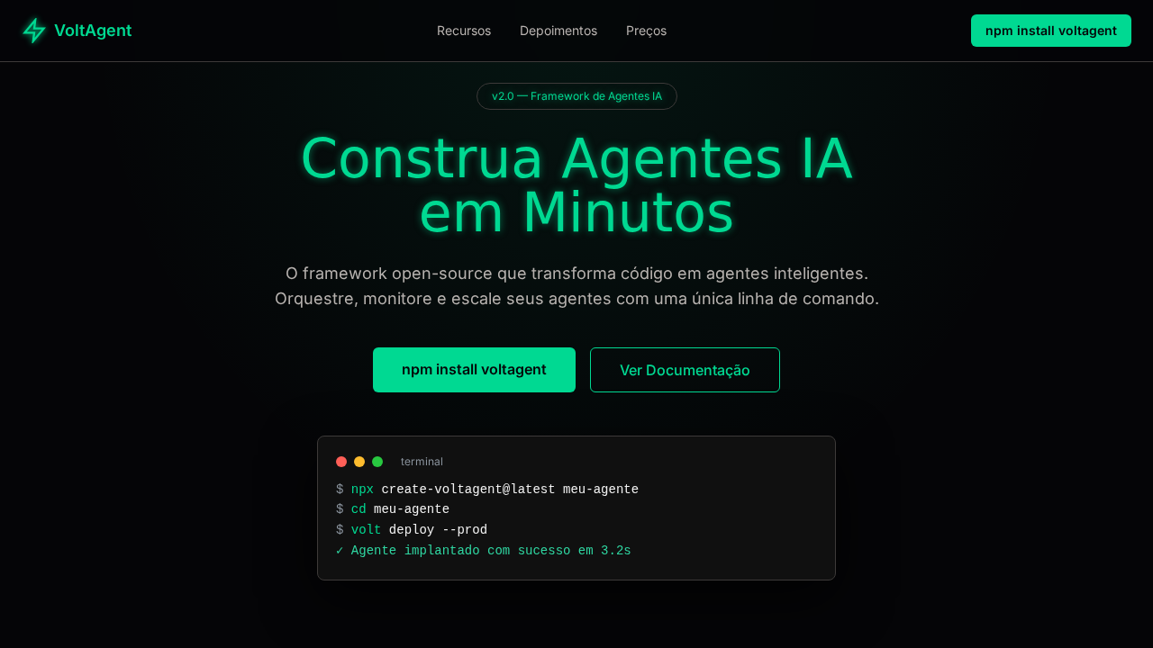
Expo Luminous Developer
Estilo Expo Luminous Developer com canvas luminoso, geometria pill e tipografia Inter full-range. Ideal para plataformas cross-platform e React Native.
Uso: Plataformas cross-platform, React Native, SDKs mobile, Ferramentas de build
Contexto Histórico
Inspirado no design do Expo, que trata espaço em branco como elemento de design premium com geometria pill amigável para developers.
Especificações Técnicas
Cores
Primárias
Secundárias
Efeitos
Canvas luminoso cool-white (#f0f0f3) com espaçamento vertical de galeria. Estritamente monocromático — cor apenas em screenshots de produto. Geometria pill em todo lugar (24px-9999px). Headlines massivas (64px) com letter-spacing extremo negativo (-1.6px a -3px). Inter como única fonte, pesos 400-900. Sombras whisper-soft que mal levantam elementos. Cards brancos flutuando sobre Cloud Gray.
Light/Dark
✓ Full / ✗ Not Recommended
CSS
background: #f0f0f3; color: #1c2024; accent: #0d74ce; border: 1px solid #e0e1e6; box-shadow: rgba(0,0,0,0.08) 0px 3px 6px; font-family: 'Inter', sans-serif; font-weight: 700-900 display; letter-spacing: -3px at 64px; border-radius: 6px buttons, 24px containers, 9999px pills
Variáveis
--bg: #f0f0f3; --card: #ffffff; --text: #1c2024; --text-secondary: #60646c; --text-muted: #b0b4ba; --link: #0d74ce; --border: #e0e1e6; --radius-btn: 6px; --radius-container: 24px; --radius-pill: 9999px
Checklist
☐ Canvas cool-white #f0f0f3, ☐ Monocromático — cor só em screenshots, ☐ Pill geometry 24px-9999px, ☐ Headlines 64px tracking negativo extremo, ☐ Inter 400-900, ☐ Sombras whisper, ☐ Espaçamento de galeria 96px+, ☐ Responsivo
DESIGN.md
Design System: Expo Luminous Developer
1. Visual Theme & Atmosphere
Estilo Expo Luminous Developer com canvas luminoso, geometria pill e tipografia Inter full-range. Ideal para plataformas cross-platform e React Native. Inspirado no design do Expo, que trata espaço em branco como elemento de design premium com geometria pill amigável para developers.
- Density: 5/10 — Balanced
- Variance: 4/10 — Moderate
- Motion: 4/10 — Subtle
2. Color Palette & Roles
- Cloud Gray (#f0f0f3) — Secondary text, borders, muted elements
- Preto (#000000) — Dark surface, primary background
- Quase Preto (#1c2024) — Dark surface, primary background
- Branco (#ffffff) — Light surface, card backgrounds
- Slate Gray (#60646c) — Secondary text, borders, muted elements
- Silver (#b0b4ba) — Extended palette, decorative use
- Cobalt Link (#0d74ce) — Primary text color
- Borda Lavanda (#e0e1e6) — Extended palette, decorative use
3. Typography Rules
- Display / Hero: Inter — Weight 700, tight tracking, used for headline impact
- Body: Inter — Weight 400, 16px/1.6 line-height, max 72ch per line
- UI Labels / Captions: Inter — 0.875rem, weight 500, slight letter-spacing
- Monospace: JetBrains Mono — Used for code, metadata, and technical values
Scale:
- Hero: clamp(2.5rem, 5vw, 4rem)
- H1: 2.25rem
- H2: 1.5rem
- Body: 1rem / 1.6
- Small: 0.875rem
4. Component Stylings
- Primary Button: Pill-shaped (9999px) shape. Accent color fill. Hover: 8% darken + subtle lift shadow. Active: -1px translate tactile press. Font weight 600. No outer glows.
- Secondary / Ghost Button: Outline variant. 1.5px border in muted color. Text in primary color. Hover: subtle background fill.
- Cards: Pill-shaped (9999px) corners. Surface background. Subtle shadow (0 2px 12px rgba(0,0,0,0.06)). 1px border stroke.
- Inputs: Label above input. 1px border stroke. Focus ring: 2px accent color offset 2px. Error text below in semantic red. No floating labels.
- Navigation: Primary surface background. Active item: accent color indicator. Font weight 500 when active.
- Skeletons: Shimmer animation matching component dimensions. No circular spinners.
- Empty States: Icon-based composition with descriptive text and action button.
5. Layout Principles
- Grid: CSS Grid primary. Max-width containment: 1280px centered with 1.5rem side padding.
- Spacing rhythm: Balanced. Base unit: 0.5rem (8px).
- Section vertical gaps: clamp(4rem, 8vw, 8rem).
- Hero layout: Split-screen (text left, visual right).
- Feature sections: Zig-zag alternating text+image rows. No 3-equal-columns.
- Mobile collapse: All multi-column layouts collapse below 768px. No horizontal overflow.
- z-index contract: base (0) / sticky-nav (100) / overlay (200) / modal (300) / toast (500).
6. Motion & Interaction
- Physics: Ease-out curves, 200-300ms duration. Smooth and predictable.
- Entry animations: Fade + translate-Y (16px → 0) over 420ms ease-out. Staggered cascades for lists: 80ms between items.
- Hover states: Subtle color shift + shadow adjustment over 200ms.
- Page transitions: Fade only (200ms).
- Performance: Only transform and opacity animated. No layout-triggering properties.
7. Anti-Patterns (Banned)
- No emojis in UI — use icon system only (Lucide, Heroicons)
- No pure black (#000000) — use off-black or charcoal variants
- No oversaturated accent colors (saturation cap: 80%)
- No 3-column equal-width feature layouts — use zig-zag or asymmetric grid
- No
h-screen— usemin-h-[100dvh] - No AI copywriting clichés: "Elevate", "Seamless", "Unleash", "Next-Gen"
- No broken external image links — use picsum.photos or inline SVG
- No generic lorem ipsum in demos
Prompt para AI
Design an Expo-inspired luminous developer landing page. Cool-white canvas (#f0f0f3) with gallery-like vertical spacing (96px+). Strictly monochromatic — product screenshots provide the only color. Pill-shaped geometry everywhere (24px-9999px radius). Massive display headlines at 64px with extreme negative letter-spacing (-1.6px to -3px). Inter as sole typeface at weights 400-900. Whisper-soft shadows. White cards floating on Cloud Gray background. Black (#000000) for headlines and primary CTAs.
Relacionados
Última sincronização: 01/04/2026