Glassmorphism Agency Hero
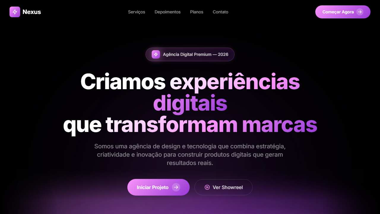
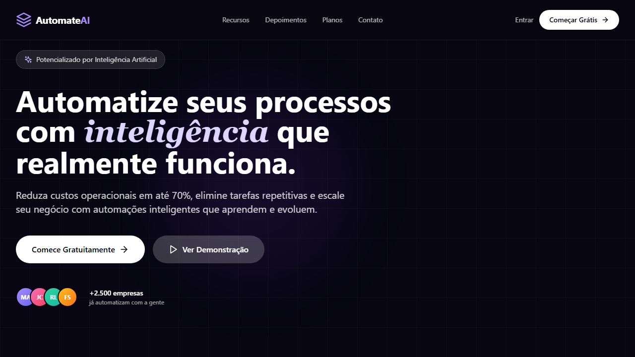
Estilo Glassmorphism Agency com vídeo mix-blend-screen, gradiente roxo-rosa e slider infinito de logos. Ideal para agências digitais, estúdios criativos e consultorias.
Uso: Agências digitais, Estúdios criativos, Consultorias de design, Portfólios de agência
Contexto Histórico
Combina glassmorphism com vídeo em mix-blend-screen, técnica avançada que funde o vídeo com o fundo. O slider infinito de logos é padrão em landing pages de agências modernas.
Especificações Técnicas
Cores
Primárias
Secundárias
Efeitos
VÍDEO: Stream HLS via Cloudflare com visual abstrato de luz e movimento em tons escuros. Efeitos de luz, partículas ou formas fluidas que se fundem com o fundo preto da página via mix-blend-screen (o preto do vídeo se torna transparente). Posicionado na parte inferior do hero com margin-top negativo (-150px), criando sobreposição atrás do texto. Gradient overlay (from #010101 via transparent to #010101) nas bordas. | EFEITOS CSS: Vídeo HLS com mix-blend-screen (fundo preto do vídeo se funde com a página), vídeo na parte inferior do hero com margin-top negativo (-150px) sobrepondo atrás do texto, gradient overlay, pill badge com ícone Zap em caixa gradiente com glow, headline com gradient fill (branco para roxo/rosa), botão CTA com círculo gradiente e seta, logo cloud animado com InfiniteSlider horizontal infinito, logos em brightness-0 invert
Light/Dark
✗ Not Recommended / ✓ Full
CSS
background: #010101, video: mix-blend-screen w-full h-auto -mt-[150px], gradient: linear-gradient(#FA93FA, #C967E8, #983AD6), -webkit-background-clip: text, animation: infinite translateX for slider, filter: brightness(0) invert(1)
Variáveis
--bg-primary: #010101, --gradient-primary: linear-gradient(#FA93FA, #C967E8, #983AD6), --text-primary: #FFFFFF, --glass-bg: rgba(28,27,36,0.15), --border-subtle: rgba(255,255,255,0.05), --video-margin: -150px, --blend-mode: screen
Checklist
☐ Vídeo HLS com mix-blend-screen, ☐ Vídeo inferior com margin negativo, ☐ Gradient overlay, ☐ Badge com Zap icon e glow, ☐ Headline gradient text fill, ☐ CTA com círculo gradiente, ☐ Logo cloud infinite slider, ☐ Logos brancos invertidos, ☐ Responsivo
DESIGN.md
Design System: Glassmorphism Agency Hero
1. Visual Theme & Atmosphere
Estilo Glassmorphism Agency com vídeo mix-blend-screen, gradiente roxo-rosa e slider infinito de logos. Ideal para agências digitais, estúdios criativos e consultorias. Combina glassmorphism com vídeo em mix-blend-screen, técnica avançada que funde o vídeo com o fundo. O slider infinito de logos é padrão em landing pages de agências modernas.
- Density: 5/10 — Balanced
- Variance: 4/10 — Moderate
- Motion: 4/10 — Subtle
2. Color Palette & Roles
- Preto Base (#010101) — Primary background surface
- Rosa (#FA93FA) — Decorative accent, highlight elements
- Roxo Médio (#C967E8) — Accent color, emphasis elements
- Roxo Escuro (#983AD6) — Dark surface, primary background
- Preto Overlay (#010101) — Deep contrast surface
- Vidro Escuro (rgba(28,27,36,0.15)) — Deep contrast surface
- **** (rgba(255,255,255,0.8)) — Extended palette, decorative use
- Borda Sutil (rgba(255,255,255,0.05)) — Extended palette, decorative use
3. Typography Rules
- Display / Hero: System UI stack (-apple-system, sans-serif) — Weight 700, tight tracking, used for headline impact
- Body: System UI stack (-apple-system, sans-serif) — Weight 400, 16px/1.6 line-height, max 72ch per line
- UI Labels / Captions: System UI stack (-apple-system, sans-serif) — 0.875rem, weight 500, slight letter-spacing
- Monospace: JetBrains Mono — Used for code, metadata, and technical values
Scale:
- Hero: clamp(2.5rem, 5vw, 4rem)
- H1: 2.25rem
- H2: 1.5rem
- Body: 1rem / 1.6
- Small: 0.875rem
4. Component Stylings
- Primary Button: Subtly rounded (0.5rem) shape. Accent color fill. Hover: 8% darken + subtle lift shadow. Active: -1px translate tactile press. Font weight 600. No outer glows.
- Secondary / Ghost Button: Outline variant. 1.5px border in muted color. Text in primary color. Hover: subtle background fill.
- Cards: Subtly rounded (0.5rem) corners. Surface background. Subtle shadow (0 2px 12px rgba(0,0,0,0.06)). 1px border stroke.
- Inputs: Label above input. 1px border stroke. Focus ring: 2px accent color offset 2px. Error text below in semantic red. No floating labels.
- Navigation: Primary surface background. Active item: accent color indicator. Font weight 500 when active.
- Skeletons: Shimmer animation matching component dimensions. No circular spinners.
- Empty States: Icon-based composition with descriptive text and action button.
5. Layout Principles
- Grid: CSS Grid primary. Max-width containment: 1280px centered with 1.5rem side padding.
- Spacing rhythm: Balanced. Base unit: 0.5rem (8px).
- Section vertical gaps: clamp(4rem, 8vw, 8rem).
- Hero layout: Split-screen (text left, visual right).
- Feature sections: Zig-zag alternating text+image rows. No 3-equal-columns.
- Mobile collapse: All multi-column layouts collapse below 768px. No horizontal overflow.
- z-index contract: base (0) / sticky-nav (100) / overlay (200) / modal (300) / toast (500).
6. Motion & Interaction
- Physics: Ease-out curves, 200-300ms duration. Smooth and predictable.
- Entry animations: Fade + translate-Y (16px → 0) over 420ms ease-out. Staggered cascades for lists: 80ms between items.
- Hover states: Subtle color shift + shadow adjustment over 200ms.
- Page transitions: Fade only (200ms).
- Performance: Only transform and opacity animated. No layout-triggering properties.
7. Anti-Patterns (Banned)
- No emojis in UI — use icon system only (Lucide, Heroicons)
- No pure white (#FFFFFF) backgrounds — use off-white or dark surfaces
- No oversaturated accent colors (saturation cap: 80%)
- No 3-column equal-width feature layouts — use zig-zag or asymmetric grid
- No
h-screen— usemin-h-[100dvh] - No AI copywriting clichés: "Elevate", "Seamless", "Unleash", "Next-Gen"
- No broken external image links — use picsum.photos or inline SVG
- No generic lorem ipsum in demos
Prompt para AI
Design a dark agency hero with HLS video using mix-blend-screen. Video at bottom with negative top margin overlapping behind text. Gradient overlay. Pill badge with Zap icon in gradient box with glow. Large headline with text gradient fill white to purple/pink. CTA with gradient circle arrow. Animated infinite logo slider with white inverted logos. Primary gradient: #FA93FA via #C967E8 to #983AD6.
Relacionados
Última sincronização: 01/04/2026