Memphis
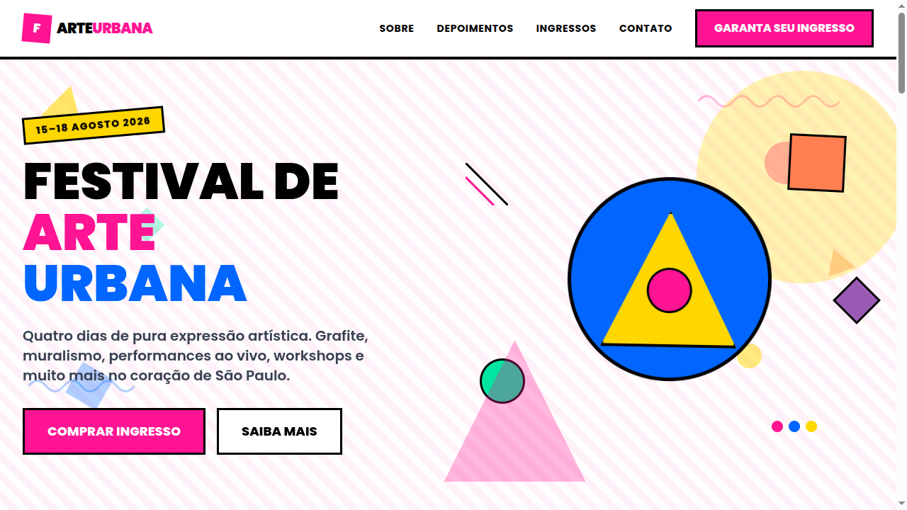
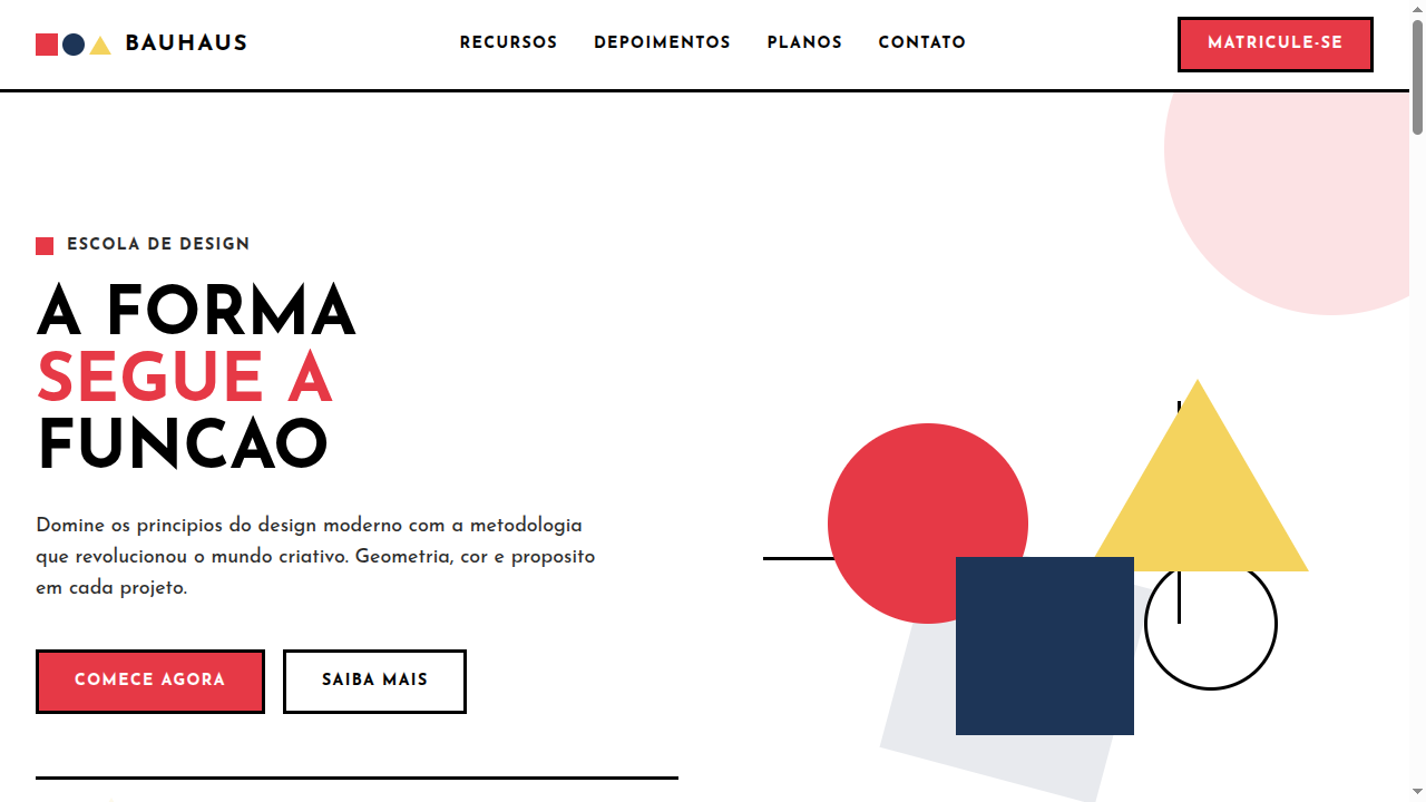
Estilo Memphis com cores vibrantes, formas geométricas ousadas e estética pós-moderna dos anos 80. Ideal para branding retro, peças editoriais e embalagens funky.
Uso: Branding retro, Peças editoriais, Embalagens funky, Campanhas jovens
Contexto Histórico
O Memphis Group (1981, Milão) revolucionou o design com cores vibrantes e formas geométricas ousadas, rejeitando o minimalismo. Liderado por Ettore Sottsass, influenciou moda, móveis e gráficos.
Especificações Técnicas
Cores
Primárias
Secundárias
Efeitos
Bold geometric shapes as decorative elements (CSS triangles, circles), squiggly line borders via SVG, confetti-like scattered patterns, playful rotation on hover (5-15deg), pop-in animations, dotted and zigzag patterns as backgrounds
Light/Dark
✓ Full / ◐ Partial
CSS
font-family: 'Poppins', sans-serif, font-weight: 700-900, background: #FFFFFF with CSS pattern overlays, color: #0066FF or #FF1493, border: 3px solid, border-radius: 0px or 50%, transform: rotate(5deg) on decorative elements, clip-path: polygon() for geometric shapes
Variáveis
--color-pink: #FF1493, --color-blue: #0066FF, --color-yellow: #FFD700, --font-primary: 'Poppins', --font-weight: 700, --border: 3px solid, --rotation: 5deg, --spacing: 1.5rem, --pattern-size: 20px
Checklist
☐ Vibrant bold color palette (4+ colors), ☐ Geometric decorative shapes scattered, ☐ Squiggly/zigzag pattern backgrounds, ☐ Bold heavy typography, ☐ Playful rotation on elements, ☐ Anti-minimalist busy aesthetic, ☐ Responsive with maintained energy
DESIGN.md
Design System: Memphis
1. Visual Theme & Atmosphere
Estilo Memphis com cores vibrantes, formas geométricas ousadas e estética pós-moderna dos anos 80. Ideal para branding retro, peças editoriais e embalagens funky. O Memphis Group (1981, Milão) revolucionou o design com cores vibrantes e formas geométricas ousadas, rejeitando o minimalismo. Liderado por Ettore Sottsass, influenciou moda, móveis e gráficos.
- Density: 5/10 — Balanced
- Variance: 7/10 — Dynamic
- Motion: 6/10 — Expressive
2. Color Palette & Roles
- Hot Pink (#FF1493) — Primary text color
- Electric Blue (#0066FF) — Accent highlight, links and focus states
- Bright Yellow (#FFD700) — Warning states, attention indicators
- Vivid Red (#FF3333) — Error states, destructive actions
- Mint Green (#00E5A0) — Success states, positive indicators
- Coral (#FF7F50) — Extended palette, decorative use
- Purple (#9B59B6) — Accent color, emphasis elements
- Turquoise (#1ABC9C) — Extended palette, decorative use
3. Typography Rules
- Display / Hero: Poppins — Weight 700, tight tracking, used for headline impact
- Body: Poppins — Weight 400, 16px/1.6 line-height, max 72ch per line
- UI Labels / Captions: Poppins — 0.875rem, weight 500, slight letter-spacing
- Monospace: JetBrains Mono — Used for code, metadata, and technical values
Scale:
- Hero: clamp(2.5rem, 5vw, 4rem)
- H1: 2.25rem
- H2: 1.5rem
- Body: 1rem / 1.6
- Small: 0.875rem
4. Component Stylings
- Primary Button: Sharp edges (0px) shape. Accent color fill. Hover: 8% darken + subtle lift shadow. Active: -1px translate tactile press. Font weight 600. No outer glows.
- Secondary / Ghost Button: Outline variant. 1.5px border in muted color. Text in primary color. Hover: subtle background fill.
- Cards: Sharp edges (0px) corners. Surface background. Subtle shadow (0 2px 12px rgba(0,0,0,0.06)). 1px border stroke.
- Inputs: Label above input. 1px border stroke. Focus ring: 2px accent color offset 2px. Error text below in semantic red. No floating labels.
- Navigation: Primary surface background. Active item: accent color indicator. Font weight 500 when active.
- Skeletons: Shimmer animation matching component dimensions. No circular spinners.
- Empty States: Icon-based composition with descriptive text and action button.
5. Layout Principles
- Grid: CSS Grid primary. Max-width containment: 1280px centered with 1.5rem side padding.
- Spacing rhythm: Balanced. Base unit: 0.5rem (8px).
- Section vertical gaps: clamp(4rem, 8vw, 8rem).
- Hero layout: Asymmetric composition.
- Feature sections: Asymmetric grid with varied card sizes. No 3-equal-columns.
- Mobile collapse: All multi-column layouts collapse below 768px. No horizontal overflow.
- z-index contract: base (0) / sticky-nav (100) / overlay (200) / modal (300) / toast (500).
6. Motion & Interaction
- Physics: Spring — stiffness 120, damping 20. Confident, weighted transitions.
- Entry animations: Fade + translate-Y (16px → 0) over 480ms ease-out. Staggered cascades for lists: 100ms between items.
- Hover states: Scale(1.03) + shadow lift over 200ms.
- Page transitions: Fade + slide (300ms).
- Performance: Only transform and opacity animated. No layout-triggering properties.
7. Anti-Patterns (Banned)
- No emojis in UI — use icon system only (Lucide, Heroicons)
- No pure black (#000000) — use off-black or charcoal variants
- No oversaturated accent colors (saturation cap: 80%)
- No 3-column equal-width feature layouts — use zig-zag or asymmetric grid
- No
h-screen— usemin-h-[100dvh] - No AI copywriting clichés: "Elevate", "Seamless", "Unleash", "Next-Gen"
- No broken external image links — use picsum.photos or inline SVG
- No generic lorem ipsum in demos
Prompt para AI
Design a Memphis-style landing page with vibrant bold colors, geometric shapes (triangles, circles, squiggles), postmodern 80s aesthetic. Use hot pink, electric blue, bright yellow. Apply scattered geometric decorations, zigzag and dotted pattern backgrounds, playful rotation on elements, bold sans-serif typography. Energetic, fun and anti-minimalist.
Relacionados
Última sincronização: 01/04/2026