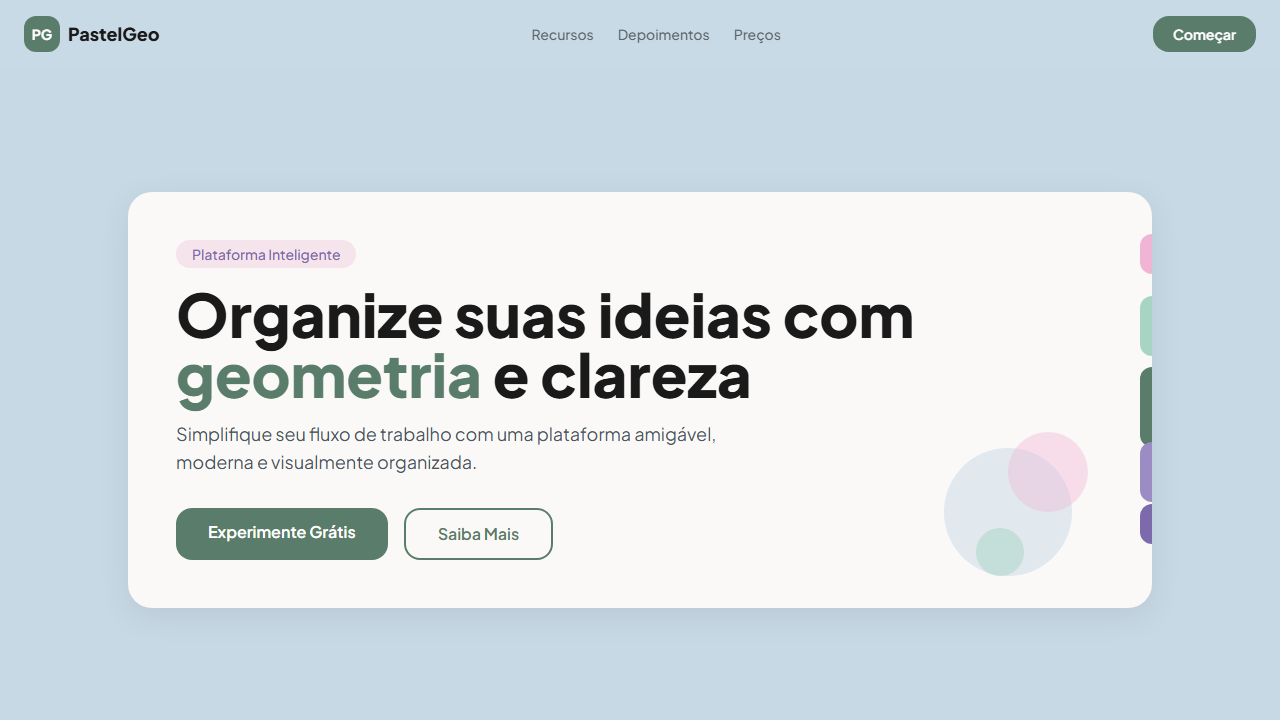
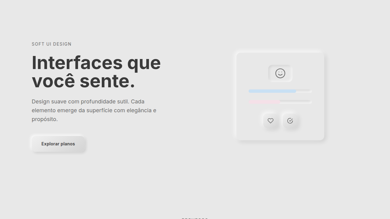
Pastel Geometry
Design pastel com pills verticais coloridos, card arredondado e tipografia Plus Jakarta Sans. Amigável e moderno. Prompt pronto para IA.
Uso: Apps de produtividade, Plataformas educacionais, SaaS friendly, Apps de saúde
Contexto Histórico
Evolução do flat design com elementos geométricos pastel. Os pills verticais na borda criam uma navegação visual única inspirada em tabs de fichário, enquanto a paleta pastel transmite acessibilidade e modernidade.
Especificações Técnicas
Cores
Primárias
Secundárias
Efeitos
Rounded card with soft shadow, vertical pills on right edge with varying heights (short-medium-tall-medium-short), consistent pill width, download/action icon in corner, smooth hover 250ms
Light/Dark
✓ Full / ✗ No
CSS
font-family: 'Plus Jakarta Sans', background: #c8d9e6, .card { background: #faf9f7; border-radius: 24px; box-shadow: 0 8px 32px rgba(0,0,0,0.08) }, .pill { width: 24px; border-radius: 12px; position: absolute; right: -12px }, .pill-short { height: 40px }, .pill-medium { height: 60px }, .pill-tall { height: 80px }
Variáveis
--bg-primary: #c8d9e6, --card-bg: #faf9f7, --pill-pink: #f0b4d4, --pill-mint: #a8d4c4, --pill-sage: #5a7c6a, --pill-lavender: #9b8dc4, --pill-violet: #7c6aad, --font-primary: 'Plus Jakarta Sans', --card-radius: 24px, --pill-width: 24px
Checklist
☐ Plus Jakarta Sans carregada, ☐ Pastel blue background #c8d9e6, ☐ White card com soft shadow, ☐ Vertical pills na borda direita, ☐ Pills com alturas variadas, ☐ Cores pastel consistentes, ☐ Responsivo mobile/tablet/desktop
DESIGN.md
Design System: Pastel Geometry
1. Visual Theme & Atmosphere
Design pastel com pills verticais coloridos, card arredondado e tipografia Plus Jakarta Sans. Amigável e moderno. Prompt pronto para IA. Evolução do flat design com elementos geométricos pastel. Os pills verticais na borda criam uma navegação visual única inspirada em tabs de fichário, enquanto a paleta pastel transmite acessibilidade e modernidade.
- Density: 5/10 — Balanced
- Variance: 4/10 — Moderate
- Motion: 4/10 — Subtle
2. Color Palette & Roles
- Pastel Blue BG (#c8d9e6) — Primary background surface
- Card White (#faf9f7) — Light surface, card backgrounds
- Text Dark (#1a1a1a) — Dark surface, primary background
- Pill Pink (#f0b4d4) — Primary text color
- Pill Mint (#a8d4c4) — Extended palette, decorative use
- Pill Sage (#5a7c6a) — Extended palette, decorative use
- Pill Lavender (#9b8dc4) — Extended palette, decorative use
- Pill Violet (#7c6aad) — Accent color, emphasis elements
3. Typography Rules
- Display / Hero: Plus Jakarta Sans — Weight 700, tight tracking, used for headline impact
- Body: Plus Jakarta Sans — Weight 400, 16px/1.6 line-height, max 72ch per line
- UI Labels / Captions: Plus Jakarta Sans — 0.875rem, weight 500, slight letter-spacing
- Monospace: JetBrains Mono — Used for code, metadata, and technical values
Scale:
- Hero: clamp(2.5rem, 5vw, 4rem)
- H1: 2.25rem
- H2: 1.5rem
- Body: 1rem / 1.6
- Small: 0.875rem
4. Component Stylings
- Primary Button: Pill-shaped (9999px) shape. Accent color fill. Hover: 8% darken + subtle lift shadow. Active: -1px translate tactile press. Font weight 600. No outer glows.
- Secondary / Ghost Button: Outline variant. 1.5px border in muted color. Text in primary color. Hover: subtle background fill.
- Cards: Pill-shaped (9999px) corners. Surface background. Subtle shadow (0 2px 12px rgba(0,0,0,0.06)). 1px border stroke.
- Inputs: Label above input. 1px border stroke. Focus ring: 2px accent color offset 2px. Error text below in semantic red. No floating labels.
- Navigation: Primary surface background. Active item: accent color indicator. Font weight 500 when active.
- Skeletons: Shimmer animation matching component dimensions. No circular spinners.
- Empty States: Icon-based composition with descriptive text and action button.
5. Layout Principles
- Grid: CSS Grid primary. Max-width containment: 1280px centered with 1.5rem side padding.
- Spacing rhythm: Balanced. Base unit: 0.5rem (8px).
- Section vertical gaps: clamp(4rem, 8vw, 8rem).
- Hero layout: Split-screen (text left, visual right).
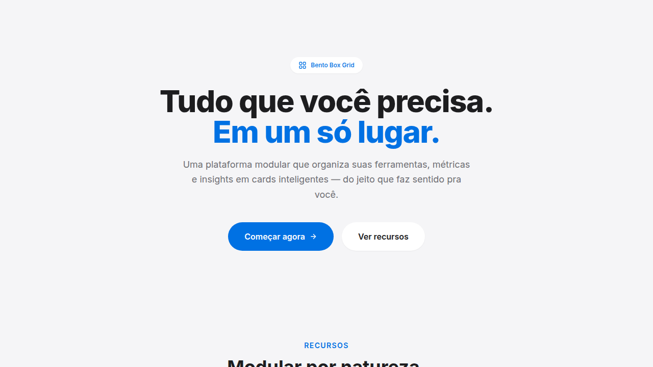
- Feature sections: Zig-zag alternating text+image rows. No 3-equal-columns.
- Mobile collapse: All multi-column layouts collapse below 768px. No horizontal overflow.
- z-index contract: base (0) / sticky-nav (100) / overlay (200) / modal (300) / toast (500).
6. Motion & Interaction
- Physics: Ease-out curves, 200-300ms duration. Smooth and predictable.
- Entry animations: Fade + translate-Y (16px → 0) over 420ms ease-out. Staggered cascades for lists: 80ms between items.
- Hover states: Subtle color shift + shadow adjustment over 200ms.
- Page transitions: Fade only (200ms).
- Performance: Only transform and opacity animated. No layout-triggering properties.
7. Anti-Patterns (Banned)
- No emojis in UI — use icon system only (Lucide, Heroicons)
- No pure black (#000000) — use off-black or charcoal variants
- No oversaturated accent colors (saturation cap: 80%)
- No 3-column equal-width feature layouts — use zig-zag or asymmetric grid
- No
h-screen— usemin-h-[100dvh] - No AI copywriting clichés: "Elevate", "Seamless", "Unleash", "Next-Gen"
- No broken external image links — use picsum.photos or inline SVG
- No generic lorem ipsum in demos
Prompt para AI
Design a friendly, organized, modern landing page with pastel geometry. Use white card (#faf9f7) on pastel blue background (#c8d9e6). Add vertical pills on the right edge with varying heights (short → medium → tall → medium → short) in pink, mint, sage, lavender, violet. Use Plus Jakarta Sans (700/800 for display, 400/500 for body). Rounded card with soft shadow. Download/action icon in corner.
Relacionados
Última sincronização: 01/04/2026