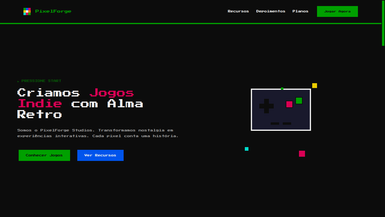
Pixel Art 8-bit
Estilo Pixel Art 8-bit com gráficos em bloco, paleta limitada e estética de videogames retrô. Ideal para jogos indie, marketing retro e designs nostálgicos dos anos 80.
Uso: Jogos indie, Marketing retro, Designs nostálgicos, Portfólios de desenvolvedores de games
Contexto Histórico
A pixel art nasceu com os primeiros videogames nos anos 70-80, quando limitações de hardware forçavam gráficos em blocos com paletas reduzidas. Hoje é um estilo artístico celebrado.
Especificações Técnicas
Cores
Primárias
Secundárias
Efeitos
image-rendering: pixelated, sharp pixel borders (no anti-aliasing), blocky box-shadows (4px steps), step-based animations (steps()), monospace pixel fonts, CRT scanline overlay effect
Light/Dark
✓ Full / ✓ Full
CSS
image-rendering: pixelated, font-family: 'Press Start 2P', monospace, border: 4px solid #0D0D0D, box-shadow: 4px 4px 0 #0D0D0D, background: #0D0D0D, color: #FCFCFC, animation-timing-function: steps(4), no border-radius, no gradients
Variáveis
--pixel-size: 4px, --color-black: #0D0D0D, --color-green: #00A800, --color-red: #E40058, --font-pixel: 'Press Start 2P', --border: 4px solid #0D0D0D, --shadow: 4px 4px 0 #0D0D0D, --border-radius: 0px
Checklist
☐ image-rendering: pixelated applied, ☐ Limited color palette (8-16 colors), ☐ Pixel font (Press Start 2P), ☐ No border-radius anywhere, ☐ Step-based animations only, ☐ CRT scanline overlay, ☐ Blocky shadows (4px steps)
DESIGN.md
Design System: Pixel Art 8-bit
1. Visual Theme & Atmosphere
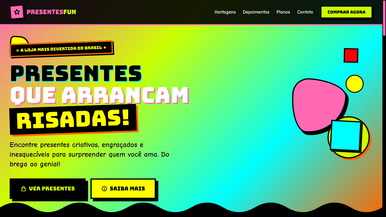
Estilo Pixel Art 8-bit com gráficos em bloco, paleta limitada e estética de videogames retrô. Ideal para jogos indie, marketing retro e designs nostálgicos dos anos 80. A pixel art nasceu com os primeiros videogames nos anos 70-80, quando limitações de hardware forçavam gráficos em blocos com paletas reduzidas. Hoje é um estilo artístico celebrado.
- Density: 5/10 — Balanced
- Variance: 7/10 — Dynamic
- Motion: 6/10 — Expressive
2. Color Palette & Roles
- NES Black (#0D0D0D) — Dark surface, primary background
- Pixel Green (#00A800) — Secondary surface or text color
- Pixel Red (#E40058) — Error states, destructive actions
- Pixel Blue (#0058F8) — Accent highlight, links and focus states
- Pixel Yellow (#F8D800) — Warning states, attention indicators
- Pixel Cyan (#00E8D8) — Secondary accent
- Pixel Orange (#F87800) — Warm accent, call-to-action secondary
- Pixel White (#FCFCFC) — Secondary surface
3. Typography Rules
- Display / Hero: Press Start 2P — Weight 700, tight tracking, used for headline impact
- Body: Press Start 2P — Weight 400, 16px/1.6 line-height, max 72ch per line
- UI Labels / Captions: Press Start 2P — 0.875rem, weight 500, slight letter-spacing
- Monospace: JetBrains Mono — Used for code, metadata, and technical values
Scale:
- Hero: clamp(2.5rem, 5vw, 4rem)
- H1: 2.25rem
- H2: 1.5rem
- Body: 1rem / 1.6
- Small: 0.875rem
4. Component Stylings
- Primary Button: Sharp edges (0px) shape. Accent color fill. Hover: 8% darken + subtle lift shadow. Active: -1px translate tactile press. Font weight 600. No outer glows.
- Secondary / Ghost Button: Outline variant. 1.5px border in muted color. Text in primary color. Hover: subtle background fill.
- Cards: Sharp edges (0px) corners. Surface background. Subtle shadow (0 2px 12px rgba(0,0,0,0.06)). 1px border stroke.
- Inputs: Label above input. 1px border stroke. Focus ring: 2px accent color offset 2px. Error text below in semantic red. No floating labels.
- Navigation: Primary surface background. Active item: accent color indicator. Font weight 500 when active.
- Skeletons: Shimmer animation matching component dimensions. No circular spinners.
- Empty States: Icon-based composition with descriptive text and action button.
5. Layout Principles
- Grid: CSS Grid primary. Max-width containment: 1280px centered with 1.5rem side padding.
- Spacing rhythm: Balanced. Base unit: 0.5rem (8px).
- Section vertical gaps: clamp(4rem, 8vw, 8rem).
- Hero layout: Asymmetric composition.
- Feature sections: Asymmetric grid with varied card sizes. No 3-equal-columns.
- Mobile collapse: All multi-column layouts collapse below 768px. No horizontal overflow.
- z-index contract: base (0) / sticky-nav (100) / overlay (200) / modal (300) / toast (500).
6. Motion & Interaction
- Physics: Spring — stiffness 120, damping 20. Confident, weighted transitions.
- Entry animations: Fade + translate-Y (16px → 0) over 480ms ease-out. Staggered cascades for lists: 100ms between items.
- Hover states: Scale(1.03) + shadow lift over 200ms.
- Page transitions: Fade + slide (300ms).
- Performance: Only transform and opacity animated. No layout-triggering properties.
7. Anti-Patterns (Banned)
- No emojis in UI — use icon system only (Lucide, Heroicons)
- No pure black (#000000) — use off-black or charcoal variants
- No oversaturated accent colors (saturation cap: 80%)
- No 3-column equal-width feature layouts — use zig-zag or asymmetric grid
- No
h-screen— usemin-h-[100dvh] - No AI copywriting clichés: "Elevate", "Seamless", "Unleash", "Next-Gen"
- No broken external image links — use picsum.photos or inline SVG
- No generic lorem ipsum in demos
Prompt para AI
Design a pixel art 8-bit landing page with retro gaming aesthetics. Use image-rendering: pixelated, limited color palette (8-16 colors), blocky shapes, pixel-perfect borders, monospace pixel fonts (Press Start 2P), CRT scanline overlay. All elements should look like they belong in an NES/arcade game. Step-based animations only.
Relacionados
Última sincronização: 01/04/2026