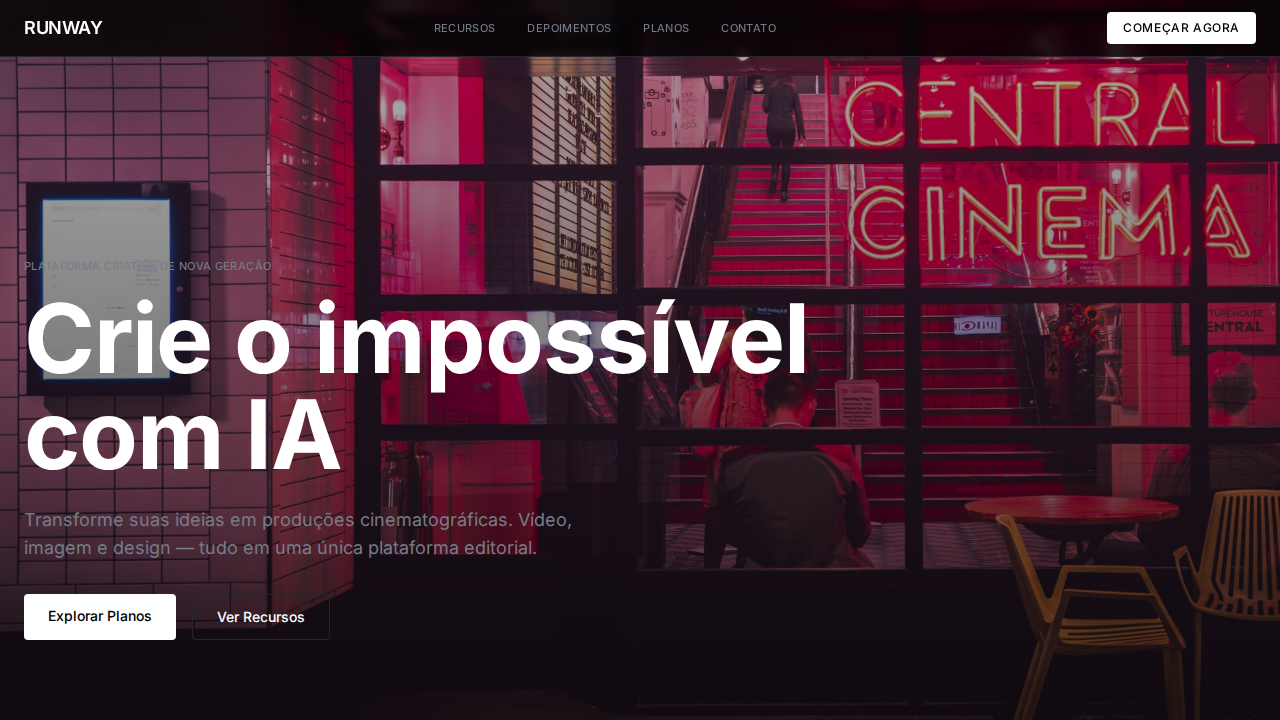
Runway Cinematic Editorial
Estilo Runway Cinematic Editorial com fotografia full-bleed, tipografia de filme e interface invisível. Ideal para AI criativa, vídeo e plataformas de mídia.
Uso: AI criativa, Geração de vídeo, Plataformas de mídia, Estúdios de produção
Contexto Histórico
Inspirado no design do Runway, onde a interface recua para invisibilidade e o conteúdo visual cinematográfico É o design.
Especificações Técnicas
Cores
Primárias
Secundárias
Efeitos
Fotografia e vídeo full-bleed cinematográfico como elementos UI primários. Fonte única (abcNormal) para tudo — display a micro labels. Headlines tight (line-height 1.0) com tracking negativo (-0.9px a -1.2px) como títulos de filme. Zero sombras, bordas mínimas — interface intencionalmente invisível. Neutrals cool-toned (#767d88, #7d848e). Labels uppercase com letter-spacing positivo (0.35px). Weight 450 incomum para labels — craft tipográfico de precisão. Layout editorial de revista com grids de imagem mixed-size.
Light/Dark
✓ Full / ✓ Full
CSS
background:#000000;color:#ffffff;border:1px solid #27272a;box-shadow:none;font-family:system-ui,sans-serif;line-height:1.0 headlines;letter-spacing:-1.2px at 48px;border-radius:4px functional,16px alerts
Variáveis
--bg:#000000;--bg-surface:#1a1a1a;--text:#ffffff;--text-secondary:#767d88;--text-tertiary:#7d848e;--border:#27272a;--cloud:#e9ecf2;--charcoal:#404040;--radius:4px
Checklist
☐ Fotografia full-bleed como UI, ☐ Fonte única para tudo, ☐ Headlines tight como títulos de filme, ☐ Zero sombras, ☐ Neutrals cool-toned, ☐ Labels uppercase, ☐ Layout editorial revista, ☐ Responsivo
DESIGN.md
Design System: Runway Cinematic Editorial
1. Visual Theme & Atmosphere
Estilo Runway Cinematic Editorial com fotografia full-bleed, tipografia de filme e interface invisível. Ideal para AI criativa, vídeo e plataformas de mídia. Inspirado no design do Runway, onde a interface recua para invisibilidade e o conteúdo visual cinematográfico É o design.
- Density: 5/10 — Balanced
- Variance: 4/10 — Moderate
- Motion: 8/10 — Cinematic
2. Color Palette & Roles
- Preto (#000000) — Dark surface, primary background
- Branco (#ffffff) — Light surface, card backgrounds
- Escuro (#1a1a1a) — Dark surface, primary background
- Cool Cloud (#e9ecf2) — Supporting palette color
- Charcoal (#404040) — Deep contrast surface
- Cool Slate (#767d88) — Extended palette, decorative use
- Mid Slate (#7d848e) — Extended palette, decorative use
- Borda (#27272a) — Extended palette, decorative use
3. Typography Rules
- Display / Hero: system-ui — Weight 700, tight tracking, used for headline impact
- Body: system-ui — Weight 400, 16px/1.6 line-height, max 72ch per line
- UI Labels / Captions: system-ui — 0.875rem, weight 500, slight letter-spacing
- Monospace: JetBrains Mono — Used for code, metadata, and technical values
Scale:
- Hero: clamp(2.5rem, 5vw, 4rem)
- H1: 2.25rem
- H2: 1.5rem
- Body: 1rem / 1.6
- Small: 0.875rem
4. Component Stylings
- Primary Button: Rounded (4px functional) shape. Accent color fill. Hover: 8% darken + subtle lift shadow. Active: -1px translate tactile press. Font weight 600. No outer glows.
- Secondary / Ghost Button: Outline variant. 1.5px border in muted color. Text in primary color. Hover: subtle background fill.
- Cards: Rounded (4px functional) corners. Surface background. Subtle shadow (0 2px 12px rgba(0,0,0,0.06)). 1px border stroke.
- Inputs: Label above input. 1px border stroke. Focus ring: 2px accent color offset 2px. Error text below in semantic red. No floating labels.
- Navigation: Primary surface background. Active item: accent color indicator. Font weight 500 when active.
- Skeletons: Shimmer animation matching component dimensions. No circular spinners.
- Empty States: Icon-based composition with descriptive text and action button.
5. Layout Principles
- Grid: CSS Grid primary. Max-width containment: 1280px centered with 1.5rem side padding.
- Spacing rhythm: Balanced. Base unit: 0.5rem (8px).
- Section vertical gaps: clamp(4rem, 8vw, 8rem).
- Hero layout: Split-screen (text left, visual right).
- Feature sections: Zig-zag alternating text+image rows. No 3-equal-columns.
- Mobile collapse: All multi-column layouts collapse below 768px. No horizontal overflow.
- z-index contract: base (0) / sticky-nav (100) / overlay (200) / modal (300) / toast (500).
6. Motion & Interaction
- Physics: Spring — stiffness 120, damping 20. Confident, weighted transitions.
- Entry animations: Fade + translate-Y (16px → 0) over 540ms ease-out. Staggered cascades for lists: 120ms between items.
- Hover states: Scale(1.03) + shadow lift over 200ms.
- Page transitions: Fade + slide (300ms).
- Performance: Only transform and opacity animated. No layout-triggering properties.
7. Anti-Patterns (Banned)
- No emojis in UI — use icon system only (Lucide, Heroicons)
- No pure black (#000000) — use off-black or charcoal variants
- No oversaturated accent colors (saturation cap: 80%)
- No 3-column equal-width feature layouts — use zig-zag or asymmetric grid
- No
h-screen— usemin-h-[100dvh] - No AI copywriting clichés: "Elevate", "Seamless", "Unleash", "Next-Gen"
- No broken external image links — use picsum.photos or inline SVG
- No generic lorem ipsum in demos
Prompt para AI
Design a Runway-inspired cinematic editorial landing page. Full-bleed photography and video as primary UI elements. Single typeface for everything from 48px display to 11px labels. Tight headlines (line-height 1.0) with negative tracking (-0.9px to -1.2px) like film titles. Zero shadows, minimal borders — intentionally invisible interface. Cool-toned neutrals (#767d88, #7d848e). Uppercase labels with 0.35px letter-spacing. Editorial magazine layout with mixed-size image grids.
Relacionados
Última sincronização: 01/04/2026