Figma Vibrant Monochrome
Estilo Figma Vibrant Monochrome com interface monocromática, gradientes vibrantes e geometria pill. Ideal para ferramentas de design e plataformas criativas.
Uso: Ferramentas de design, Plataformas criativas, Editores visuais, Portfolios de design
Contexto Histórico
Inspirado no design system do Figma, onde a interface é uma galeria monocromática que exibe conteúdo colorido como arte.
Especificações Técnicas
Cores
Primárias
Efeitos
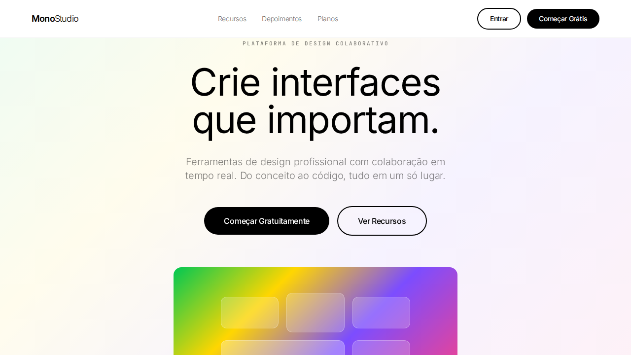
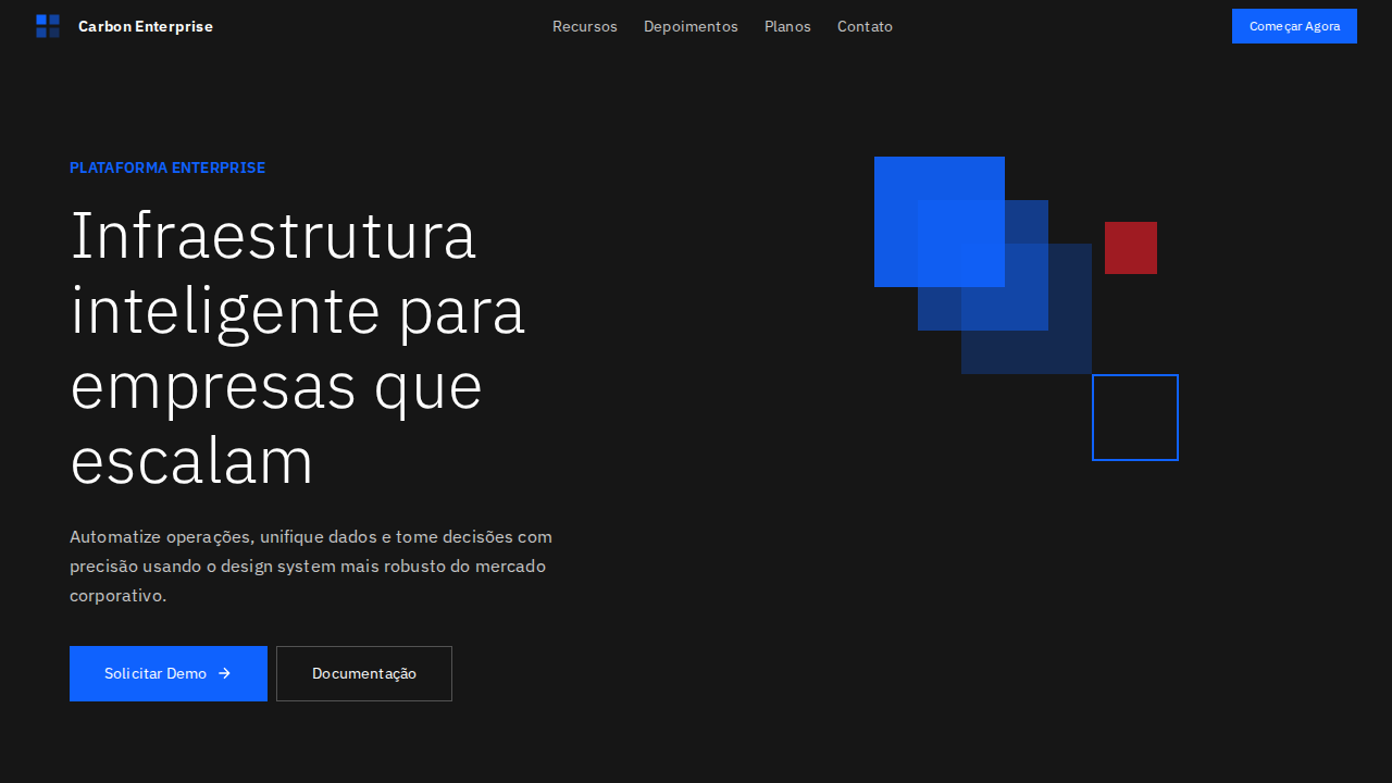
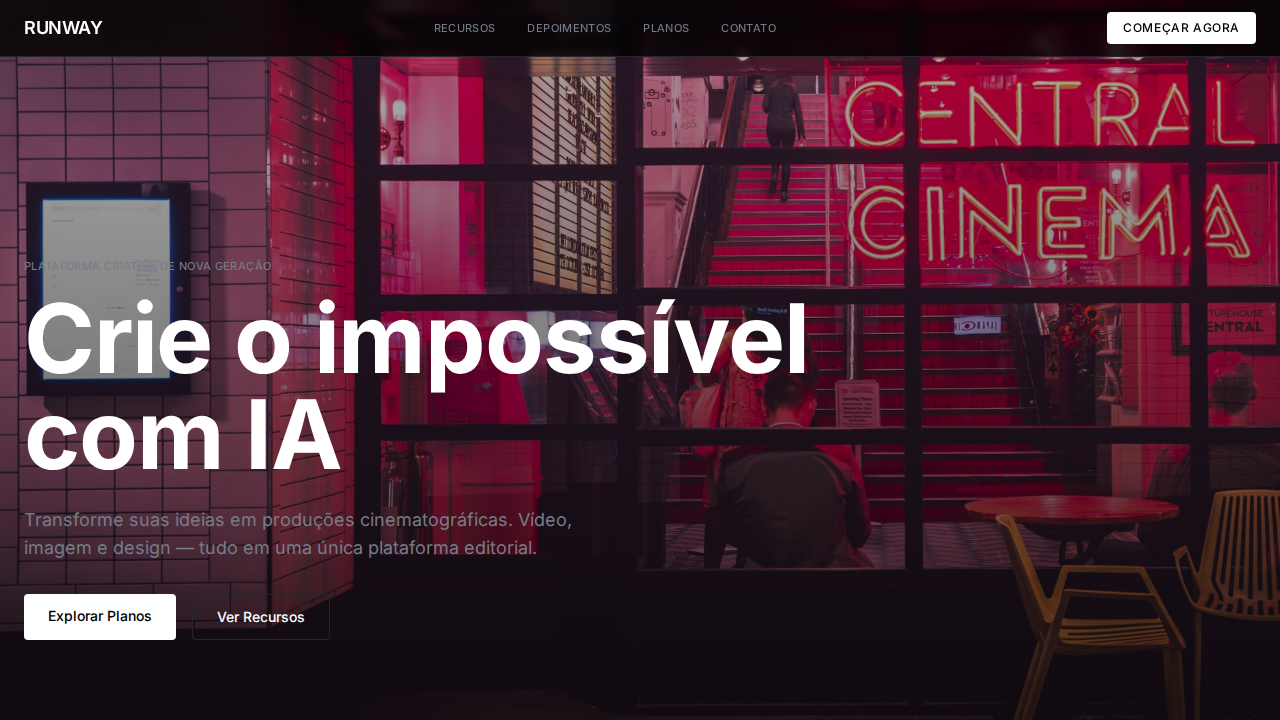
Interface estritamente preto-e-branco — cor existe apenas no conteúdo do produto. Hero com gradiente vibrante multi-cor (verde, amarelo, roxo, rosa). Botões pill (50px) e circulares (50%). Focus indicators com outline dashed 2px (referência ao editor Figma). Font variable com pesos incomuns (320, 330, 340, 450, 480, 540). Letter-spacing negativo em todo texto (-0.1px a -1.72px).
Light/Dark
✓ Full / ✗ Not Recommended
CSS
color: #000000 or #ffffff only; background: #ffffff; hero-gradient: multi-color; border-radius: 50px pills, 50% circles; outline: dashed 2px; font-feature-settings: 'kern'; letter-spacing: -1.72px at 86px; font-weight: 320-540 variable
Variáveis
--text: #000000; --bg: #ffffff; --glass-dark: rgba(0,0,0,0.08); --glass-light: rgba(255,255,255,0.16); --radius-pill: 50px; --radius-circle: 50%; --focus: dashed 2px
Checklist
☐ Interface apenas preto e branco, ☐ Hero gradiente vibrante multi-cor, ☐ Font variable pesos 320-540, ☐ Pill buttons 50px, ☐ Focus dashed 2px, ☐ Letter-spacing negativo, ☐ Monospace labels uppercase, ☐ Responsivo
DESIGN.md
Design System: Figma Vibrant Monochrome
1. Visual Theme & Atmosphere
Estilo Figma Vibrant Monochrome com interface monocromática, gradientes vibrantes e geometria pill. Ideal para ferramentas de design e plataformas criativas. Inspirado no design system do Figma, onde a interface é uma galeria monocromática que exibe conteúdo colorido como arte.
- Density: 5/10 — Balanced
- Variance: 4/10 — Moderate
- Motion: 4/10 — Subtle
2. Color Palette & Roles
- Preto Puro (#000000) — Dark surface, primary background
- Branco Puro (#ffffff) — Light surface, card backgrounds
- Vidro Escuro (rgba(0,0,0,0.08)) — Dark surface, primary background
- Vidro Claro (rgba(255,255,255,0.16)) — Supporting palette color
3. Typography Rules
- Display / Hero: System UI stack (-apple-system, sans-serif) — Weight 700, tight tracking, used for headline impact
- Body: System UI stack (-apple-system, sans-serif) — Weight 400, 16px/1.6 line-height, max 72ch per line
- UI Labels / Captions: System UI stack (-apple-system, sans-serif) — 0.875rem, weight 500, slight letter-spacing
- Monospace: JetBrains Mono — Used for code, metadata, and technical values
Scale:
- Hero: clamp(2.5rem, 5vw, 4rem)
- H1: 2.25rem
- H2: 1.5rem
- Body: 1rem / 1.6
- Small: 0.875rem
4. Component Stylings
- Primary Button: Pill-shaped (9999px) shape. Accent color fill. Hover: 8% darken + subtle lift shadow. Active: -1px translate tactile press. Font weight 600. No outer glows.
- Secondary / Ghost Button: Outline variant. 1.5px border in muted color. Text in primary color. Hover: subtle background fill.
- Cards: Pill-shaped (9999px) corners. Surface background. Subtle shadow (0 2px 12px rgba(0,0,0,0.06)). 1px border stroke.
- Inputs: Label above input. 1px border stroke. Focus ring: 2px accent color offset 2px. Error text below in semantic red. No floating labels.
- Navigation: Primary surface background. Active item: accent color indicator. Font weight 500 when active.
- Skeletons: Shimmer animation matching component dimensions. No circular spinners.
- Empty States: Icon-based composition with descriptive text and action button.
5. Layout Principles
- Grid: CSS Grid primary. Max-width containment: 1280px centered with 1.5rem side padding.
- Spacing rhythm: Balanced. Base unit: 0.5rem (8px).
- Section vertical gaps: clamp(4rem, 8vw, 8rem).
- Hero layout: Split-screen (text left, visual right).
- Feature sections: Zig-zag alternating text+image rows. No 3-equal-columns.
- Mobile collapse: All multi-column layouts collapse below 768px. No horizontal overflow.
- z-index contract: base (0) / sticky-nav (100) / overlay (200) / modal (300) / toast (500).
6. Motion & Interaction
- Physics: Ease-out curves, 200-300ms duration. Smooth and predictable.
- Entry animations: Fade + translate-Y (16px → 0) over 420ms ease-out. Staggered cascades for lists: 80ms between items.
- Hover states: Subtle color shift + shadow adjustment over 200ms.
- Page transitions: Fade only (200ms).
- Performance: Only transform and opacity animated. No layout-triggering properties.
7. Anti-Patterns (Banned)
- No emojis in UI — use icon system only (Lucide, Heroicons)
- No pure black (#000000) — use off-black or charcoal variants
- No oversaturated accent colors (saturation cap: 80%)
- No 3-column equal-width feature layouts — use zig-zag or asymmetric grid
- No
h-screen— usemin-h-[100dvh] - No AI copywriting clichés: "Elevate", "Seamless", "Unleash", "Next-Gen"
- No broken external image links — use picsum.photos or inline SVG
- No generic lorem ipsum in demos
Prompt para AI
Design a Figma-inspired landing page with strictly black-and-white interface chrome. Hero section with vibrant multi-color gradient (green, yellow, purple, pink). Variable font with unusual weight stops (320-540). Pill buttons (50px radius) and circular icon buttons (50%). Dashed 2px focus outlines. Negative letter-spacing throughout (-0.1px to -1.72px). Display headline at 86px weight 400 line-height 1.0. Monospace labels uppercase with positive letter-spacing.
Relacionados
Última sincronização: 01/04/2026