Bento Grid
Estilo Bento Grid com layout modular organizado inspirado em caixas japonesas Bento e design Apple. Ideal para UI/UX, dashboards, portfólios e web design limpo.
Uso: UI/UX, Dashboards, Portfólios, Web design limpo, Branding de produtos Apple
Contexto Histórico
O Bento Grid é inspirado nas caixas de almoço japonesas Bento, onde cada compartimento tem seu espaço dedicado. Popularizado pela Apple em apresentações de produtos, tornou-se padrão em UI moderna.
Especificações Técnicas
Cores
Primárias
Secundárias
Efeitos
CSS grid with varying span sizes (1x1, 2x1, 1x2, 2x2), uniform gap (12-16px), subtle rounded corners (16-20px), very soft shadows (0 2px 8px rgba(0,0,0,0.04)), smooth hover lift (translateY -2px), clean compartment borders
Light/Dark
✓ Full / ✓ Full
CSS
display: grid, grid-template-columns: repeat(4, 1fr), grid-auto-rows: minmax(200px, auto), gap: 16px, background: #F5F5F7, color: #1D1D1F, border-radius: 20px, box-shadow: 0 2px 8px rgba(0,0,0,0.04), padding: 24px per compartment, transition: transform 200ms
Variáveis
--color-white: #FFFFFF, --color-light-grey: #F5F5F7, --color-dark: #1D1D1F, --color-accent: #0071E3, --font-primary: -apple-system, BlinkMacSystemFont, 'SF Pro', --border-radius: 20px, --gap: 16px, --shadow: 0 2px 8px rgba(0,0,0,0.04), --padding: 24px
Checklist
☐ CSS grid with varying span sizes, ☐ Uniform gap spacing (16px), ☐ Rounded corners (16-20px), ☐ Very soft shadows, ☐ Each compartment with dedicated content, ☐ Clean Apple-inspired aesthetic, ☐ Responsive: 4→2→1 columns on breakpoints
DESIGN.md
Design System: Bento Grid
1. Visual Theme & Atmosphere
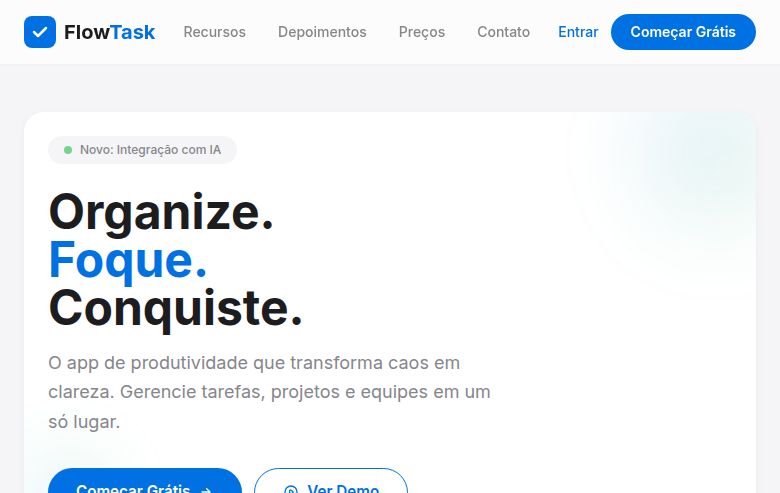
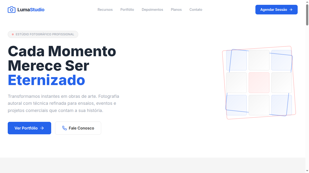
Estilo Bento Grid com layout modular organizado inspirado em caixas japonesas Bento e design Apple. Ideal para UI/UX, dashboards, portfólios e web design limpo. O Bento Grid é inspirado nas caixas de almoço japonesas Bento, onde cada compartimento tem seu espaço dedicado. Popularizado pela Apple em apresentações de produtos, tornou-se padrão em UI moderna.
- Density: 8/10 — Dense
- Variance: 2/10 — Structured
- Motion: 4/10 — Subtle
2. Color Palette & Roles
- Pure White (#FFFFFF) — Light surface, card backgrounds
- Light Grey (#F5F5F7) — Secondary text, borders, muted elements
- Dark Grey (#1D1D1F) — Dark surface, primary background
- Accent Blue (#0071E3) — Primary accent, CTAs and interactive elements
- Soft Grey (#E8E8ED) — Secondary text, borders, muted elements
- Medium Grey (#86868B) — Secondary text, borders, muted elements
- Black (#000000) — Deep contrast surface
- Accent Green (#34C759) — Primary accent, CTAs and interactive elements
3. Typography Rules
- Display / Hero: SF Pro — Weight 700, tight tracking, used for headline impact
- Body: SF Pro — Weight 400, 16px/1.6 line-height, max 72ch per line
- UI Labels / Captions: SF Pro — 0.875rem, weight 500, slight letter-spacing
- Monospace: JetBrains Mono — Used for code, metadata, and technical values
Scale:
- Hero: clamp(2.5rem, 5vw, 4rem)
- H1: 2.25rem
- H2: 1.5rem
- Body: 1rem / 1.6
- Small: 0.875rem
4. Component Stylings
- Primary Button: Generously rounded (1.5rem) shape. Accent color fill. Hover: 8% darken + subtle lift shadow. Active: -1px translate tactile press. Font weight 600. No outer glows.
- Secondary / Ghost Button: Outline variant. 1.5px border in muted color. Text in primary color. Hover: subtle background fill.
- Cards: Generously rounded (1.5rem) corners. Surface background. Subtle shadow (0 2px 12px rgba(0,0,0,0.06)). 1px border stroke.
- Inputs: Label above input. 1px border stroke. Focus ring: 2px accent color offset 2px. Error text below in semantic red. No floating labels.
- Navigation: Primary surface background. Active item: accent color indicator. Font weight 500 when active.
- Skeletons: Shimmer animation matching component dimensions. No circular spinners.
- Empty States: Icon-based composition with descriptive text and action button.
5. Layout Principles
- Grid: CSS Grid primary. Max-width containment: 1280px centered with 1.5rem side padding.
- Spacing rhythm: Balanced. Base unit: 0.5rem (8px).
- Section vertical gaps: clamp(4rem, 8vw, 8rem).
- Hero layout: Split-screen (text left, visual right).
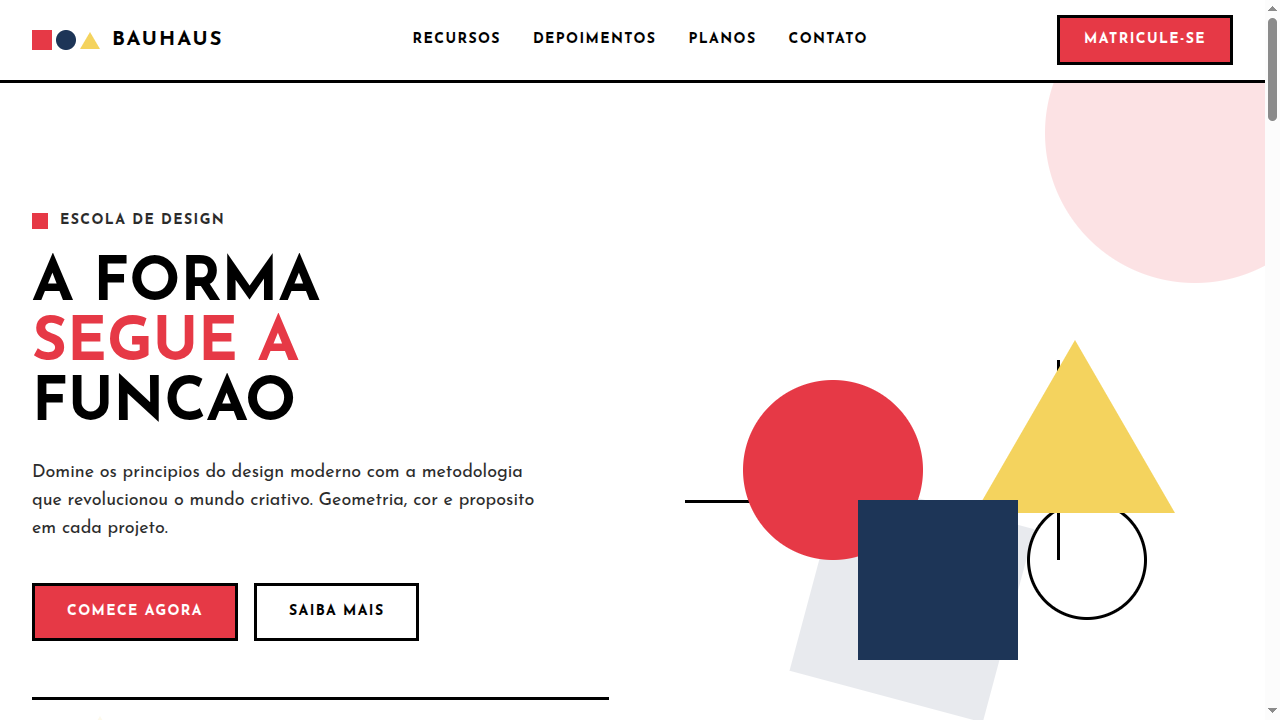
- Feature sections: Zig-zag alternating text+image rows. No 3-equal-columns.
- Mobile collapse: All multi-column layouts collapse below 768px. No horizontal overflow.
- z-index contract: base (0) / sticky-nav (100) / overlay (200) / modal (300) / toast (500).
6. Motion & Interaction
- Physics: Ease-out curves, 200-300ms duration. Smooth and predictable.
- Entry animations: Fade + translate-Y (16px → 0) over 420ms ease-out. Staggered cascades for lists: 80ms between items.
- Hover states: Subtle color shift + shadow adjustment over 200ms.
- Page transitions: Fade only (200ms).
- Performance: Only transform and opacity animated. No layout-triggering properties.
7. Anti-Patterns (Banned)
- No emojis in UI — use icon system only (Lucide, Heroicons)
- No pure black (#000000) — use off-black or charcoal variants
- No oversaturated accent colors (saturation cap: 80%)
- No 3-column equal-width feature layouts — use zig-zag or asymmetric grid
- No
h-screen— usemin-h-[100dvh] - No AI copywriting clichés: "Elevate", "Seamless", "Unleash", "Next-Gen"
- No broken external image links — use picsum.photos or inline SVG
- No generic lorem ipsum in demos
Prompt para AI
Design a Bento Grid landing page inspired by Japanese bento boxes and Apple's design language. Use CSS grid with varying compartment sizes (1x1, 2x1, 1x2, 2x2 spans). White, light grey, dark grey with single accent blue. Each compartment has dedicated content with generous padding. Rounded corners (16-20px), very soft shadows, clean borders. Organized, modular, tidy aesthetic.
Relacionados
Última sincronização: 01/04/2026