Utilitarian
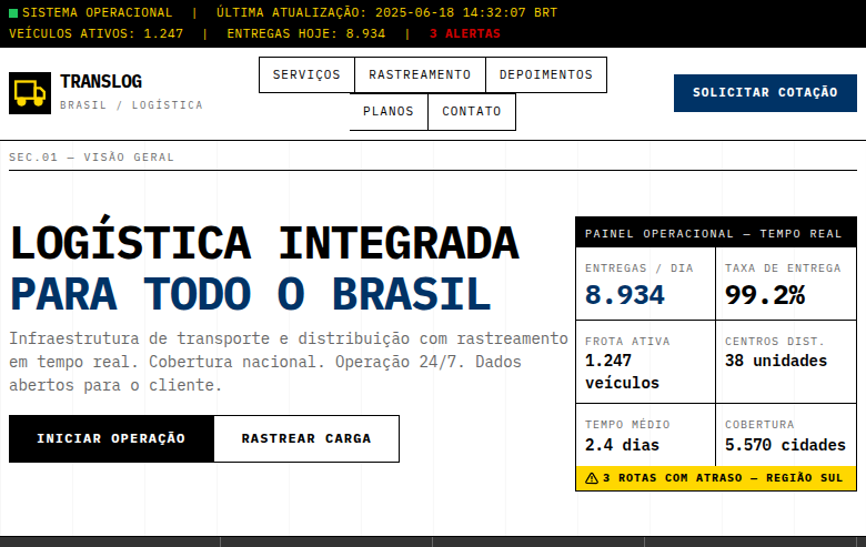
Estilo Utilitário despido ao essencial, focado na função sobre decoração com tipografia monospace em grade rigorosa. Ideal para sinalética, interfaces industriais e etiquetas.
Uso: Sinalética, Interfaces industriais, Etiquetas de roupa, Design de embalagens informativas
Contexto Histórico
O design Utilitário prioriza função absoluta sobre decoração, inspirado em sinalética militar e industrial. Cada elemento existe por necessidade, usando tipografia monospace em grades rigorosas.
Especificações Técnicas
Cores
Primárias
Secundárias
Efeitos
No decorative elements whatsoever, strict rigid grid (12-column), monospace typography only, visible grid lines as design element, high information density, minimal padding, functional color coding (red=alert, yellow=warning, blue=info), no animations except functional state changes
Light/Dark
✓ Full / ✓ Full
CSS
font-family: 'IBM Plex Mono', monospace, display: grid, grid-template-columns: repeat(12, 1fr), gap: 1px, background: #FFFFFF, color: #000000, border: 1px solid #000000, border-radius: 0px, box-shadow: none, padding: 8px, font-size: 14px, line-height: 1.4, text-transform: uppercase for labels
Variáveis
--color-white: #FFFFFF, --color-black: #000000, --color-warning: #FFD700, --color-alert: #CC0000, --color-info: #003366, --font-mono: 'IBM Plex Mono', --grid-columns: 12, --gap: 1px, --padding: 8px, --border: 1px solid #000000, --border-radius: 0px
Checklist
☐ No decorative elements, ☐ Strict 12-column grid, ☐ Monospace typography only, ☐ Functional color coding, ☐ High information density, ☐ Minimal padding, ☐ No animations (except state changes), ☐ Every element serves a purpose, ☐ Responsive grid
DESIGN.md
Design System: Utilitarian
1. Visual Theme & Atmosphere
Estilo Utilitário despido ao essencial, focado na função sobre decoração com tipografia monospace em grade rigorosa. Ideal para sinalética, interfaces industriais e etiquetas. O design Utilitário prioriza função absoluta sobre decoração, inspirado em sinalética militar e industrial. Cada elemento existe por necessidade, usando tipografia monospace em grades rigorosas.
- Density: 3/10 — Airy
- Variance: 2/10 — Structured
- Motion: 6/10 — Expressive
2. Color Palette & Roles
- Pure White (#FFFFFF) — Light surface, card backgrounds
- Pure Black (#000000) — Dark surface, primary background
- Safety Yellow (#FFD700) — Warning states, attention indicators
- Signal Red (#CC0000) — Error states, destructive actions
- Medium Grey (#666666) — Secondary text, borders, muted elements
- Light Grey (#CCCCCC) — Secondary text, borders, muted elements
- Dark Grey (#333333) — Deep contrast surface
- Industrial Blue (#003366) — Secondary accent
3. Typography Rules
- Display / Hero: IBM Plex Mono — Weight 700, tight tracking, used for headline impact
- Body: IBM Plex Mono — Weight 400, 16px/1.6 line-height, max 72ch per line
- UI Labels / Captions: IBM Plex Mono — 0.875rem, weight 500, slight letter-spacing
- Monospace: IBM Plex Mono — Used for code, metadata, and technical values
Scale:
- Hero: clamp(2.5rem, 5vw, 4rem)
- H1: 2.25rem
- H2: 1.5rem
- Body: 1rem / 1.6
- Small: 0.875rem
4. Component Stylings
- Primary Button: Sharp edges (0px) shape. Accent color fill. Hover: 8% darken + subtle lift shadow. Active: -1px translate tactile press. Font weight 600. No outer glows.
- Secondary / Ghost Button: Outline variant. 1.5px border in muted color. Text in primary color. Hover: subtle background fill.
- Cards: Sharp edges (0px) corners. Surface background. Subtle shadow (0 2px 12px rgba(0,0,0,0.06)). 1px border stroke.
- Inputs: Label above input. 1px border stroke. Focus ring: 2px accent color offset 2px. Error text below in semantic red. No floating labels.
- Navigation: Primary surface background. Active item: accent color indicator. Font weight 500 when active.
- Skeletons: Shimmer animation matching component dimensions. No circular spinners.
- Empty States: Icon-based composition with descriptive text and action button.
5. Layout Principles
- Grid: CSS Grid primary. Max-width containment: 1280px centered with 1.5rem side padding.
- Spacing rhythm: Balanced. Base unit: 0.5rem (8px).
- Section vertical gaps: clamp(4rem, 8vw, 8rem).
- Hero layout: Split-screen (text left, visual right).
- Feature sections: Zig-zag alternating text+image rows. No 3-equal-columns.
- Mobile collapse: All multi-column layouts collapse below 768px. No horizontal overflow.
- z-index contract: base (0) / sticky-nav (100) / overlay (200) / modal (300) / toast (500).
6. Motion & Interaction
- Physics: Spring — stiffness 120, damping 20. Confident, weighted transitions.
- Entry animations: Fade + translate-Y (16px → 0) over 480ms ease-out. Staggered cascades for lists: 100ms between items.
- Hover states: Scale(1.03) + shadow lift over 200ms.
- Page transitions: Fade + slide (300ms).
- Performance: Only transform and opacity animated. No layout-triggering properties.
7. Anti-Patterns (Banned)
- No emojis in UI — use icon system only (Lucide, Heroicons)
- No decorative gradients — flat color only
- No shadows heavier than 0 2px 8px rgba(0,0,0,0.08)
- No pure black (#000000) — use off-black or charcoal variants
- No oversaturated accent colors (saturation cap: 80%)
- No 3-column equal-width feature layouts — use zig-zag or asymmetric grid
- No
h-screen— usemin-h-[100dvh] - No AI copywriting clichés: "Elevate", "Seamless", "Unleash", "Next-Gen"
- No broken external image links — use picsum.photos or inline SVG
- No generic lorem ipsum in demos
Prompt para AI
Design a utilitarian landing page stripped to absolute essentials. Function over decoration. Use pure black, white with safety yellow and signal red for functional color coding. Monospace typography only on a strict rigid 12-column grid. Visible grid lines, high information density, minimal padding. No decorative elements, no animations except functional state changes. Industrial signage aesthetic — every element serves a purpose.
Relacionados
Última sincronização: 01/04/2026