Neoclassical Art
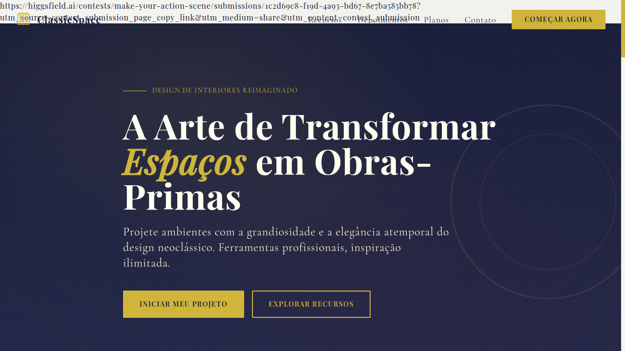
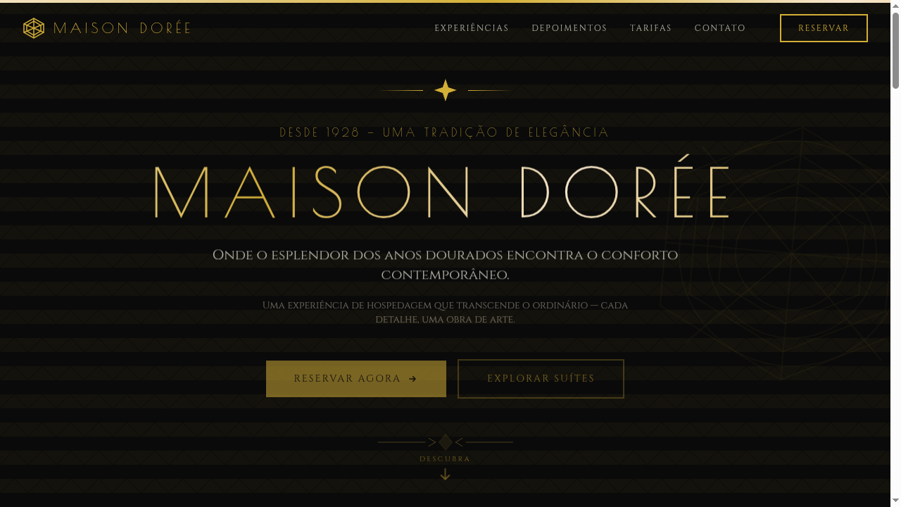
Estilo Arte Neoclássica com texturas de mármore, acentos dourados e tipografia serifada grandiosa. Ideal para marcas de luxo, interiores e projetos formais.
Uso: Marcas de luxo, Design de interiores, Galerias de arte, Projetos formais e institucionais
Contexto Histórico
O Neoclassicismo (séc. XVIII) reviveu a estética da Grécia e Roma antigas, valorizando simetria, proporção e grandiosidade. Influenciou arquitetura, pintura e design até hoje.
Especificações Técnicas
Cores
Primárias
Secundárias
Efeitos
Subtle gold borders, classical column dividers, serif typography with elegant spacing, marble texture backgrounds, soft vignette overlays, smooth fade-in transitions (400ms)
Light/Dark
✓ Full / ◐ Partial
CSS
font-family: 'Playfair Display', serif, background: marble texture or #F5F5F0, border: 2px solid #CFB53B, color: #1B1F3B, letter-spacing: 0.05em, text-transform: uppercase for headings, box-shadow: 0 4px 20px rgba(0,0,0,0.1)
Variáveis
--font-primary: 'Playfair Display', --color-gold: #CFB53B, --color-ivory: #FFFFF0, --color-navy: #1B1F3B, --border-accent: 2px solid #CFB53B, --spacing: 2.5rem, --border-radius: 2px
Checklist
☐ Serif typography with classical hierarchy, ☐ Gold accent borders and dividers, ☐ Marble or ivory backgrounds, ☐ Column-inspired layout dividers, ☐ Formal and grand visual tone, ☐ Mobile responsive with stacked columns
DESIGN.md
Design System: Neoclassical Art
1. Visual Theme & Atmosphere
Estilo Arte Neoclássica com texturas de mármore, acentos dourados e tipografia serifada grandiosa. Ideal para marcas de luxo, interiores e projetos formais. O Neoclassicismo (séc. XVIII) reviveu a estética da Grécia e Roma antigas, valorizando simetria, proporção e grandiosidade. Influenciou arquitetura, pintura e design até hoje.
- Density: 5/10 — Balanced
- Variance: 2/10 — Structured
- Motion: 4/10 — Subtle
2. Color Palette & Roles
- Ivory (#FFFFF0) — Light surface, card backgrounds
- Gold (#CFB53B) — Premium accent, decorative highlights
- Marble White (#F5F5F0) — Light surface, card backgrounds
- Deep Navy (#1B1F3B) — Supporting palette color
- Burgundy (#800020) — Extended palette, decorative use
- Olive Green (#556B2F) — Success states, positive indicators
- Bronze (#CD7F32) — Metallic accent, decorative detail
- Parchment (#F1E9D2) — Extended palette, decorative use
3. Typography Rules
- Display / Hero: Playfair Display — Weight 700, tight tracking, used for headline impact
- Body: Playfair Display — Weight 400, 16px/1.6 line-height, max 72ch per line
- UI Labels / Captions: Playfair Display — 0.875rem, weight 500, slight letter-spacing
- Monospace: JetBrains Mono — Used for code, metadata, and technical values
Scale:
- Hero: clamp(2.5rem, 5vw, 4rem)
- H1: 2.25rem
- H2: 1.5rem
- Body: 1rem / 1.6
- Small: 0.875rem
4. Component Stylings
- Primary Button: Rounded (2px font-family: 'Playfair Display') shape. Accent color fill. Hover: 8% darken + subtle lift shadow. Active: -1px translate tactile press. Font weight 600. No outer glows.
- Secondary / Ghost Button: Outline variant. 1.5px border in muted color. Text in primary color. Hover: subtle background fill.
- Cards: Rounded (2px font-family: 'Playfair Display') corners. Surface background. Subtle shadow (0 2px 12px rgba(0,0,0,0.06)). 1px border stroke.
- Inputs: Label above input. 1px border stroke. Focus ring: 2px accent color offset 2px. Error text below in semantic red. No floating labels.
- Navigation: Primary surface background. Active item: accent color indicator. Font weight 500 when active.
- Skeletons: Shimmer animation matching component dimensions. No circular spinners.
- Empty States: Icon-based composition with descriptive text and action button.
5. Layout Principles
- Grid: CSS Grid primary. Max-width containment: 1280px centered with 1.5rem side padding.
- Spacing rhythm: Balanced. Base unit: 0.5rem (8px).
- Section vertical gaps: clamp(4rem, 8vw, 8rem).
- Hero layout: Split-screen (text left, visual right).
- Feature sections: Zig-zag alternating text+image rows. No 3-equal-columns.
- Mobile collapse: All multi-column layouts collapse below 768px. No horizontal overflow.
- z-index contract: base (0) / sticky-nav (100) / overlay (200) / modal (300) / toast (500).
6. Motion & Interaction
- Physics: Ease-out curves, 200-300ms duration. Smooth and predictable.
- Entry animations: Fade + translate-Y (16px → 0) over 420ms ease-out. Staggered cascades for lists: 80ms between items.
- Hover states: Subtle color shift + shadow adjustment over 200ms.
- Page transitions: Fade only (200ms).
- Performance: Only transform and opacity animated. No layout-triggering properties.
7. Anti-Patterns (Banned)
- No emojis in UI — use icon system only (Lucide, Heroicons)
- No pure black (#000000) — use off-black or charcoal variants
- No oversaturated accent colors (saturation cap: 80%)
- No 3-column equal-width feature layouts — use zig-zag or asymmetric grid
- No
h-screen— usemin-h-[100dvh] - No AI copywriting clichés: "Elevate", "Seamless", "Unleash", "Next-Gen"
- No broken external image links — use picsum.photos or inline SVG
- No generic lorem ipsum in demos
Prompt para AI
Design a neoclassical landing page inspired by ancient Greek and Roman art. Use marble textures, gold accents, classical columns as dividers, serif typography (like Playfair Display or Cormorant), ivory and deep navy palette. Evoke grandeur, timelessness and formal elegance. Include subtle oil-painting-style background elements.
Relacionados
Última sincronização: 01/04/2026