Victorian
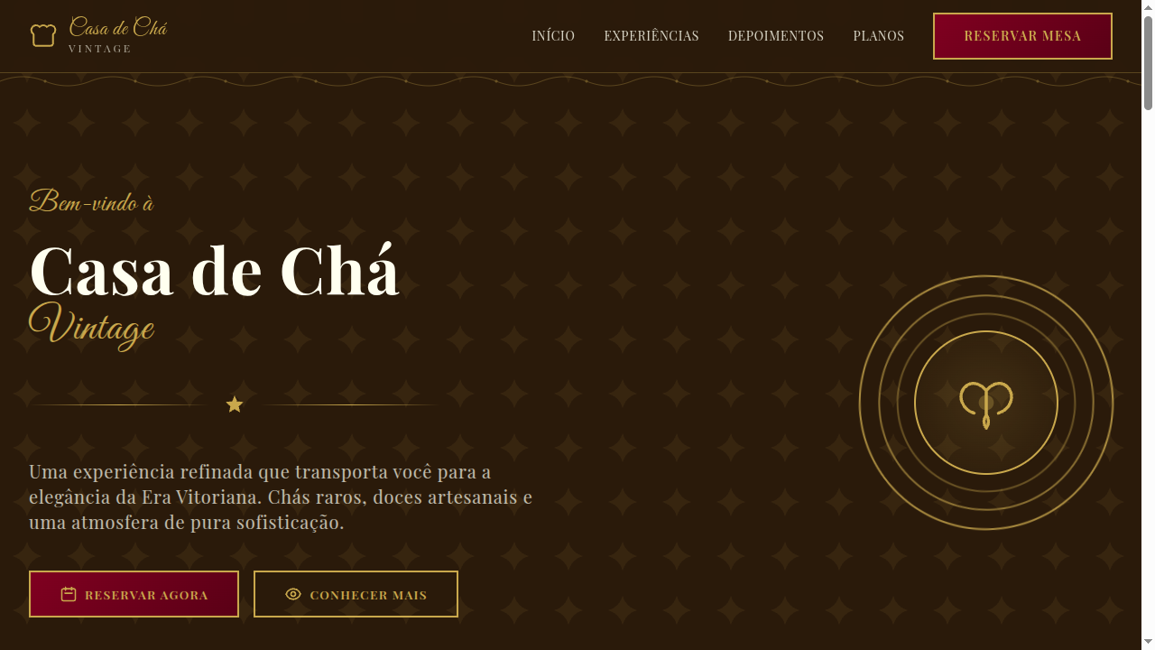
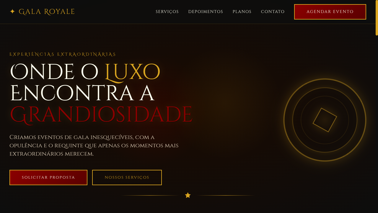
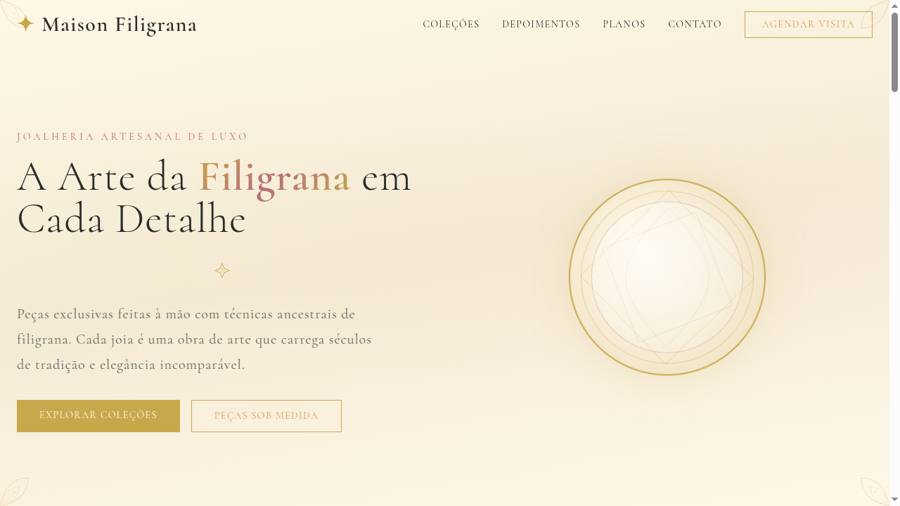
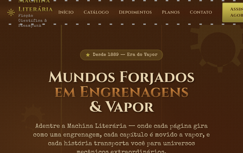
Estilo Vitoriano com detalhes ornamentados, florais intrincados e elegância da era 1837-1901. Ideal para caligrafia moderna, convites temáticos e branding vintage.
Uso: Caligrafia moderna, Convites temáticos, Branding vintage, Designs steampunk
Contexto Histórico
A era Vitoriana (1837-1901) é marcada por ornamentação excessiva, florais intrincados e elegância detalhada. Influenciou profundamente design gráfico, tipografia e artes decorativas.
Especificações Técnicas
Cores
Primárias
Secundárias
Efeitos
Intricate SVG floral border ornaments, Victorian frame corners, rich layered backgrounds with damask patterns, ornate divider lines, elegant hover effects with gold glow, scroll-triggered reveal animations (500ms)
Light/Dark
✓ Full / ✓ Full
CSS
font-family: 'Playfair Display', serif mixed with 'Great Vibes', cursive, background: #FFFFF0 with CSS damask pattern, color: #2A1A0A, border: 2px solid #C9A84C, border-image with ornate SVG, box-shadow: 0 4px 20px rgba(201,168,76,0.2), letter-spacing: 0.05em
Variáveis
--color-burgundy: #800020, --color-gold: #C9A84C, --color-green: #004953, --color-ivory: #FFFFF0, --font-display: 'Playfair Display', --font-script: 'Great Vibes', --border-ornate: 2px solid #C9A84C, --spacing: 2rem
Checklist
☐ Intricate floral SVG borders, ☐ Victorian frame corners on sections, ☐ Damask pattern backgrounds, ☐ Rich deep color palette, ☐ Decorative serif + calligraphic typography, ☐ Ornate divider lines, ☐ Responsive with simplified ornaments on mobile
DESIGN.md
Design System: Victorian
1. Visual Theme & Atmosphere
Estilo Vitoriano com detalhes ornamentados, florais intrincados e elegância da era 1837-1901. Ideal para caligrafia moderna, convites temáticos e branding vintage. A era Vitoriana (1837-1901) é marcada por ornamentação excessiva, florais intrincados e elegância detalhada. Influenciou profundamente design gráfico, tipografia e artes decorativas.
- Density: 5/10 — Balanced
- Variance: 8/10 — Expressive
- Motion: 6/10 — Expressive
2. Color Palette & Roles
- Deep Burgundy (#800020) — Primary surface or dominant color
- Antique Gold (#C9A84C) — Premium accent, decorative highlights
- Midnight Green (#004953) — Dark surface, primary background
- Ivory (#FFFFF0) — Light surface, card backgrounds
- Plum (#8E4585) — Extended palette, decorative use
- Copper (#B87333) — Metallic accent, decorative detail
- Sage (#8A9A5B) — Extended palette, decorative use
- Warm Taupe (#8B7D6B) — Extended palette, decorative use
3. Typography Rules
- Display / Hero: Playfair Display — Weight 700, tight tracking, used for headline impact
- Accent: Great Vibes — Used for decorative or emphasis text
- Body: Playfair Display — Weight 400, 16px/1.6 line-height, max 72ch per line
- UI Labels / Captions: Playfair Display — 0.875rem, weight 500, slight letter-spacing
- Monospace: JetBrains Mono — Used for code, metadata, and technical values
Scale:
- Hero: clamp(2.5rem, 5vw, 4rem)
- H1: 2.25rem
- H2: 1.5rem
- Body: 1rem / 1.6
- Small: 0.875rem
4. Component Stylings
- Primary Button: Subtly rounded (0.5rem) shape. Accent color fill. Hover: 8% darken + subtle lift shadow. Active: -1px translate tactile press. Font weight 600. No outer glows.
- Secondary / Ghost Button: Outline variant. 1.5px border in muted color. Text in primary color. Hover: subtle background fill.
- Cards: Subtly rounded (0.5rem) corners. Surface background. Subtle shadow (0 2px 12px rgba(0,0,0,0.06)). 1px border stroke.
- Inputs: Label above input. 1px border stroke. Focus ring: 2px accent color offset 2px. Error text below in semantic red. No floating labels.
- Navigation: Primary surface background. Active item: accent color indicator. Font weight 500 when active.
- Skeletons: Shimmer animation matching component dimensions. No circular spinners.
- Empty States: Icon-based composition with descriptive text and action button.
5. Layout Principles
- Grid: CSS Grid primary. Max-width containment: 1280px centered with 1.5rem side padding.
- Spacing rhythm: Balanced. Base unit: 0.5rem (8px).
- Section vertical gaps: clamp(4rem, 8vw, 8rem).
- Hero layout: Asymmetric composition.
- Feature sections: Asymmetric grid with varied card sizes. No 3-equal-columns.
- Mobile collapse: All multi-column layouts collapse below 768px. No horizontal overflow.
- z-index contract: base (0) / sticky-nav (100) / overlay (200) / modal (300) / toast (500).
6. Motion & Interaction
- Physics: Spring — stiffness 120, damping 20. Confident, weighted transitions.
- Entry animations: Fade + translate-Y (16px → 0) over 480ms ease-out. Staggered cascades for lists: 100ms between items.
- Hover states: Scale(1.03) + shadow lift over 200ms.
- Page transitions: Fade + slide (300ms).
- Performance: Only transform and opacity animated. No layout-triggering properties.
7. Anti-Patterns (Banned)
- No emojis in UI — use icon system only (Lucide, Heroicons)
- No pure black (#000000) — use off-black or charcoal variants
- No oversaturated accent colors (saturation cap: 80%)
- No 3-column equal-width feature layouts — use zig-zag or asymmetric grid
- No
h-screen— usemin-h-[100dvh] - No AI copywriting clichés: "Elevate", "Seamless", "Unleash", "Next-Gen"
- No broken external image links — use picsum.photos or inline SVG
- No generic lorem ipsum in demos
Prompt para AI
Design a Victorian-era landing page with extremely ornate details. Use deep burgundy, antique gold, midnight green, ivory. Apply intricate SVG floral borders, Victorian frame corners, damask pattern backgrounds, ornate divider lines. Typography should be decorative serif with calligraphic accents. Rich, elegant, and historically detailed atmosphere.
Relacionados
Última sincronização: 01/04/2026