Ethereal
Estilo Etéreo com tons ultra-suaves, camadas translúcidas e atmosfera onírica. Perfeito para alta-costura, arte conceitual e designs refinados e nostálgicos.
Uso: Lookbooks de alta-costura, Arte conceitual, Designs refinados, Portfólios artísticos
Contexto Histórico
O estilo Etéreo transcende épocas, evocando uma qualidade onírica e de outro mundo. Combina delicadeza romântica com minimalismo suave, criando atmosferas leves e nostálgicas.
Especificações Técnicas
Cores
Primárias
Secundárias
Efeitos
Very subtle opacity layers (0.3-0.6), soft gaussian blur backgrounds (5-10px), delicate thin borders (0.5px), gentle fade-in animations (800ms), light text shadows, feathered edges
Light/Dark
✓ Full / ◐ Partial
CSS
font-family: 'Cormorant Garamond', serif, font-weight: 300, background: #F0F0F5, color: #4A4A5A, border: 0.5px solid rgba(200,200,210,0.4), backdrop-filter: blur(8px), opacity layers, transition: all 800ms ease, letter-spacing: 0.08em
Variáveis
--color-blush: #F8E8E0, --color-mist: #F0F0F5, --color-lavender: #E6E0F3, --font-primary: 'Cormorant Garamond', --font-weight: 300, --border-delicate: 0.5px solid rgba(200,200,210,0.4), --transition: 800ms ease, --blur: 8px
Checklist
☐ Ultra-soft color palette, ☐ Translucent layered elements, ☐ Thin elegant typography (weight 300), ☐ Gentle fade-in animations, ☐ Dreamlike atmosphere maintained, ☐ Responsive with preserved delicacy
DESIGN.md
Design System: Ethereal
1. Visual Theme & Atmosphere
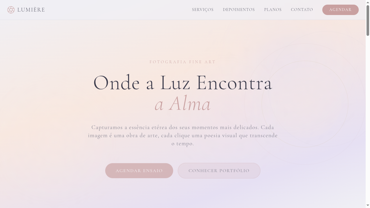
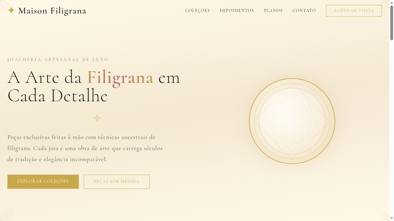
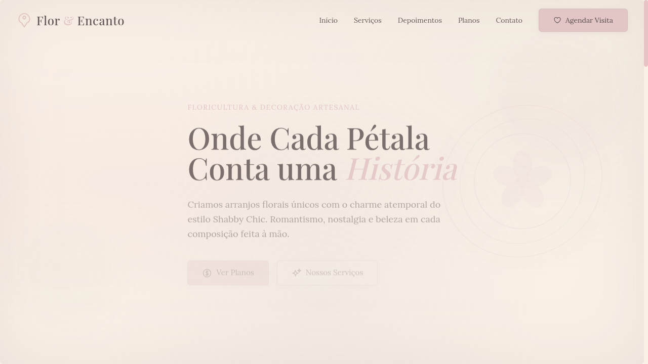
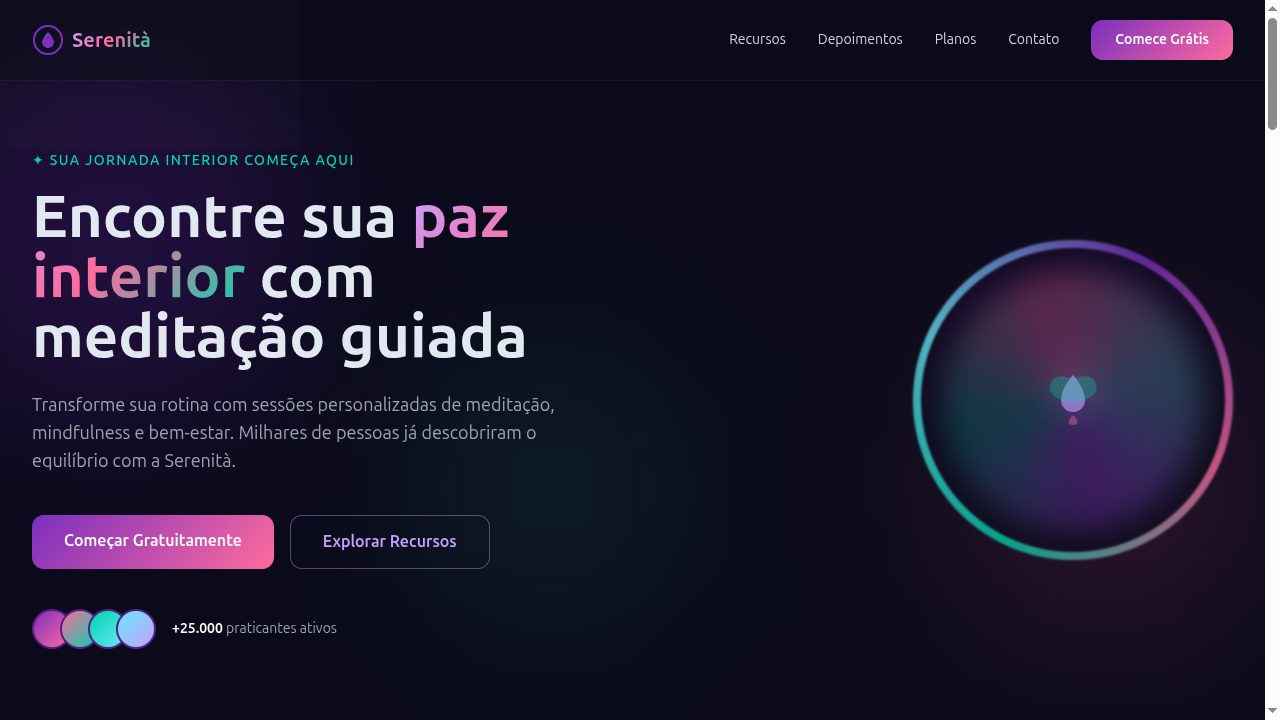
Estilo Etéreo com tons ultra-suaves, camadas translúcidas e atmosfera onírica. Perfeito para alta-costura, arte conceitual e designs refinados e nostálgicos. O estilo Etéreo transcende épocas, evocando uma qualidade onírica e de outro mundo. Combina delicadeza romântica com minimalismo suave, criando atmosferas leves e nostálgicas.
- Density: 5/10 — Balanced
- Variance: 4/10 — Moderate
- Motion: 6/10 — Expressive
2. Color Palette & Roles
- Soft Blush (#F8E8E0) — Primary surface or dominant color
- Mist White (#F0F0F5) — Light surface, card backgrounds
- Pale Lavender (#E6E0F3) — Supporting palette color
- Cloud Grey (#D8D8E0) — Secondary text, borders, muted elements
- Dusty Rose (#C9A0A0) — Extended palette, decorative use
- Soft Gold (#D4C5A0) — Premium accent, decorative highlights
- Pale Sky (#B8D4E3) — Extended palette, decorative use
- Whisper Pink (#F5E0E8) — Primary text color
3. Typography Rules
- Display / Hero: Cormorant Garamond — Weight 700, tight tracking, used for headline impact
- Body: Cormorant Garamond — Weight 400, 16px/1.6 line-height, max 72ch per line
- UI Labels / Captions: Cormorant Garamond — 0.875rem, weight 500, slight letter-spacing
- Monospace: JetBrains Mono — Used for code, metadata, and technical values
Scale:
- Hero: clamp(2.5rem, 5vw, 4rem)
- H1: 2.25rem
- H2: 1.5rem
- Body: 1rem / 1.6
- Small: 0.875rem
4. Component Stylings
- Primary Button: Moderately rounded (0.75rem) shape. Accent color fill. Hover: 8% darken + subtle lift shadow. Active: -1px translate tactile press. Font weight 600. No outer glows.
- Secondary / Ghost Button: Outline variant. 1.5px border in muted color. Text in primary color. Hover: subtle background fill.
- Cards: Moderately rounded (0.75rem) corners. Surface background. Subtle shadow (0 2px 12px rgba(0,0,0,0.06)). 1px border stroke.
- Inputs: Label above input. 1px border stroke. Focus ring: 2px accent color offset 2px. Error text below in semantic red. No floating labels.
- Navigation: Primary surface background. Active item: accent color indicator. Font weight 500 when active.
- Skeletons: Shimmer animation matching component dimensions. No circular spinners.
- Empty States: Icon-based composition with descriptive text and action button.
5. Layout Principles
- Grid: CSS Grid primary. Max-width containment: 1280px centered with 1.5rem side padding.
- Spacing rhythm: Balanced. Base unit: 0.5rem (8px).
- Section vertical gaps: clamp(4rem, 8vw, 8rem).
- Hero layout: Split-screen (text left, visual right).
- Feature sections: Zig-zag alternating text+image rows. No 3-equal-columns.
- Mobile collapse: All multi-column layouts collapse below 768px. No horizontal overflow.
- z-index contract: base (0) / sticky-nav (100) / overlay (200) / modal (300) / toast (500).
6. Motion & Interaction
- Physics: Spring — stiffness 120, damping 20. Confident, weighted transitions.
- Entry animations: Fade + translate-Y (16px → 0) over 480ms ease-out. Staggered cascades for lists: 100ms between items.
- Hover states: Scale(1.03) + shadow lift over 200ms.
- Page transitions: Fade + slide (300ms).
- Performance: Only transform and opacity animated. No layout-triggering properties.
7. Anti-Patterns (Banned)
- No emojis in UI — use icon system only (Lucide, Heroicons)
- No pure black (#000000) — use off-black or charcoal variants
- No oversaturated accent colors (saturation cap: 80%)
- No 3-column equal-width feature layouts — use zig-zag or asymmetric grid
- No
h-screen— usemin-h-[100dvh] - No AI copywriting clichés: "Elevate", "Seamless", "Unleash", "Next-Gen"
- No broken external image links — use picsum.photos or inline SVG
- No generic lorem ipsum in demos
Prompt para AI
Design an ethereal landing page with extremely soft, delicate tones. Use pale blush, lavender, mist white and cloud grey. Apply translucent layers, soft blur backgrounds, thin delicate borders, and gentle fade-in animations. Create a dreamlike, otherworldly atmosphere that feels light, airy and nostalgic. Typography should be thin and elegant.
Relacionados
Última sincronização: 01/04/2026