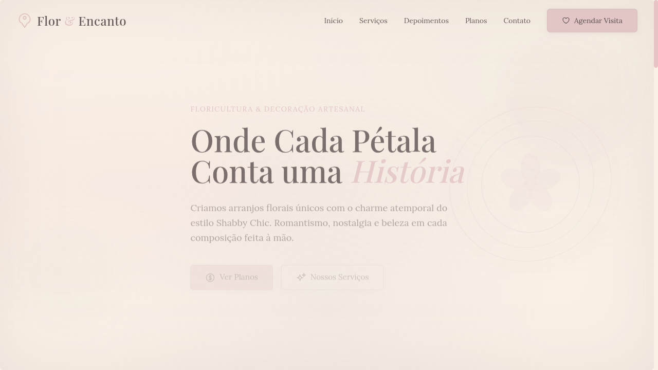
Shabby Chic
Estilo Shabby Chic com tons pastel desbotados, florais vintage e romance rústico. Ideal para convites de casamento, embalagens acolhedoras e marcas nostálgicas.
Uso: Convites de casamento, Embalagens acolhedoras, Marcas nostálgicas, Decoração de interiores
Contexto Histórico
O Shabby Chic surgiu nos anos 80-90 na Inglaterra, celebrando a beleza do desgaste e do reaproveitamento. Combina romance vintage com rusticidade acolhedora em tons pastel desbotados.
Especificações Técnicas
Cores
Primárias
Secundárias
Efeitos
Faded/washed-out color overlays (opacity 0.7), distressed texture backgrounds, soft floral pattern overlays via CSS, vintage vignette borders, gentle blur on background images (3px), delicate thin borders with rounded corners (6px)
Light/Dark
✓ Full / ✗ Not Recommended
CSS
font-family: 'Lora', serif, font-weight: 300-400, background: #FAF0E6, color: #6A5A5A, border: 1px solid rgba(200,180,180,0.4), border-radius: 6px, box-shadow: 0 2px 10px rgba(0,0,0,0.05), filter: saturate(0.8) for faded effect, opacity: 0.9 on decorative elements
Variáveis
--color-rose: #E8C4C4, --color-white: #FAF0E6, --color-sage: #C5D5C5, --color-blue: #A4B8C4, --font-primary: 'Lora', --font-weight: 300, --border-radius: 6px, --shadow-soft: 0 2px 10px rgba(0,0,0,0.05), --saturation: 0.8
Checklist
☐ Faded pastel color palette, ☐ Distressed texture backgrounds, ☐ Floral pattern overlays, ☐ Vintage vignette borders, ☐ Thin elegant serif typography, ☐ Washed-out/faded visual effects, ☐ Cozy nostalgic atmosphere, ☐ Responsive with maintained romance
DESIGN.md
Design System: Shabby Chic
1. Visual Theme & Atmosphere
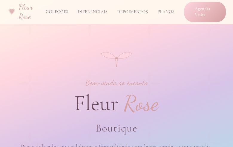
Estilo Shabby Chic com tons pastel desbotados, florais vintage e romance rústico. Ideal para convites de casamento, embalagens acolhedoras e marcas nostálgicas. O Shabby Chic surgiu nos anos 80-90 na Inglaterra, celebrando a beleza do desgaste e do reaproveitamento. Combina romance vintage com rusticidade acolhedora em tons pastel desbotados.
- Density: 5/10 — Balanced
- Variance: 7/10 — Dynamic
- Motion: 4/10 — Subtle
2. Color Palette & Roles
- Faded Rose (#E8C4C4) — Primary surface or dominant color
- Antique White (#FAF0E6) — Light surface, card backgrounds
- Soft Sage (#C5D5C5) — Supporting palette color
- Dusty Blue (#A4B8C4) — Accent highlight, links and focus states
- Lavender Mist (#D8D0E0) — Extended palette, decorative use
- Warm Linen (#F0E6D6) — Extended palette, decorative use
- Blush Pink (#F5D5D5) — Primary text color
- Weathered Wood (#B8A898) — Error states, destructive actions
3. Typography Rules
- Display / Hero: Lora — Weight 700, tight tracking, used for headline impact
- Body: Lora — Weight 400, 16px/1.6 line-height, max 72ch per line
- UI Labels / Captions: Lora — 0.875rem, weight 500, slight letter-spacing
- Monospace: JetBrains Mono — Used for code, metadata, and technical values
Scale:
- Hero: clamp(2.5rem, 5vw, 4rem)
- H1: 2.25rem
- H2: 1.5rem
- Body: 1rem / 1.6
- Small: 0.875rem
4. Component Stylings
- Primary Button: Rounded (6px) shape. Accent color fill. Hover: 8% darken + subtle lift shadow. Active: -1px translate tactile press. Font weight 600. No outer glows.
- Secondary / Ghost Button: Outline variant. 1.5px border in muted color. Text in primary color. Hover: subtle background fill.
- Cards: Rounded (6px) corners. Surface background. Subtle shadow (0 2px 12px rgba(0,0,0,0.06)). 1px border stroke.
- Inputs: Label above input. 1px border stroke. Focus ring: 2px accent color offset 2px. Error text below in semantic red. No floating labels.
- Navigation: Primary surface background. Active item: accent color indicator. Font weight 500 when active.
- Skeletons: Shimmer animation matching component dimensions. No circular spinners.
- Empty States: Icon-based composition with descriptive text and action button.
5. Layout Principles
- Grid: CSS Grid primary. Max-width containment: 1280px centered with 1.5rem side padding.
- Spacing rhythm: Balanced. Base unit: 0.5rem (8px).
- Section vertical gaps: clamp(4rem, 8vw, 8rem).
- Hero layout: Asymmetric composition.
- Feature sections: Asymmetric grid with varied card sizes. No 3-equal-columns.
- Mobile collapse: All multi-column layouts collapse below 768px. No horizontal overflow.
- z-index contract: base (0) / sticky-nav (100) / overlay (200) / modal (300) / toast (500).
6. Motion & Interaction
- Physics: Ease-out curves, 200-300ms duration. Smooth and predictable.
- Entry animations: Fade + translate-Y (16px → 0) over 420ms ease-out. Staggered cascades for lists: 80ms between items.
- Hover states: Subtle color shift + shadow adjustment over 200ms.
- Page transitions: Fade only (200ms).
- Performance: Only transform and opacity animated. No layout-triggering properties.
7. Anti-Patterns (Banned)
- No emojis in UI — use icon system only (Lucide, Heroicons)
- No pure black (#000000) — use off-black or charcoal variants
- No oversaturated accent colors (saturation cap: 80%)
- No 3-column equal-width feature layouts — use zig-zag or asymmetric grid
- No
h-screen— usemin-h-[100dvh] - No AI copywriting clichés: "Elevate", "Seamless", "Unleash", "Next-Gen"
- No broken external image links — use picsum.photos or inline SVG
- No generic lorem ipsum in demos
Prompt para AI
Design a shabby chic landing page with faded pastel tones and vintage romance. Use faded rose, antique white, soft sage, dusty blue. Apply distressed texture backgrounds, faded floral overlays, vintage vignette borders, washed-out color effects. Typography should be elegant serif with thin weights. Cozy, nostalgic, cottage-like atmosphere.
Relacionados
Última sincronização: 01/04/2026