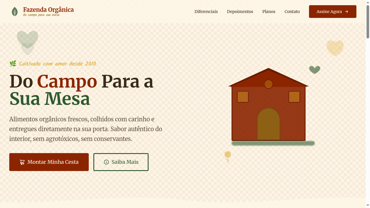
Farmhouse / Cottage Core
Estilo Farmhouse/Cottage Core com simplicidade rústica, tecidos naturais e charme do campo. Ideal para decoração de interiores, marcas boutique e capas de livros.
Uso: Decoração de interiores, Marcas de vestuário boutique, Capas de livros, Produtos artesanais
Contexto Histórico
O Farmhouse/Cottage Core celebra a vida rural simples, com raízes na estética americana e inglesa do campo. Ganhou força nas redes sociais como movimento de valorização do artesanal e natural.
Especificações Técnicas
Cores
Primárias
Secundárias
Efeitos
Wood grain texture backgrounds, gingham/plaid CSS patterns, hand-drawn botanical SVG decorations, rustic thick borders (3px), warm sepia-toned overlays, gentle sway animations on botanical elements
Light/Dark
✓ Full / ◐ Partial
CSS
font-family: 'Merriweather', serif mixed with 'Kalam', cursive, background: #FDF5E6 with CSS gingham pattern, color: #3A2A1A, border: 3px solid #8B2500, border-radius: 4px, box-shadow: 2px 2px 0 rgba(139,37,0,0.1), line-height: 1.7
Variáveis
--color-barn-red: #8B2500, --color-cream: #FDF5E6, --color-wood: #8B6914, --color-forest: #2E5A2E, --font-serif: 'Merriweather', --font-handwritten: 'Kalam', --border: 3px solid #8B2500, --border-radius: 4px, --spacing: 2rem
Checklist
☐ Rustic earthy color palette, ☐ Wood grain texture backgrounds, ☐ Gingham/plaid patterns, ☐ Botanical SVG decorations, ☐ Warm serif + handwritten typography, ☐ Pastoral cozy atmosphere, ☐ Responsive with maintained charm
DESIGN.md
Design System: Farmhouse / Cottage Core
1. Visual Theme & Atmosphere
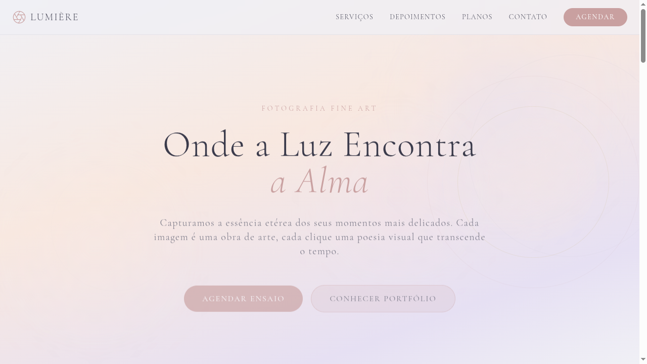
Estilo Farmhouse/Cottage Core com simplicidade rústica, tecidos naturais e charme do campo. Ideal para decoração de interiores, marcas boutique e capas de livros. O Farmhouse/Cottage Core celebra a vida rural simples, com raízes na estética americana e inglesa do campo. Ganhou força nas redes sociais como movimento de valorização do artesanal e natural.
- Density: 5/10 — Balanced
- Variance: 4/10 — Moderate
- Motion: 6/10 — Expressive
2. Color Palette & Roles
- Barn Red (#8B2500) — Error states, destructive actions
- Cream White (#FDF5E6) — Light surface, card backgrounds
- Natural Wood (#8B6914) — Supporting palette color
- Forest Green (#2E5A2E) — Supporting palette color
- Wheat Gold (#DAA520) — Premium accent, decorative highlights
- Stone Grey (#8E8E82) — Secondary text, borders, muted elements
- Lavender (#9B8EC4) — Extended palette, decorative use
- Sky Blue (#87CEEB) — Secondary accent
3. Typography Rules
- Display / Hero: Merriweather — Weight 700, tight tracking, used for headline impact
- Accent: Kalam — Used for decorative or emphasis text
- Body: Merriweather — Weight 400, 16px/1.6 line-height, max 72ch per line
- UI Labels / Captions: Merriweather — 0.875rem, weight 500, slight letter-spacing
- Monospace: JetBrains Mono — Used for code, metadata, and technical values
Scale:
- Hero: clamp(2.5rem, 5vw, 4rem)
- H1: 2.25rem
- H2: 1.5rem
- Body: 1rem / 1.6
- Small: 0.875rem
4. Component Stylings
- Primary Button: Rounded (4px) shape. Accent color fill. Hover: 8% darken + subtle lift shadow. Active: -1px translate tactile press. Font weight 600. No outer glows.
- Secondary / Ghost Button: Outline variant. 1.5px border in muted color. Text in primary color. Hover: subtle background fill.
- Cards: Rounded (4px) corners. Surface background. Subtle shadow (0 2px 12px rgba(0,0,0,0.06)). 1px border stroke.
- Inputs: Label above input. 1px border stroke. Focus ring: 2px accent color offset 2px. Error text below in semantic red. No floating labels.
- Navigation: Primary surface background. Active item: accent color indicator. Font weight 500 when active.
- Skeletons: Shimmer animation matching component dimensions. No circular spinners.
- Empty States: Icon-based composition with descriptive text and action button.
5. Layout Principles
- Grid: CSS Grid primary. Max-width containment: 1280px centered with 1.5rem side padding.
- Spacing rhythm: Balanced. Base unit: 0.5rem (8px).
- Section vertical gaps: clamp(4rem, 8vw, 8rem).
- Hero layout: Split-screen (text left, visual right).
- Feature sections: Zig-zag alternating text+image rows. No 3-equal-columns.
- Mobile collapse: All multi-column layouts collapse below 768px. No horizontal overflow.
- z-index contract: base (0) / sticky-nav (100) / overlay (200) / modal (300) / toast (500).
6. Motion & Interaction
- Physics: Spring — stiffness 120, damping 20. Confident, weighted transitions.
- Entry animations: Fade + translate-Y (16px → 0) over 480ms ease-out. Staggered cascades for lists: 100ms between items.
- Hover states: Scale(1.03) + shadow lift over 200ms.
- Page transitions: Fade + slide (300ms).
- Performance: Only transform and opacity animated. No layout-triggering properties.
7. Anti-Patterns (Banned)
- No emojis in UI — use icon system only (Lucide, Heroicons)
- No pure black (#000000) — use off-black or charcoal variants
- No oversaturated accent colors (saturation cap: 80%)
- No 3-column equal-width feature layouts — use zig-zag or asymmetric grid
- No
h-screen— usemin-h-[100dvh] - No AI copywriting clichés: "Elevate", "Seamless", "Unleash", "Next-Gen"
- No broken external image links — use picsum.photos or inline SVG
- No generic lorem ipsum in demos
Prompt para AI
Design a farmhouse/cottage core landing page with rustic countryside charm. Use barn red, cream white, natural wood, forest green. Apply wood grain textures, gingham patterns, hand-drawn botanical SVG decorations, rustic thick borders. Typography should be warm serif mixed with handwritten accents. Pastoral, cozy, handmade atmosphere rooted in rural simplicity.
Relacionados
Última sincronização: 01/04/2026