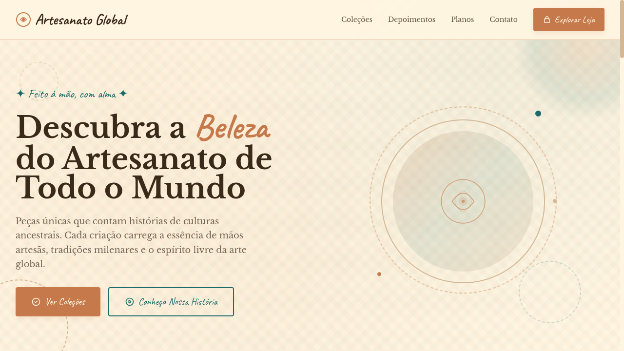
Bohemian (Boho)
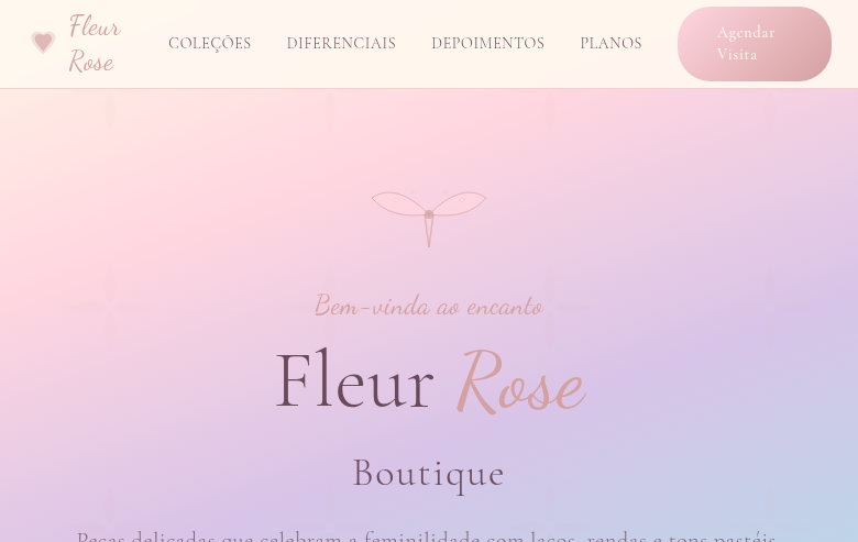
Estilo Bohemian com paleta terrosa vibrante, texturas em camadas e influências globais. Ideal para branding de eventos, moda e produtos lifestyle criativos.
Uso: Branding de eventos, Linhas de moda, Produtos lifestyle, Marcas de viagem
Contexto Histórico
O estilo Bohemian nasceu da contracultura dos anos 60-70, inspirado por viagens, artesanato global e espírito livre. Hoje é sinônimo de design eclético, terroso e autêntico.
Especificações Técnicas
Cores
Primárias
Secundárias
Efeitos
Layered textile-like textures (CSS patterns), hand-drawn style borders, warm gradient overlays, macramé-inspired decorative dividers via SVG, gentle parallax on background textures, earthy shadow tones
Light/Dark
✓ Full / ◐ Partial
CSS
font-family: 'Libre Baskerville', serif mixed with 'Caveat', cursive, background: #FFF5E1 with CSS textile patterns, color: #3A2A1A, border: 2px solid #C67A4B, border-radius: 4px, box-shadow: 0 4px 12px rgba(198,122,75,0.15), line-height: 1.7
Variáveis
--color-terracotta: #C67A4B, --color-sand: #D4B896, --color-teal: #1A6B6A, --color-cream: #FFF5E1, --font-serif: 'Libre Baskerville', --font-handwritten: 'Caveat', --border-radius: 4px, --spacing: 2rem
Checklist
☐ Earthy muted color palette, ☐ Layered textile textures, ☐ Hand-drawn style borders, ☐ Macramé-inspired dividers, ☐ Mixed serif and handwritten typography, ☐ Free-spirited eclectic atmosphere, ☐ Responsive with maintained warmth
DESIGN.md
Design System: Bohemian (Boho)
1. Visual Theme & Atmosphere
Estilo Bohemian com paleta terrosa vibrante, texturas em camadas e influências globais. Ideal para branding de eventos, moda e produtos lifestyle criativos. O estilo Bohemian nasceu da contracultura dos anos 60-70, inspirado por viagens, artesanato global e espírito livre. Hoje é sinônimo de design eclético, terroso e autêntico.
- Density: 5/10 — Balanced
- Variance: 7/10 — Dynamic
- Motion: 8/10 — Cinematic
2. Color Palette & Roles
- Terracotta (#C67A4B) — Primary surface or dominant color
- Desert Sand (#D4B896) — Secondary surface or text color
- Deep Teal (#1A6B6A) — Accent highlight, links and focus states
- Warm Cream (#FFF5E1) — Light surface, card backgrounds
- Burnt Orange (#CC5500) — Warm accent, call-to-action secondary
- Dusty Mauve (#B08B8B) — Extended palette, decorative use
- Olive (#6B7B3A) — Extended palette, decorative use
- Indigo (#3F51B5) — Accent color, emphasis elements
3. Typography Rules
- Display / Hero: Libre Baskerville — Weight 700, tight tracking, used for headline impact
- Accent: Caveat — Used for decorative or emphasis text
- Body: Libre Baskerville — Weight 400, 16px/1.6 line-height, max 72ch per line
- UI Labels / Captions: Libre Baskerville — 0.875rem, weight 500, slight letter-spacing
- Monospace: JetBrains Mono — Used for code, metadata, and technical values
Scale:
- Hero: clamp(2.5rem, 5vw, 4rem)
- H1: 2.25rem
- H2: 1.5rem
- Body: 1rem / 1.6
- Small: 0.875rem
4. Component Stylings
- Primary Button: Rounded (4px) shape. Accent color fill. Hover: 8% darken + subtle lift shadow. Active: -1px translate tactile press. Font weight 600. No outer glows.
- Secondary / Ghost Button: Outline variant. 1.5px border in muted color. Text in primary color. Hover: subtle background fill.
- Cards: Rounded (4px) corners. Surface background. Subtle shadow (0 2px 12px rgba(0,0,0,0.06)). 1px border stroke.
- Inputs: Label above input. 1px border stroke. Focus ring: 2px accent color offset 2px. Error text below in semantic red. No floating labels.
- Navigation: Primary surface background. Active item: accent color indicator. Font weight 500 when active.
- Skeletons: Shimmer animation matching component dimensions. No circular spinners.
- Empty States: Icon-based composition with descriptive text and action button.
5. Layout Principles
- Grid: CSS Grid primary. Max-width containment: 1280px centered with 1.5rem side padding.
- Spacing rhythm: Balanced. Base unit: 0.5rem (8px).
- Section vertical gaps: clamp(4rem, 8vw, 8rem).
- Hero layout: Asymmetric composition.
- Feature sections: Asymmetric grid with varied card sizes. No 3-equal-columns.
- Mobile collapse: All multi-column layouts collapse below 768px. No horizontal overflow.
- z-index contract: base (0) / sticky-nav (100) / overlay (200) / modal (300) / toast (500).
6. Motion & Interaction
- Physics: Spring — stiffness 120, damping 20. Confident, weighted transitions.
- Entry animations: Fade + translate-Y (16px → 0) over 540ms ease-out. Staggered cascades for lists: 120ms between items.
- Hover states: Scale(1.03) + shadow lift over 200ms.
- Page transitions: Fade + slide (300ms).
- Performance: Only transform and opacity animated. No layout-triggering properties.
7. Anti-Patterns (Banned)
- No emojis in UI — use icon system only (Lucide, Heroicons)
- No pure black (#000000) — use off-black or charcoal variants
- No oversaturated accent colors (saturation cap: 80%)
- No 3-column equal-width feature layouts — use zig-zag or asymmetric grid
- No
h-screen— usemin-h-[100dvh] - No AI copywriting clichés: "Elevate", "Seamless", "Unleash", "Next-Gen"
- No broken external image links — use picsum.photos or inline SVG
- No generic lorem ipsum in demos
Prompt para AI
Design a bohemian landing page with vibrant yet muted earthy tones. Use terracotta, desert sand, deep teal, warm cream. Apply layered textile textures, hand-drawn borders, macramé-inspired SVG dividers, warm gradient overlays. Typography should mix serif and handwritten fonts. Free-spirited, eclectic, globally-inspired atmosphere with handmade feel.
Relacionados
Última sincronização: 01/04/2026