Gothic
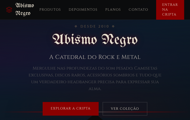
Estilo Gótico com arcos pontiagudos, entalhes intrincados e aura sombria misteriosa. Ideal para merchandising de bandas, logótipos provocadores e moda dark.
Uso: Merchandising de bandas, Logótipos provocadores, Branding vintage dark, Moda gótica
Contexto Histórico
O estilo Gótico (séc. XII-XVI) é marcado por arcos pontiagudos, vitrais e entalhes intrincados das catedrais medievais. Revivido em subculturas modernas, varia do grandioso ao misterioso.
Especificações Técnicas
Cores
Primárias
Secundárias
Efeitos
Pointed arch shapes via clip-path, intricate SVG tracery patterns, cathedral window-inspired section frames, dark gradient backgrounds with fog effect, gargoyle/ornament SVG decorations, eerie glow effects on hover, slow dramatic transitions (600ms)
Light/Dark
✗ Not Recommended / ✓ Full
CSS
font-family: 'UnifrakturMaguntia', 'Cinzel', serif, background: linear-gradient(to bottom, #0B0B0B, #1A0A1A), color: #E8E0D0, border: 2px solid #5A5A5A, clip-path: polygon() for pointed arches, box-shadow: 0 0 30px rgba(139,0,0,0.2), text-shadow: 0 0 10px rgba(139,0,0,0.3), transition: all 600ms ease
Variáveis
--color-black: #0B0B0B, --color-red: #8B0000, --color-grey: #5A5A5A, --color-bone: #E8E0D0, --font-gothic: 'UnifrakturMaguntia', --font-serif: 'Cinzel', --glow-red: rgba(139,0,0,0.2), --border: 2px solid #5A5A5A, --spacing: 2rem, --transition: 600ms
Checklist
☐ Dark mysterious color palette, ☐ Pointed arch shapes, ☐ Intricate SVG tracery patterns, ☐ Cathedral window-inspired frames, ☐ Gothic/blackletter typography, ☐ Eerie glow effects, ☐ Dark fog gradient backgrounds, ☐ Responsive with maintained mystery
DESIGN.md
Design System: Gothic
1. Visual Theme & Atmosphere
Estilo Gótico com arcos pontiagudos, entalhes intrincados e aura sombria misteriosa. Ideal para merchandising de bandas, logótipos provocadores e moda dark. O estilo Gótico (séc. XII-XVI) é marcado por arcos pontiagudos, vitrais e entalhes intrincados das catedrais medievais. Revivido em subculturas modernas, varia do grandioso ao misterioso.
- Density: 5/10 — Balanced
- Variance: 4/10 — Moderate
- Motion: 4/10 — Subtle
2. Color Palette & Roles
- Obsidian Black (#0B0B0B) — Dark surface, primary background
- Blood Red (#8B0000) — Error states, destructive actions
- Stone Grey (#5A5A5A) — Secondary text, borders, muted elements
- Bone White (#E8E0D0) — Light surface, card backgrounds
- Deep Purple (#2D0A3E) — Accent color, emphasis elements
- Midnight Blue (#0D1B2A) — Deep contrast surface
- Tarnished Gold (#8B7355) — Premium accent, decorative highlights
- Moss Green (#4A5A3A) — Success states, positive indicators
3. Typography Rules
- Display / Hero: UnifrakturMaguntia — Weight 700, tight tracking, used for headline impact
- Accent: Cinzel — Used for decorative or emphasis text
- Body: UnifrakturMaguntia — Weight 400, 16px/1.6 line-height, max 72ch per line
- UI Labels / Captions: UnifrakturMaguntia — 0.875rem, weight 500, slight letter-spacing
- Monospace: JetBrains Mono — Used for code, metadata, and technical values
Scale:
- Hero: clamp(2.5rem, 5vw, 4rem)
- H1: 2.25rem
- H2: 1.5rem
- Body: 1rem / 1.6
- Small: 0.875rem
4. Component Stylings
- Primary Button: Subtly rounded (0.5rem) shape. Accent color fill. Hover: 8% darken + subtle lift shadow. Active: -1px translate tactile press. Font weight 600. No outer glows.
- Secondary / Ghost Button: Outline variant. 1.5px border in muted color. Text in primary color. Hover: subtle background fill.
- Cards: Subtly rounded (0.5rem) corners. Surface background. Subtle shadow (0 2px 12px rgba(0,0,0,0.06)). 1px border stroke.
- Inputs: Label above input. 1px border stroke. Focus ring: 2px accent color offset 2px. Error text below in semantic red. No floating labels.
- Navigation: Primary surface background. Active item: accent color indicator. Font weight 500 when active.
- Skeletons: Shimmer animation matching component dimensions. No circular spinners.
- Empty States: Icon-based composition with descriptive text and action button.
5. Layout Principles
- Grid: CSS Grid primary. Max-width containment: 1280px centered with 1.5rem side padding.
- Spacing rhythm: Balanced. Base unit: 0.5rem (8px).
- Section vertical gaps: clamp(4rem, 8vw, 8rem).
- Hero layout: Split-screen (text left, visual right).
- Feature sections: Zig-zag alternating text+image rows. No 3-equal-columns.
- Mobile collapse: All multi-column layouts collapse below 768px. No horizontal overflow.
- z-index contract: base (0) / sticky-nav (100) / overlay (200) / modal (300) / toast (500).
6. Motion & Interaction
- Physics: Ease-out curves, 200-300ms duration. Smooth and predictable.
- Entry animations: Fade + translate-Y (16px → 0) over 420ms ease-out. Staggered cascades for lists: 80ms between items.
- Hover states: Subtle color shift + shadow adjustment over 200ms.
- Page transitions: Fade only (200ms).
- Performance: Only transform and opacity animated. No layout-triggering properties.
7. Anti-Patterns (Banned)
- No emojis in UI — use icon system only (Lucide, Heroicons)
- No pure white (#FFFFFF) backgrounds — use off-white or dark surfaces
- No oversaturated accent colors (saturation cap: 80%)
- No 3-column equal-width feature layouts — use zig-zag or asymmetric grid
- No
h-screen— usemin-h-[100dvh] - No AI copywriting clichés: "Elevate", "Seamless", "Unleash", "Next-Gen"
- No broken external image links — use picsum.photos or inline SVG
- No generic lorem ipsum in demos
Prompt para AI
Design a gothic landing page with dark, mysterious, cathedral-inspired aesthetics. Use obsidian black, blood red, stone grey, bone white. Apply pointed arch clip-path shapes, intricate SVG tracery patterns, cathedral window frames, dark fog gradient backgrounds, gargoyle SVG decorations, eerie glow effects. Typography should be blackletter or gothic serif. Dramatic, mysterious, grandeur atmosphere.
Relacionados
Última sincronização: 01/04/2026