Acanthus
Estilo Acanto com padrões de folhas clássicas, bordas ornamentais e tipografia serifada elegante. Ideal para detalhes arquitetônicos, tipografia sofisticada e layouts de impressão.
Uso: Detalhes arquitetônicos, Tipografia sofisticada, Layouts de impressão elegantes, Museus
Contexto Histórico
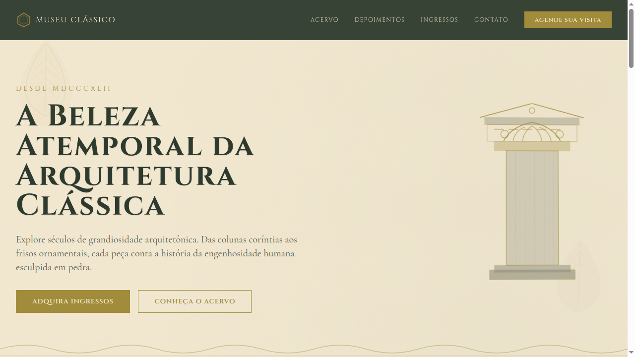
O padrão de folha de acanto é um dos motivos decorativos mais antigos, encontrado em capitéis coríntios da Grécia Antiga. Simboliza resistência e beleza natural na arquitetura clássica.
Especificações Técnicas
Cores
Primárias
Secundárias
Efeitos
SVG acanthus leaf border ornaments, classical column-inspired section dividers, subtle emboss effect on headings, warm parchment texture backgrounds, gentle parallax on decorative elements, smooth transitions (350ms)
Light/Dark
✓ Full / ◐ Partial
CSS
font-family: 'Cinzel', serif, background: #F2E8D0, color: #2D3A2D, border: 1px solid #A08C3A, border-image with SVG leaf patterns, text-shadow: 0 1px 2px rgba(0,0,0,0.1), box-shadow: 0 4px 16px rgba(0,0,0,0.08), letter-spacing: 0.04em
Variáveis
--color-stone: #8C8C7A, --color-olive-gold: #A08C3A, --color-parchment: #F2E8D0, --color-forest: #2D3A2D, --font-display: 'Cinzel', --border-classical: 1px solid #A08C3A, --spacing: 2.5rem, --border-radius: 0px
Checklist
☐ Acanthus leaf SVG border ornaments, ☐ Classical column section dividers, ☐ Parchment/stone texture backgrounds, ☐ Serif typography with flourishes, ☐ Olive gold accent color consistent, ☐ Responsive with simplified ornaments on mobile
DESIGN.md
Design System: Acanthus
1. Visual Theme & Atmosphere
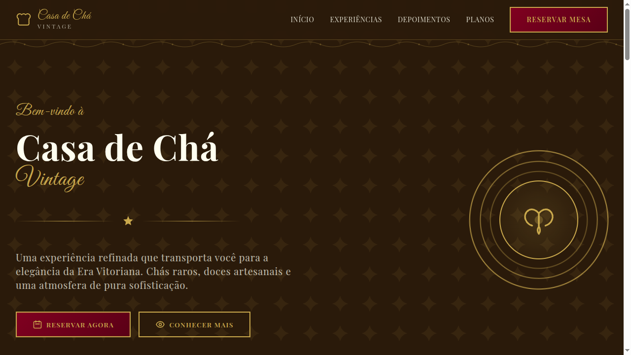
Estilo Acanto com padrões de folhas clássicas, bordas ornamentais e tipografia serifada elegante. Ideal para detalhes arquitetônicos, tipografia sofisticada e layouts de impressão. O padrão de folha de acanto é um dos motivos decorativos mais antigos, encontrado em capitéis coríntios da Grécia Antiga. Simboliza resistência e beleza natural na arquitetura clássica.
- Density: 5/10 — Balanced
- Variance: 4/10 — Moderate
- Motion: 8/10 — Cinematic
2. Color Palette & Roles
- Stone Grey (#8C8C7A) — Secondary text, borders, muted elements
- Olive Gold (#A08C3A) — Premium accent, decorative highlights
- Parchment (#F2E8D0) — Supporting palette color
- Deep Forest (#2D3A2D) — Supporting palette color
- Terracotta (#C67A4B) — Extended palette, decorative use
- Aged Bronze (#8B7355) — Metallic accent, decorative detail
- Sage Green (#7A8B6A) — Success states, positive indicators
- Warm Cream (#F5EDD6) — Secondary surface
3. Typography Rules
- Display / Hero: Cinzel — Weight 700, tight tracking, used for headline impact
- Body: Cinzel — Weight 400, 16px/1.6 line-height, max 72ch per line
- UI Labels / Captions: Cinzel — 0.875rem, weight 500, slight letter-spacing
- Monospace: JetBrains Mono — Used for code, metadata, and technical values
Scale:
- Hero: clamp(2.5rem, 5vw, 4rem)
- H1: 2.25rem
- H2: 1.5rem
- Body: 1rem / 1.6
- Small: 0.875rem
4. Component Stylings
- Primary Button: Sharp edges (0px) shape. Accent color fill. Hover: 8% darken + subtle lift shadow. Active: -1px translate tactile press. Font weight 600. No outer glows.
- Secondary / Ghost Button: Outline variant. 1.5px border in muted color. Text in primary color. Hover: subtle background fill.
- Cards: Sharp edges (0px) corners. Surface background. Subtle shadow (0 2px 12px rgba(0,0,0,0.06)). 1px border stroke.
- Inputs: Label above input. 1px border stroke. Focus ring: 2px accent color offset 2px. Error text below in semantic red. No floating labels.
- Navigation: Primary surface background. Active item: accent color indicator. Font weight 500 when active.
- Skeletons: Shimmer animation matching component dimensions. No circular spinners.
- Empty States: Icon-based composition with descriptive text and action button.
5. Layout Principles
- Grid: CSS Grid primary. Max-width containment: 1280px centered with 1.5rem side padding.
- Spacing rhythm: Balanced. Base unit: 0.5rem (8px).
- Section vertical gaps: clamp(4rem, 8vw, 8rem).
- Hero layout: Split-screen (text left, visual right).
- Feature sections: Zig-zag alternating text+image rows. No 3-equal-columns.
- Mobile collapse: All multi-column layouts collapse below 768px. No horizontal overflow.
- z-index contract: base (0) / sticky-nav (100) / overlay (200) / modal (300) / toast (500).
6. Motion & Interaction
- Physics: Spring — stiffness 120, damping 20. Confident, weighted transitions.
- Entry animations: Fade + translate-Y (16px → 0) over 540ms ease-out. Staggered cascades for lists: 120ms between items.
- Hover states: Scale(1.03) + shadow lift over 200ms.
- Page transitions: Fade + slide (300ms).
- Performance: Only transform and opacity animated. No layout-triggering properties.
7. Anti-Patterns (Banned)
- No emojis in UI — use icon system only (Lucide, Heroicons)
- No pure black (#000000) — use off-black or charcoal variants
- No oversaturated accent colors (saturation cap: 80%)
- No 3-column equal-width feature layouts — use zig-zag or asymmetric grid
- No
h-screen— usemin-h-[100dvh] - No AI copywriting clichés: "Elevate", "Seamless", "Unleash", "Next-Gen"
- No broken external image links — use picsum.photos or inline SVG
- No generic lorem ipsum in demos
Prompt para AI
Design a landing page inspired by acanthus leaf patterns from Greek and Roman architecture. Use SVG leaf border ornaments, classical column dividers, stone and parchment textures, olive gold accents. Typography should feature classical serifs with decorative flourishes. Evoke architectural elegance and timeless craftsmanship.
Relacionados
Última sincronização: 01/04/2026