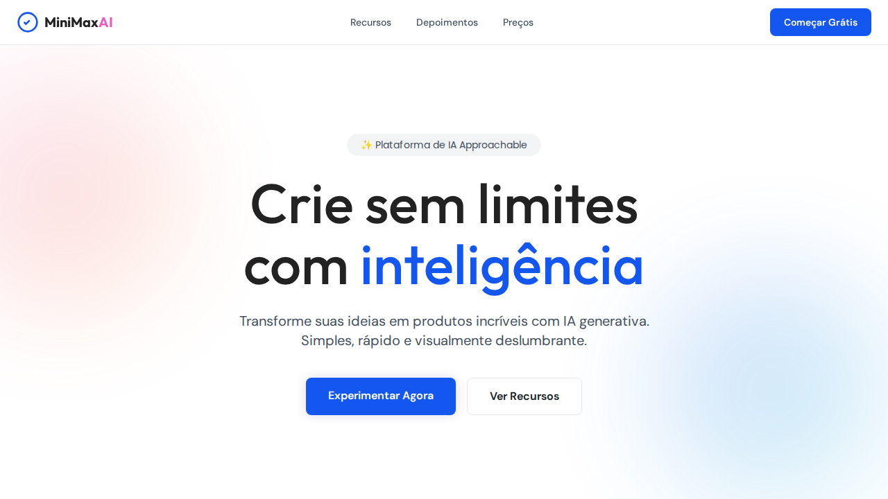
MiniMax Colorful Cards
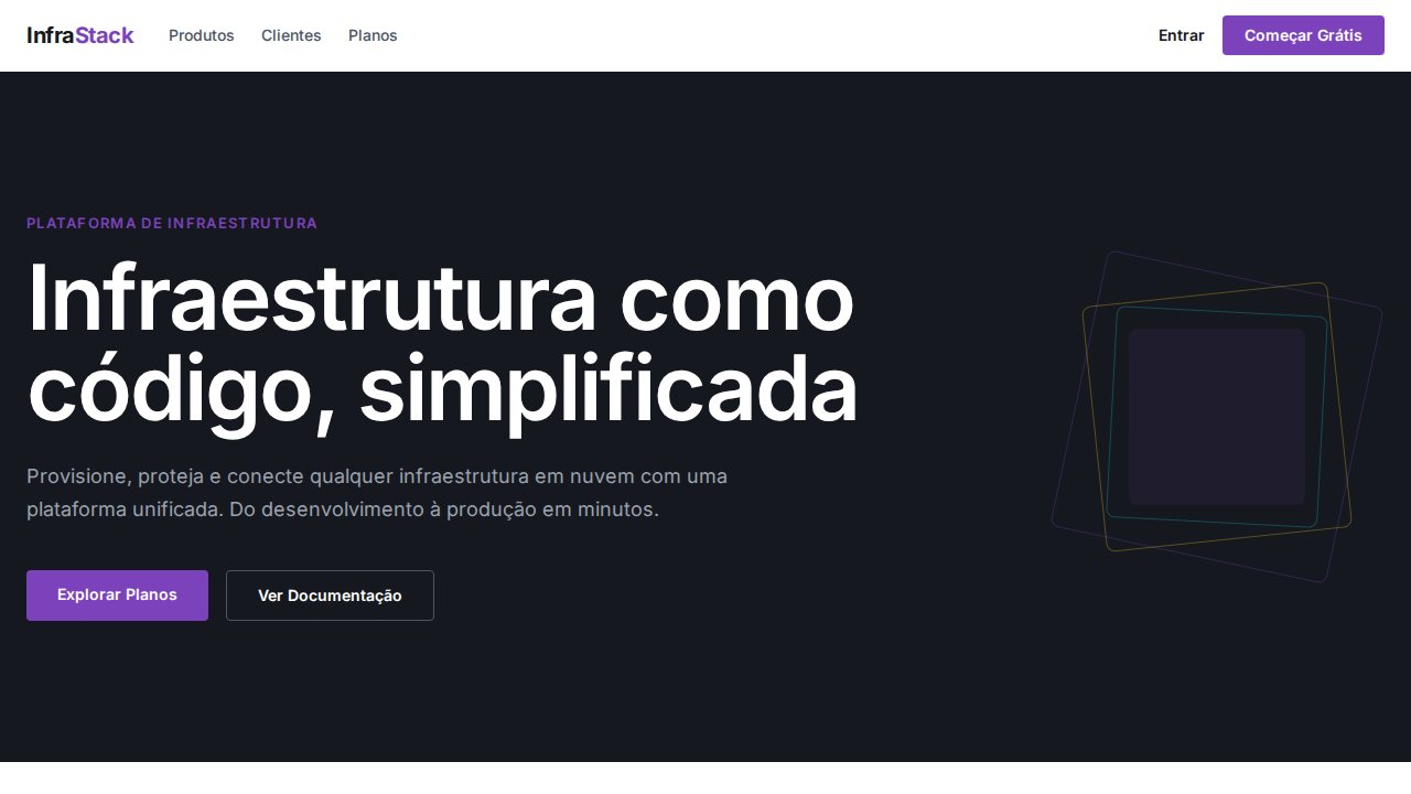
Estilo MiniMax Colorful Cards com canvas branco, cards vibrantes e sombras roxas. Ideal para plataformas de IA, produtos multi-modelo e galerias de AI.
Uso: Plataformas de IA multi-modelo, Galerias de AI, Produtos consumer AI, Showcases de tecnologia
Contexto Histórico
Inspirado no design do MiniMax, que trata cada produto AI como um ícone de app colorido em uma galeria branca.
Especificações Técnicas
Cores
Primárias
Secundárias
Efeitos
Canvas branco dominante com cards de produto coloridos como âncoras visuais. Cards com gradientes vibrantes (rosa, roxo, laranja, azul) como galeria de IA. Sombras purple-tinted (rgba(44,30,116,0.16)) criando glow de marca. Pill nav (9999px) para navegação e toggles. Cards generosamente arredondados (20-24px). Multi-font: DM Sans (UI), Outfit (display), Poppins (mid-tier). Hero 80px weight 500 line-height 1.10. Line-height universal 1.50.
Light/Dark
✓ Full / ✗ Not Recommended
CSS
background: #ffffff; color: #222222; accent: #1456f0; box-shadow: rgba(44,30,116,0.16) 0px 0px 15px; border-radius: 20px cards, 9999px pills, 8px buttons; font-family: 'DM Sans' body, 'Outfit' display; line-height: 1.50
Variáveis
--bg: #ffffff; --text: #222222; --brand-blue: #1456f0; --brand-pink: #ea5ec1; --primary: #3b82f6; --dark: #181e25; --border: #e5e7eb; --shadow-purple: rgba(44,30,116,0.16); --radius-card: 20px; --radius-pill: 9999px; --radius-btn: 8px
Checklist
☐ Canvas branco com cards coloridos, ☐ Gradientes vibrantes nos cards, ☐ Sombras purple-tinted, ☐ Pill nav 9999px, ☐ Cards 20-24px radius, ☐ Multi-font system, ☐ Hero 80px weight 500, ☐ Responsivo
DESIGN.md
Design System: MiniMax Colorful Cards
1. Visual Theme & Atmosphere
Estilo MiniMax Colorful Cards com canvas branco, cards vibrantes e sombras roxas. Ideal para plataformas de IA, produtos multi-modelo e galerias de AI. Inspirado no design do MiniMax, que trata cada produto AI como um ícone de app colorido em uma galeria branca.
- Density: 5/10 — Balanced
- Variance: 4/10 — Moderate
- Motion: 4/10 — Subtle
2. Color Palette & Roles
- Branco (#ffffff) — Light surface, card backgrounds
- Quase Preto (#222222) — Dark surface, primary background
- Azul Brand (#1456f0) — Primary accent, CTAs and interactive elements
- Rosa Brand (#ea5ec1) — Primary accent, CTAs and interactive elements
- Azul Primary (#3b82f6) — Primary accent, CTAs and interactive elements
- Escuro (#181e25) — Deep contrast surface
- Cinza (#45515e) — Secondary text, borders, muted elements
- Borda (#e5e7eb) — Extended palette, decorative use
3. Typography Rules
- Display / Hero: DM Sans — Weight 700, tight tracking, used for headline impact
- Accent: Outfit — Used for decorative or emphasis text
- Body: DM Sans — Weight 400, 16px/1.6 line-height, max 72ch per line
- UI Labels / Captions: DM Sans — 0.875rem, weight 500, slight letter-spacing
- Monospace: JetBrains Mono — Used for code, metadata, and technical values
Scale:
- Hero: clamp(2.5rem, 5vw, 4rem)
- H1: 2.25rem
- H2: 1.5rem
- Body: 1rem / 1.6
- Small: 0.875rem
4. Component Stylings
- Primary Button: Pill-shaped (9999px) shape. Accent color fill. Hover: 8% darken + subtle lift shadow. Active: -1px translate tactile press. Font weight 600. No outer glows.
- Secondary / Ghost Button: Outline variant. 1.5px border in muted color. Text in primary color. Hover: subtle background fill.
- Cards: Pill-shaped (9999px) corners. Surface background. Subtle shadow (0 2px 12px rgba(0,0,0,0.06)). 1px border stroke.
- Inputs: Label above input. 1px border stroke. Focus ring: 2px accent color offset 2px. Error text below in semantic red. No floating labels.
- Navigation: Primary surface background. Active item: accent color indicator. Font weight 500 when active.
- Skeletons: Shimmer animation matching component dimensions. No circular spinners.
- Empty States: Icon-based composition with descriptive text and action button.
5. Layout Principles
- Grid: CSS Grid primary. Max-width containment: 1280px centered with 1.5rem side padding.
- Spacing rhythm: Balanced. Base unit: 0.5rem (8px).
- Section vertical gaps: clamp(4rem, 8vw, 8rem).
- Hero layout: Split-screen (text left, visual right).
- Feature sections: Zig-zag alternating text+image rows. No 3-equal-columns.
- Mobile collapse: All multi-column layouts collapse below 768px. No horizontal overflow.
- z-index contract: base (0) / sticky-nav (100) / overlay (200) / modal (300) / toast (500).
6. Motion & Interaction
- Physics: Ease-out curves, 200-300ms duration. Smooth and predictable.
- Entry animations: Fade + translate-Y (16px → 0) over 420ms ease-out. Staggered cascades for lists: 80ms between items.
- Hover states: Subtle color shift + shadow adjustment over 200ms.
- Page transitions: Fade only (200ms).
- Performance: Only transform and opacity animated. No layout-triggering properties.
7. Anti-Patterns (Banned)
- No emojis in UI — use icon system only (Lucide, Heroicons)
- No pure black (#000000) — use off-black or charcoal variants
- No oversaturated accent colors (saturation cap: 80%)
- No 3-column equal-width feature layouts — use zig-zag or asymmetric grid
- No
h-screen— usemin-h-[100dvh] - No AI copywriting clichés: "Elevate", "Seamless", "Unleash", "Next-Gen"
- No broken external image links — use picsum.photos or inline SVG
- No generic lorem ipsum in demos
Prompt para AI
Design a MiniMax-inspired landing page with white canvas and colorful product cards. Vibrant gradient cards (pink, purple, orange, blue) as visual anchors. Purple-tinted shadows (rgba(44,30,116,0.16)). Pill navigation (9999px radius). Generous card radius (20-24px). DM Sans for UI, Outfit for display headings at 80px weight 500. Universal 1.50 line-height. Dark footer (#181e25). Brand blue (#1456f0) and pink (#ea5ec1) accents in logo/decorative only.
Relacionados
Última sincronização: 01/04/2026